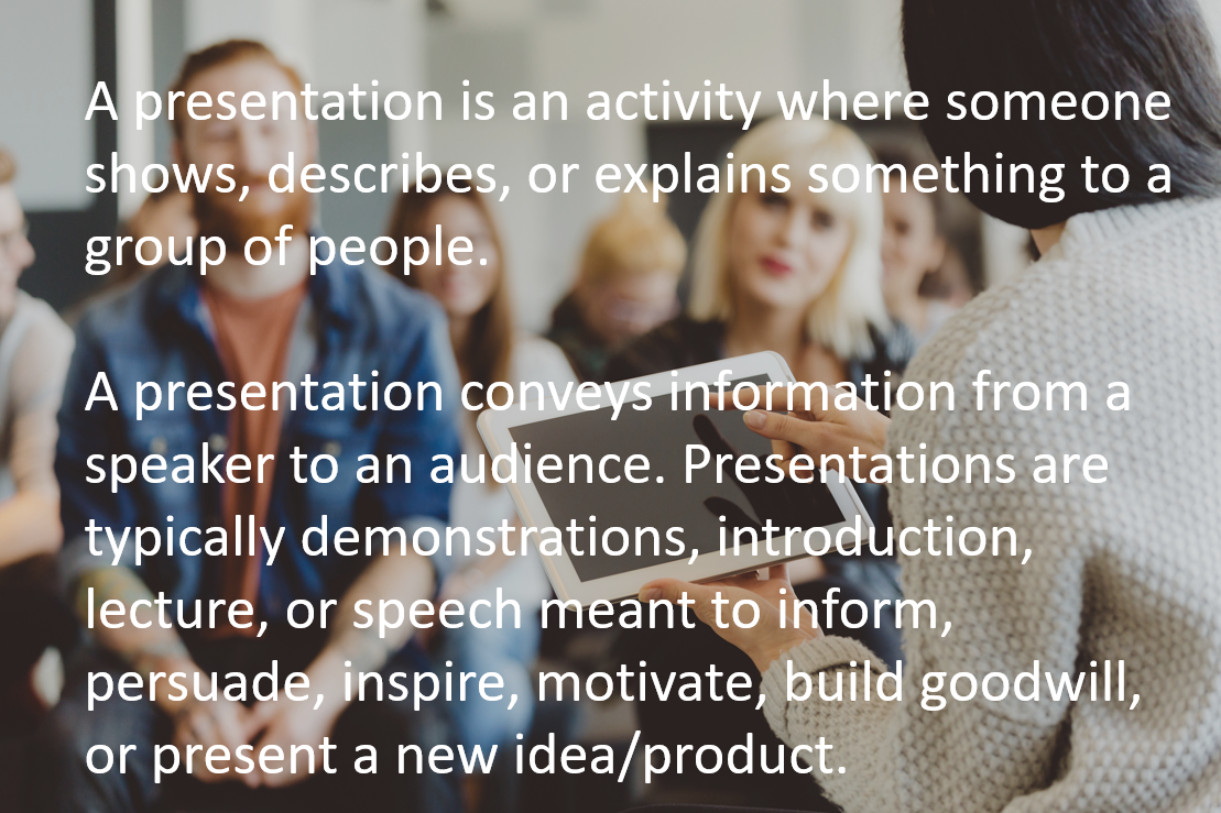
Cue the eerie music and dim the lights. Today, we're delving deep into the stuff of legends — not ghosts, goblins, or ghouls, but something far more terrifying: presentations gone wrong.
These are the slide mistakes that send shivers down our spines this Halloween season. We’ll show you some examples of presentations gone wrong, and also give you some tips for avoiding these massive missteps in your own slide decks.
Grab your security blanket, it's going to be a hair-raising ride!
Mistake #1: Cramming Too Much Text on Each Slide
Ah, the dreaded wall of text. It's like the monster under the bed of the presentation world, and one of the spookiest mistakes a presenter can make.
When faced with a slide that’s packed to the gills with text, most viewers feel overwhelmed. They're caught in a bind, trying to read the onslaught of words while also attempting to listen to the speaker. Their divided attention means they’ll likely miss out on key points from the spoken and written content.
Slides cluttered with text also lack the punchy, memorable visuals that help drive home key points. This missed opportunity can turn your hard work into a forgettable blur in the minds of your audience.
Presenters, here's a chilling truth — if you're reading your presentation off the deck, you're doing it wrong. Your slides should serve as guideposts in your presentation, not as a script.
When presenters read directly from their slides, it often feels robotic and disconnected. It robs the speech of its natural ebb and flow, making it less engaging and more snooze-worthy.
Instead of cramming every detail onto your slides, use bullet points, engaging visuals, and concise statements or phrases to summarize your message.
Let the slide highlight the essentials while you dig deeper into each topic with your spoken words. Creating the right balance of text on the slides will ensure your message sticks and banish the ghosts of boredom from the boardroom!
Mistake #2: Poor Contrast
Have you ever seen a slide that just flat-out hurts your eyes? Or one that makes you squint to read the text?
Using low-contrast color combinations, like white text on pale backgrounds, is a common presentation mistake.
Text that blends too much with its background performs an unintended magic trick: it disappears. When your audience strains their eyes to decipher what's on the slide, they're likely to miss the message altogether. And in presentations, visibility is everything.
Slides with poor contrast aren't just hard to read — they're distracting. Instead of focusing on your key points, viewers might find themselves wrestling with thoughts like, "Is that an 'a' or an 'o'?" These distractions divert attention away from your core message.
A presentation that's hard to read is a one-way ticket to Snoozeville. When your audience is spending energy trying to decipher your slides, it's energy they're not spending engaging with your content. And let's face it: a bored audience is the true nightmare.
To avoid letting your presentation become a horror show, always opt for high-contrast color combinations. Think dark text on light backgrounds or vice versa. Don’t use bright colors as the background of your slide — nearly any color on top of neon green is going to be hard to decipher.

Testing your slides on various screens, under different lighting conditions, can also help ward off any lurking contrast issues.
When you’re crafting your slides, clarity is king. So, keep those contrasts crisp, and ensure your message stands out as boldly as a full moon on a clear, spooky night.
Mistake #3: Lack of Structure
Journeying through a presentation without a map is like wandering in a maze with endless twists, turns, and dead ends. Before you know it, you're lost, and so is your audience.
Signposts aren't just for roads — they're critical cues that help listeners navigate your presentation and follow along with what you’re saying.
Presentations that lack structure can also stretch into an endless loop of monotony. It's like being trapped in a never-ending horror movie scene — repetitive, predictable, and mind-numbingly dull. And ghostly gaps in logic can make it challenging for viewers to piece together your main arguments and draw meaningful conclusions.
This woman, who was speaking at a local government meeting, could’ve used a touch more structure in her presentation:
Here's a three-step process for banishing confusion in your presentation:
- Tell your audience what you're going to tell them.
- Communicate your main points.
- Summarize and wrap up what you’ve told them.
When you do this, your audience can easily follow your points and remember your core message.
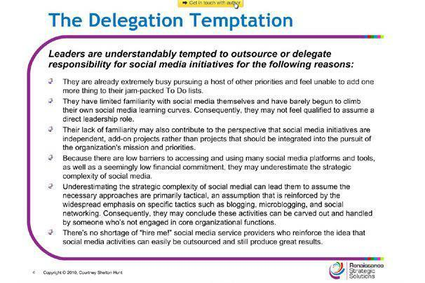
Mistake #4: Charts Gone Bad
When used well, charts and graphs can be tremendously helpful in presentations.
But ooh boy, when they go wrong — they can go horribly wrong.
Take this classic example from a military briefing to explain the complexity of American strategy in the war in Afghanistan.
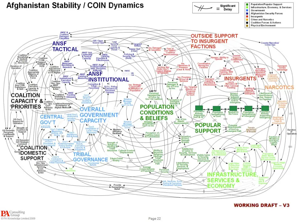
General Stanley A. McChrystal, the former leader of American and NATO forces in Afghanistan, was a member of the audience at this briefing, and when he saw this slide, he quipped, “When we understand that slide, we’ll have won the war.”
A bad chart is like a riddle wrapped in an enigma. Instead of elucidating, it obfuscates. When data is presented in a confusing way, the main message often gets lost.
And the most sinister charts or graphs are the ones that distort the truth. Whether it's through disproportionate scales, misaligned data points, or poor design choices, a misleading image can convey false information that leaves your audience with the wrong impression.
To keep your charts from becoming monstrous miscreations, keep your design simple and straightforward. Every element should serve a purpose.
Prioritize telling the truth — cherry-picked data or misleading visuals can quickly discredit your entire presentation.
Most importantly, present only the most relevant data so your chart can tell a clear, concise story.
Mistake #5: Word Art Overload
Overindulging in graphic elements like word art is one of the deadliest presentation sins. While word art can add flair, an overdose can drag your deck into the deepest depths of design despair.
Too much word art can also make your slides appear outdated or juvenile — and jazzing, jarring fonts can be distracting for your audience.

When it comes to presentation design, less is more. Use design elements like word art sparingly and purposefully. Choose consistent fonts and styles that complement your presentation's theme and tone.
Instead of relying on glitzy graphics, let your content be the star, using design to enhance, not eclipse, your message.
Sleep Soundly, Sans Slide Nightmares
We've all had that cold-sweat moment, right? You're nestled under your covers, deep in a dream, when suddenly you're on stage.
Your slides are gibberish, the clicker's on the fritz, and is that your 5th-grade teacher in the front row, chuckling to himself?
Oh, the horror of the dreaded presentation nightmare! Slideshow spooks can keep us tossing and turning…but you’re not resigned to that fate. We’ve got two powerful resources that can help.
The SCRAP method of slide design — from the book Public Speaking 3.0 by Sherwyn P. Morreale and Janice G. Thorpe — brings together all of the guidelines above and can keep you from creating scary presentations. The acronym stands for Simplicity, Contrast, Repetition, Alignment, and Proximity — check out the book for more details on how to create professional, engaging visual aids.
Showcase Workshop can also be your new best friend for creating professional, polished presentations that engage your audience and let your message shine through. Sign up here to get your free trial today.