Hey, I saw that. You rolled your eyes, didn't you? Or gave a slight smirk. Because we've all seen this before.
It's a very common trope – a comparison of two apps or solutions, written by the company that makes one of those apps or solutions. No prizes for guessing which service comes out on top! It's ours!
Except in this case, it's not. Or at least...not always. It depends on context. There's no one app or solution for everything.

In New Zealand at least, Canva has been putting a charming little pre-roll ad before some YouTube videos and on-demand streaming services. It features a lady having to make a presentation out of nowhere in 20 minutes. Yikes! She takes it in stride though, and uses Canva to collab with her colleagues and get it done.

So Canva is clearly trying to position themselves as a presentation tool for businesses.
That's also what Showcase Workshop is, in essence (although like Canva, you can get creative with it).
Which is better for the kind of presentations you're doing? Let's look at some use cases.
Use Case #1: One-off or Recurring Internal Presentations (Small Audience)
This is what Canva's ad looks like, to me – Mia and her team are pitching something to the boss, or maybe reporting on their achievements for the quarter. Because nobody leaves a client presentation til the last 20 minutes - right Tess? - but you might feasibly decide on the day that you need a handful of slides to pep up your internal quarterly report.

This is an ideal use of Canva presentations. Pull some elements from the Brand Kit, slap in a graph or two, and you're away laughing. It's low-stakes; maybe you're not even going to use this presentation again.
Canva is clearly the better solution here. A from-scratch Showcase presentation can't be hurled together quite this quickly, and you don't need to use our powerful sharing capabilities either. If the presentation turns into something you need to use more than once – like, the boss wants to see the same slides at your next quarterly report – Canva's quick editing tools allow you to just keep updating it as needed. Who needs old versions or an audit log? Pfft. No time.
The Showcase Workshop reporting tools are wasted in this context too; you really don't need to know which slide performed well or who in your team has viewed it the most.
Verdict
For internal presentations with a small audience, using Showcase is like using a flamethrower to light a candle – way too powerful, and kinda inefficient as a result. It's Canva all the way for this one.
Use Case #2: Recurring Internal Presentations (Bigger Audience)
Imagine your company has a fleet of trucks, freighting hazardous chemicals all over the country. Your drivers diligently deliver to dozens, if not hundreds of individual sites, each with their own safety and security protocols. How do you keep drivers briefed on changes to these, visually, every week on their phones or tablets while also tracking whether they've got the message?
Canva presentations straight-up cannot do this. This is a Showcase job all the way baby. Try get your drivers to go to a different 158-character Canva URL on their phone for safety info each time, and you can kiss that no-claims bonus goodbye.

You can do this in Showcase by having a standing template that you re-use – with all previous versions stored in 'History' for posterity and archive purposes. Because Showcase has an app for every platform, it doesn't matter what device drivers are using out on the road – they'll all be able to access Safety Briefing Presentations straight from the app. And it works offline. And you can see who's viewed it and when. You can even use a Showcase Form to get written confirmation that they've read and understand.
Verdict
For recurring internal presentations to a bigger audience, you want better deliverability and more accountability than Canva can provide. It's Showcase Workshop that wins this one.
Use Case #3: Low-stakes Customer Pitch
You've known Barry at Barry's Bootyful Blue Jeans Co. for 6 years; you've eaten jalapeño poppers with him that one time. You want to sell him on your company's new Fixeners 2.0 range.
All you need is half a dozen slides to riff off of – some pics of the Fixeners, a testimonial quote, a graph of improved performance, maybe a pricing table. You might share this mini-deck with him afterwards, in case he needs purchasing approval. But it'd be weird if this was the most slick, professional sales experience Barry's ever had. You chill cats don't need to stand on ceremony.

With Showcase, you can create complex structures of tiered content – getting progressively more detailed for the prospects that need convincing. Making similar pitches to multiple clients? The Tags feature allows you to collate slides relevant just to them, and send those in a tracked and branded email.
In this case however, you do not need a fully-branded, multi-level, high-detail app-like sales presentation. As the Zoomers say these days, it's not that deep.
Fire up that free basic-tier Canva account; dig out a 'smiling jeans-wearing young adults' stock photo; you're halfway there. You can use Canva's straightforward "Share a link to view" option to give Barry a copy. Sure, the URL is as long as your arm; Barry can only passively swipe back and forth; and you have no idea if he even looks at the dang thing. But as we've established, that doesn't matter in this context.
Verdict
If you have a couple dozen Barrys in your Rolodex, you'd still genuinely benefit from Showcase (cf. the afore-mentioned Tags feature and tracked sharing). But for a one-off, casual conversation, Canva is the time-saving winner for this scenario.
Use Case #4: High-stakes Customer Pitch
Let's imagine the spiritual opposite of a Barry situation. You've been chasing Big Scary Jackets Company™ for 9 months. The National Procurement Officer just agreed to a half-hour video call next week. If you can land this contract, you'd be supplying Fixeners for hundreds of thousands of jackets across the globe. No pressure, right?

It's time to bring out the big guns. This is not a moment to be slapping down bokeh-drenched stock photos and "Bold Foliage" clip art on the fly, hoping that it all sticks.
You need something of substance here.
That means technical data sheet PDFs seamlessly linked as backup, ready to flash up on screen at a moment's notice. That means multi-choice menus, so you can adapt to the conversation as it flows, not hurriedly dash through the next 6 slides to get to the part they're asking about.
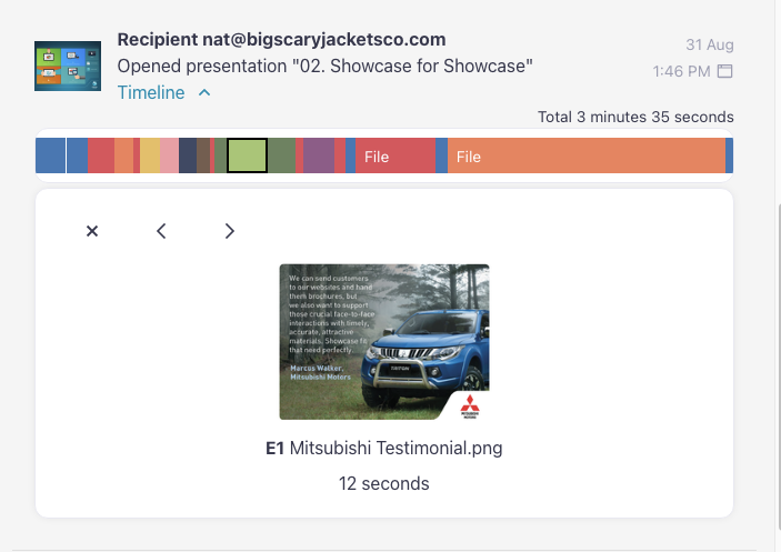
It also means analytics. When you send your beautiful slides to the prospect after the call – slides they can scroll, or swipe, or tap, with rich video and PDF content at their fingertips – you want to know: did they even open your email?
Showcase tells you this. In fact, Showcase gives you a blow-by-blow of everything they looked at, every slide and file, and for how long.

Verdict
I'm so sorry Canva, the Bold Foliage is great, but this one isn't even close. For high-stakes customer presos, you'll need Showcase Workshop.
Use Case #5: Fully-fledged Sales Toolkit
Give enough presentations, and you start to notice patterns. Folks love a good ol' "Big numbers" slide; case studies can still seal the deal; there's always that one lady at the back who expresses skepticism about your reports and needs to see the example ("So glad you asked, Jemima; I actually have it right here").

When there's this much repetition, you want to give your sales team everything they need to consistently win that conversation. Even if the "sales team" is just yourself. Prep those files and slides in advance, then deliver it all in an app that you can tap around in confidently anytime (even offline).
Canva does not let you conjure up a singular bank of branded, presentable collateral in the same way Showcase does. And although Canva truly does make it impressively easy for non-designers to design things; should your sales team actually be laying out presentations anyway? You're not hiring salespeople for their ability to match pastel tones.
Take the uncertainty out of presentation aesthetics and hand your team a ready-made toolkit of content to present from every time. If the content changes? You change it in the app; the team still access it from the same place and see the same structure.
Showcase's sharing and reporting rounds out the sales presentation experience for a full toolkit that goes well beyond those 6 slides you dashed off in 20 minutes.
Verdict
For big-picture, long-term sales presentation success, Showcase Workshop takes the prize.
Why can't we all just get along?
With all this being said, there's room for both Showcase Workshop and Canva to comfortably co-exist in your tech stack. Canva's pricing ranges from $0 to $48 per user per month, while Showcase is $29 per user per month (less in a bigger team). Both are extremely good value; you can pony up for both without shattering your tech budget for the year.
As we've seen above, there are times when you might use Canva to present, and times when Showcase is a better fit. Even if you're not using Canva for presentations at all, you can still use it to design the slides that you eventually use in Showcase. As a pure design tool, Canva is user-friendly, versatile, and accessible. And cheaper than Adobe InDesign. The "design slides in Canva" method is something we were already recommending way back in 2017, and that recommendation still stands today.
Rather than trying to decide between these two very handy tools, there's scope to have both. What's that saying about cake??

If you want to see Showcase's general excellence for yourself, we offer detailed demonstrations of what it's like to use Showcase in any of those winning use cases described above (and then some). Times are limited, so secure yours today.