Introducing new hotspot styling options right within the presentation editor.
We’re not InDesign. And usually, we don’t try to be. But for a while now, we’ve felt that it’s a bit tricky to get a modern, stylized look directly within the Showcase presentation editor. You have to get quite fiddly uploading custom PNG hotspot backgrounds and hacking around with spacing.
All that is about to change.
We are rabidly excited to introduce a whole host of hotspot styling options to the Showcase presentation editor.
Up until now, there have been a limited number of ways to style a hotspot. You could:
- Set the font type, size and color
- Set how the text is aligned inside the hotspot
- Highlight text within the hotspot
- Create a colored strip background
- Set a hotspot background image
- Fill a hotspot with color

For reference, this is what the main toolbar previously looked like when you selected a hotspot in the Editor.

And here’s what it looks like now.

The differences are subtle but will make a world of difference to your presentations. Nothing is gone from this toolbar, but some things have been moved around. Here are a few of those subtle changes:
- The 'PIN Protect' option has moved to the 'Add Content' dropdown menu:

- Text color and highlight color used to be set separately, but are now set from the same dropdown:

- Hotspot fill color is still an option, but now sits with the 'Hotspot Image' control:

Aside from all those, we have four new controls in that toolbar.... holey moley! Let’s go through them one by one.
Spacing
The first is Spacing.

Within this dropdown you have three options: letter spacing, line height, and padding.
The letter spacing, as you might expect, applies to the spaces between the letters. You can now make this really little.

Or absolutely massive!

Line height will only make a difference to your hotspots if you have multiple lines of text. Use it to give certain paragraphs more breathing room.

Or squish them up to save some space.

Padding refers to the amount of space between the text and the inside edge of the hotspot. Here's a comparison:

In these examples, the text has been aligned to the top and the left of the hotspot.
If your text is right-aligned and vertically centred, it’ll look more like this:

With large padding, you may only notice a difference if the hotspot itself is large. Here’s those same two alignments when the hotspot is bigger:

Text Effects
I know what you’re thinking – man, Nicky tell me about those ✨ sparkles ✨

Ok, the sparkles are Text Effects.
This is where you can add a drop shadow (in three different sizes!) to your text. You can also set your text to be uppercase or lowercase, without having to retype it.
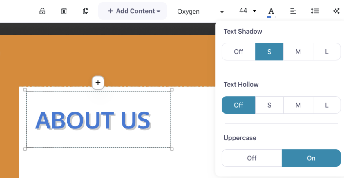
But what’s that thing in the middle there? Text hollow? What’s that? I’m so glad you asked.
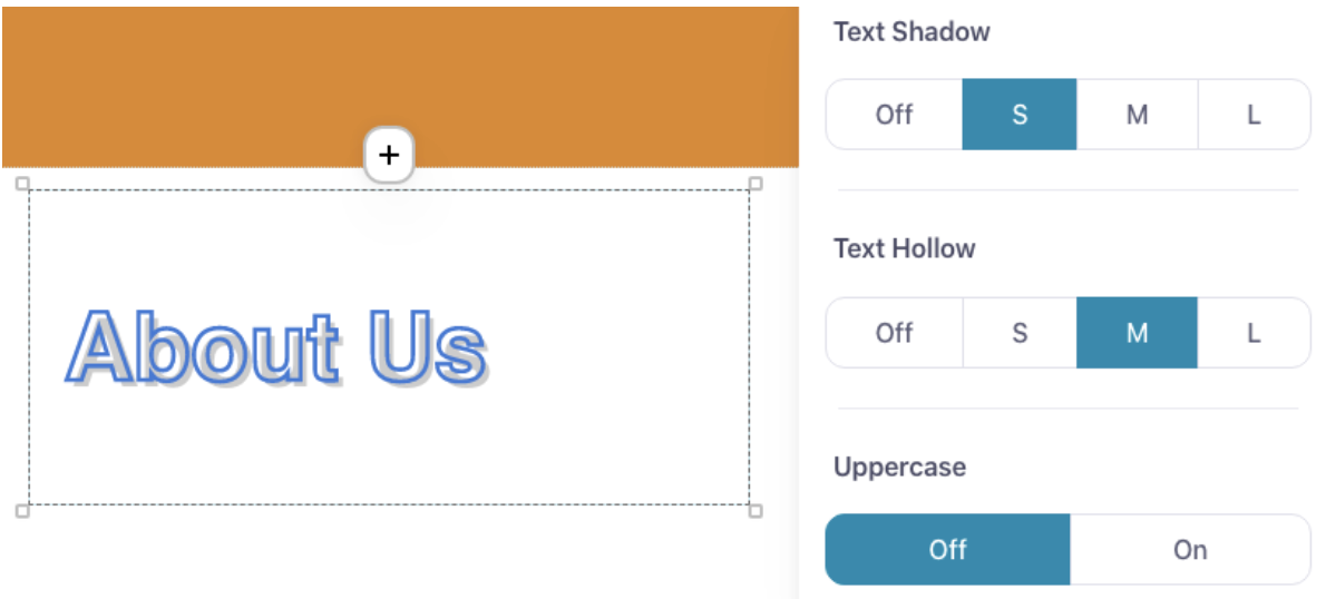
Hollow effectively “hollows out” your text, making it transparent in the middle, with just an outline. It can make for some cool effects.

Especially when combined with a shadow.
Omigod awesome. So cool. What’s next?
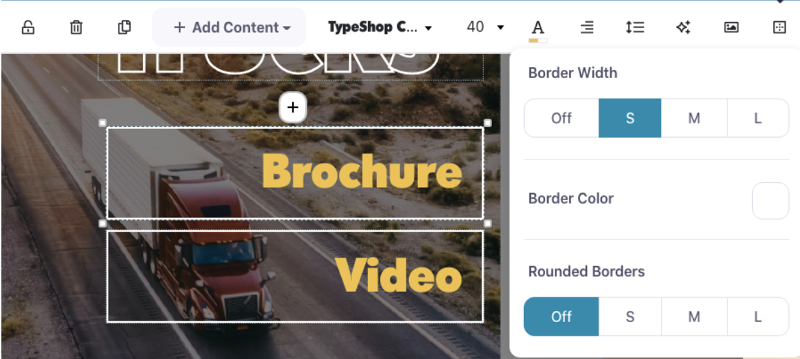
Borders
Borders, my friend. Borders are what’s next.

You can set a delightfully subtle border on any given hotspot — it doesn’t need a background image or fill color either.
Or you can get a bit bolder with a thicker border, a brighter color, and heck – why not a friendly rounded corner as well?
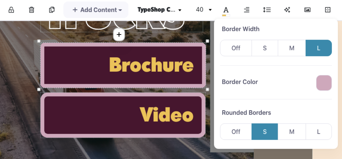
It's important to note that you can round the corners of a hotspot without setting a border width.
What that means in practical terms is that you can apply rounded borders to hotspots that feature an image or a solid fill color.
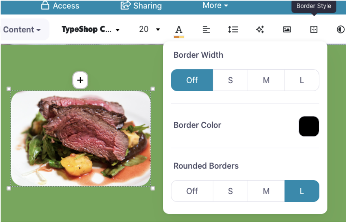
Magic.
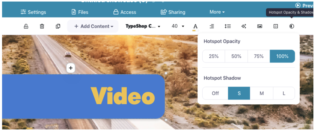
Opacity and Shadow
All of this is completely rad, I’m sure you’ll agree, but we’re not done yet. Oh no. We still have to talk about Opacity and Shadow.
Wait, didn’t we already talk about shadows? Yes, we did. Text shadows are an option under 'Text Effects'. But you can also separately add a shadow to a hotspot!
And, on a photographic background, it can give you a lovely little pop:
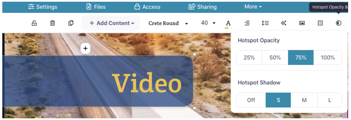
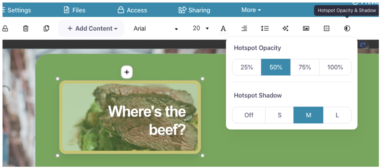
Opacity will reduce the opacity of the hotspot background to the specified amount. Hotspot background is everything except text – in other words, the hotspot image, fill color, and any borders you’ve applied.
It works a treat with dark hotspots on photographic backgrounds:
You can also use it to fade out hotspot images so the text is more obvious:
Updated color picker
As part of these changes, we've also updated our color picker window. Up until now, when you’ve needed to apply a color to something, we’ve shown you a simple dropdown menu with some pre-set color options in a grid.
But from now on, the color picker will pop up as a separate window and give you more options for selecting a color:
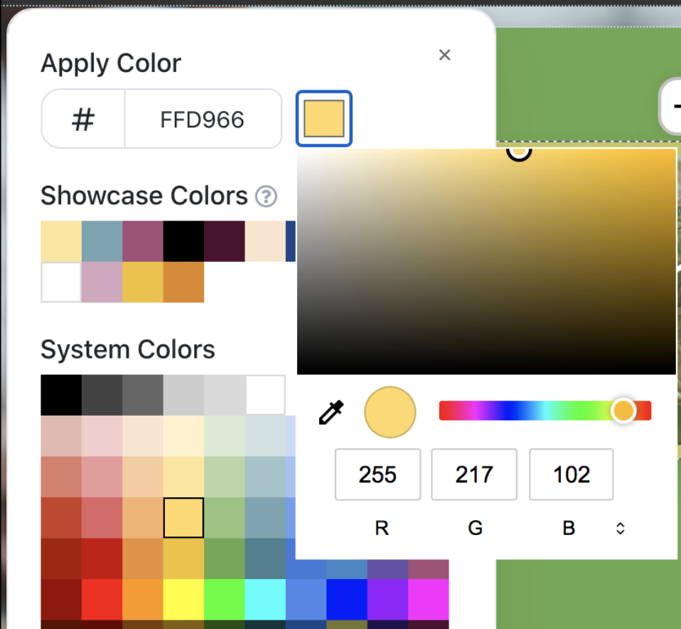
The system colors will still appear in the grid, and you still have the option to directly enter a hex value. But now you can also choose a color from your computer system’s color picker as well.
We’re also showing you all the colors that are being used elsewhere in the presentation, under the heading 'Showcase Colors'. So if you know you set a lovely yellow on some text a few slides back and you want to use the same one again, you can quickly pick it from the list.
Sort and Search
If you’re the kind of person who would rather not use a graphic designer, but you still want a bit of style in your presentations, these new features will be exactly what you need.
If you do use a designer for your presentations, this might feel less relevant to you. But we have another little change bundled with this release that everyone should find useful!
We’re adding a Sort and Search option to the Present tab in the web platform.
In this new release, labels will be left-aligned, to make room for a handy search and filter option.
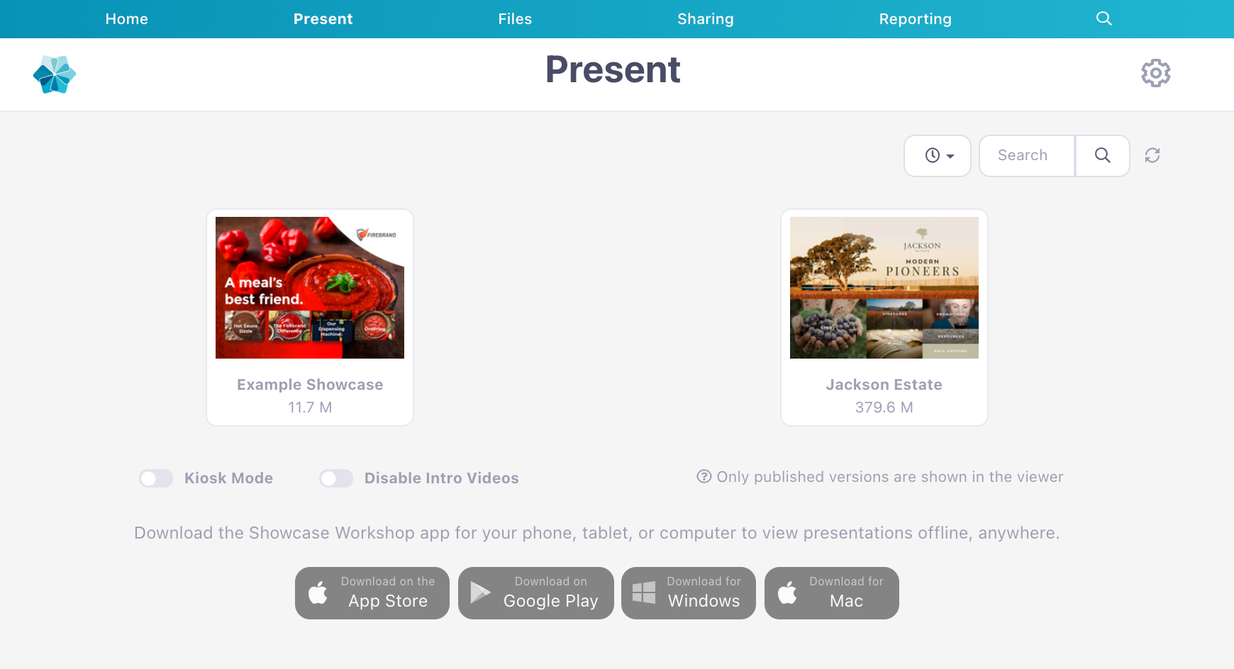
Admins and Editors will already be familiar with this, because it’s what’s already visible on the Home tab. But now Viewers and Managers also have the convenience of searching for a presentation or rearranging the sort order!
As a result of this change, you can see the app install buttons have moved to the bottom of the page – still accessible for anyone that needs to install the apps, while allowing the actual presentations more room to shine.
That’s all of our great changes for now! We’d love to hear what you think – send any and all feedback to my2cents@showcaseworkshop.com.
Header image by Gabrielle Henderson on Unsplash