On principle, sequels are usually awful - remember Grease 2? Yeah… it was bad. But luckily for you, this sequel blog post will be riveting, informative, and better than Michelle Pfeiffer in leather pants.

This is part 2 of our ‘Exploring Forms’ series and today’s post is about our HTML5 forms. If you didn't catch the first instalment of the Wonderful World of Forms - Simple forms, check it out here.
You don’t need to be tech savvy or a developer to understand HTML forms, I’m here to chat about the benefits of implementing one of these bad boys in your showcase, in everyday language.

What's the difference?
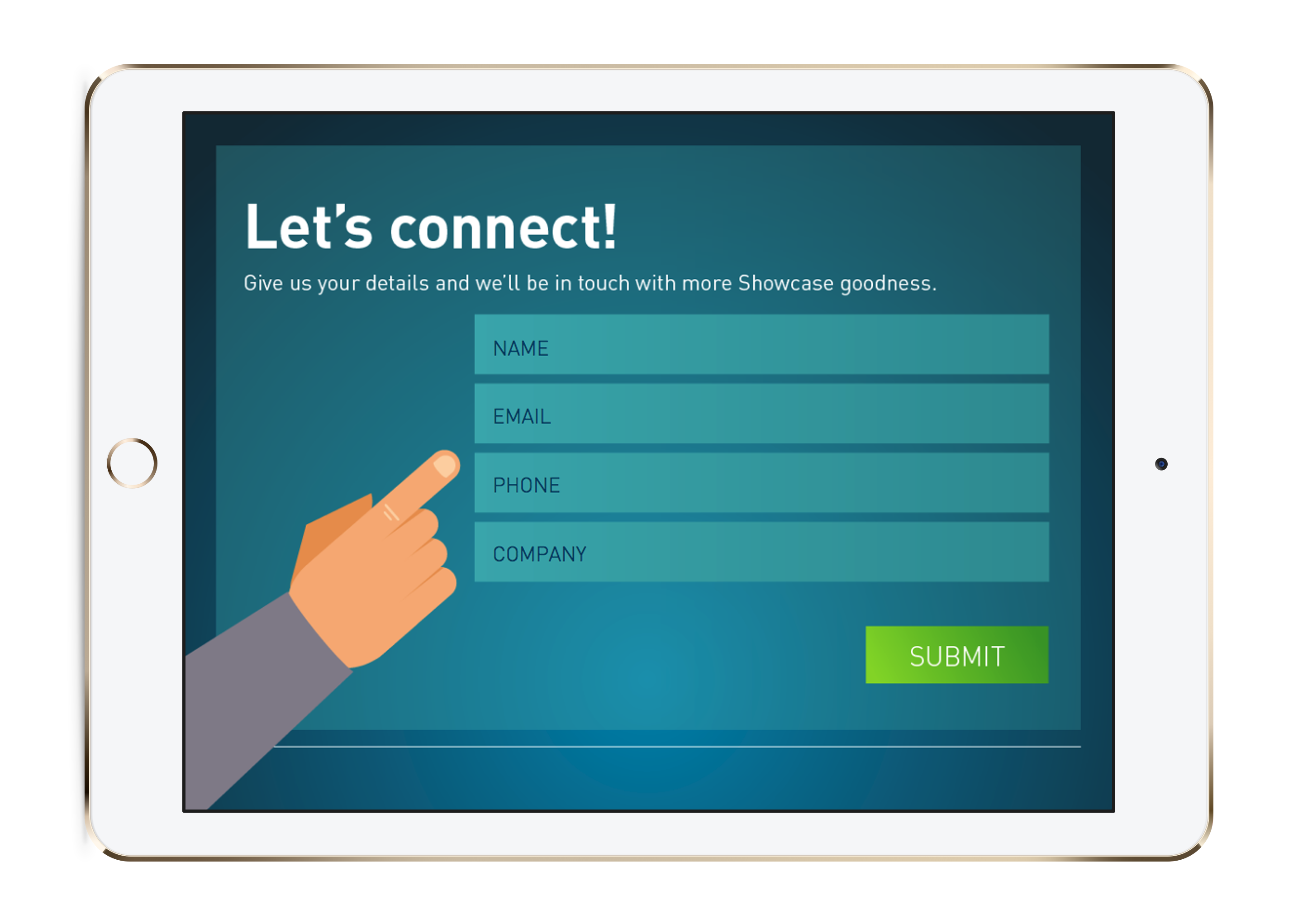
So as we went through last time, simple forms are just that - simple. So if we were to compare the two forms, having a simple form is like having a cheeseburger. It’s good, tasty, and fills you up, totally does the job. Having an HTML form is like having a cheeseburger with all the fixins. Bacon, extra cheese, pickles... You name it.
They’re both great - it just depends on what kind of craving you have.
On brand
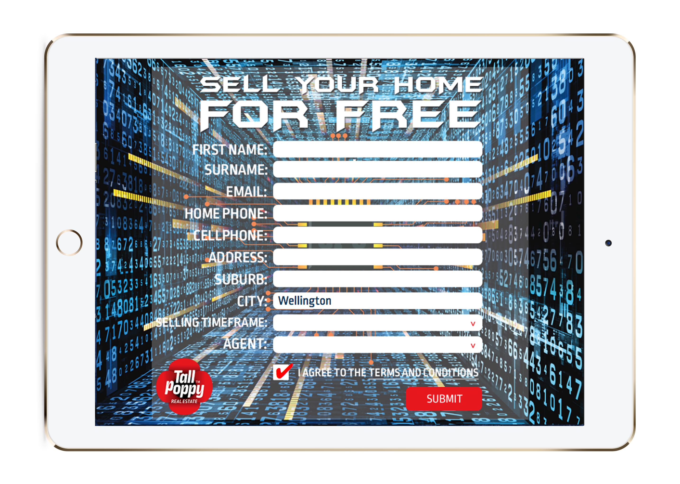
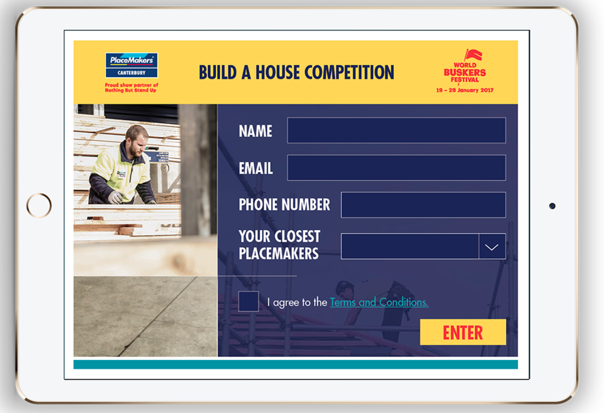
The best thing about HTML5 forms (in my opinion), is that they have a larger capacity for customisation than a simple form does and more design ability.
You have the option to design the form in any way you like so it can match exactly to the rest of your slides. If you have a design team in-house, this is perfect for them to dream up and create on their own and then we can easily code it into your showcase for you! If you're designer-less, get in touch and we can help you out here.
HTML forms are built by us nerds here at Showcase, but alternatively, if you have anyone on your team with solid HTML, CSS, and Javascript knowledge, they could get nifty and code it in themselves too.

Multi screens
It might be hard to fit all the information you need in one singular form on one slide - HTML forms have the ability to be multi screens! There are many ways you can utilize this option, for example, say your customer selects Option A, they skip right to the end of the form. But if they select Option B, they have to continue through the answers.
Multi screens are also super helpful for adding in extra bits and bobs, like terms and conditions.
Stream lining the process
Having the ability to add features to your forms rather than sticking to the old school simple form, allows you to give the form-filler more options to detail their preferences.
There is a plethora of fun things you can chuck in, like Dropdowns.
Dropdowns are brilliant for things you need limited answers to. Imagine having to wade through a text box entry for a customer dictating what product they’re interested in, only to find out at the very end of the paragraph. Wouldn’t it just be simpler to have a dropdown with the options that the customer could select? I know right! Dropdowns can ensure you contact your follow-ups and customer with the exact information they’re after, and they’re more likely to engage and respond.
You can sort by anything you’d like - regions, country, products, presentations, even job title.

Radio buttons can also be added! They are awesome for mutually exclusive options, also "seeing" the options that would usually be hidden in a drop-down. Generally, dropdowns are better for bigger lists and radio buttons for smaller sets of options. Here's a handy example:

Not to be forgotten, are checkboxes. This fail-safe, multi-choice feature is great for medium sized lists and can please even the pickiest of form filler. Checkboxes are excellent because they allow the user to create a niche bundle of options, completely tailored to them. Looks good for you, as you can be uber certain that you aren't spamming them with info they don't even need!
Validation
HTML5 forms also have the option to require validation to complete the form. In short, this means you can ensure that people are entering the correct information and you're not getting half-finished forms or forms with random information.
We can 'validate' whether certain fields have been filled - so you may like to make "Name" a mandatory field. We can also validate an email address to ensure it fits an email pattern: [X]@[Y].[Z] and then you don't get folks trying to put in "Yes please send me email" in this field.

To tell you the truth, I could go on for pages and pages about all the things HTML5 forms are capable of - but I don't want to give you RSI from an hour of scrolling. If you're keen to see how you can use HTML forms in your showcase, get in touch with us at helpdesk@showcaseworkshop.com and we can spin some wonderful yarns.