You may remember our great three-part series on how to put interactive content like forms and calculators right into Showcase. It was wildly popular, with tens of views.
Our first post talked mostly about simple pop-up forms, which are practical but have very little visual flavour. The next two posts described how, with some HTML, CSS, & Javascript, you could get aesthetically appealing, more sophisticated forms and calculators going. Score.
It’s possible to straight-up hire us nerds at Showcase to build these more advanced, HTML-based tools for you. But, if you have both graphic design skills and HTML/CSS/Javascript tools within your team - maybe within the same person - then it’s possible to create some of this interactive content in-house.
You can also split the difference and do the design in-house, then hand it to us Showcase nerds for the code part.
This post is going to walk you through the best practices for designing a calculator or form, and getting the visual resources together ready for it to be coded up.
Broadly speaking, a calculator or form is usually comprised of a big, flattened, visual background - much like a normal showcase slide - placed in an HTML page and bundled with a CSS & Javascript file. For the majority of calculators and forms, you’ll have some ‘fields’ on the page somewhere, which is where the user will tap to enter their details or some numbers.
So right off the bat, the same main principles as designing slides for Showcase will apply; that is, you’ll want your background images to be:
- PNGs
- 2048 x 1536 pixels
- RGB colour
You’ll also want to continue to keep the “four corners” of the image relatively clear for the Showcase home, share, and menu buttons.
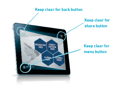
Yes smarty-pants, there are clearly only 3 corners with buttons in the example. But keep that bottom right corner clear anyway - you never know what cool feature we'll throw in there!
Just like with hotspots on a showcase slide, you’ll also need to consider how big your “tappable areas” are. If your showcases are often viewed on a phone, tham means a smaller screen with smaller real estate for fingers to jab at. So if your form or calculator has a large number of fields and controls, it may be wiser to split the functionality into two or more screens so the user doesn’t get overwhelmed or find it difficult to hit all the fields.
That’s the basics - PNGs at 2048 x 1536 with clear corners and reasonable space for users to tap on.
Now we’ll get a little more form-specific.
From a general usability perspective - and this applies to form design in general, not just within Showcase - you’ll want to consider reading direction and how a user’s eyes move around the page. In English this usually means left to right, down the page. Consider as well the need for labels on your form fields, and what the placeholder text might say. If the field is a required field, it’s good practice to indicate that somehow so the user doesn’t skip it.
For forms on Showcase specifically, you’ll need to ensure there is some kind of “Submit” button designed into the page - this is what the user will hit once the form is complete and this will tell the form to submit the form data to the Showcase server.
Calculators can be coded to update automatically as data is changed, so you may not need a “calculate” button built into the design of these - but you could consider, for both forms and calculators, a button or icon that re-sets the entered data so that a new form can be filled or a fresh set of data entered.


If you’ve ended up with multiple screens in your form or calculator, make sure it’s clear how the user is expected to navigate from one screen to the next - probably with “next” and or “previous” buttons in a location and colour that won’t be confused with your “submit” button or any of the other controls.
If your form has a yes/no option, throw in a checkbox. This can be coded to make a check-mark appear when tapped. Make sure you include some explanatory text in the design, so the user knows what they’re agreeing to!

If your form has a multi-choice option, consider how this might be represented. For 5 options or less, you can design radio buttons, so that all options are visible and the user simply selects one.

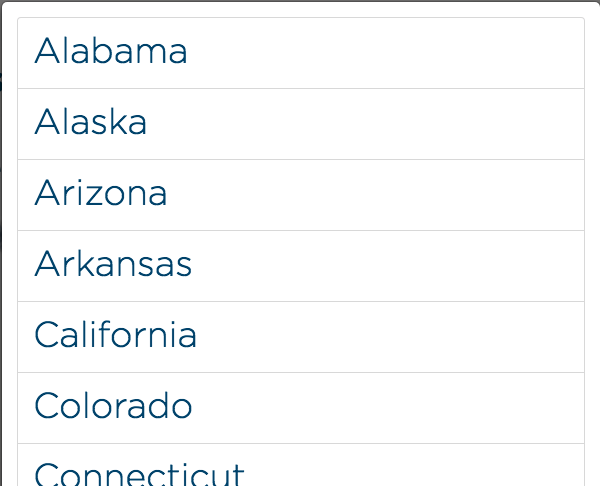
For a bigger range of options, consider a dropdown list. Typically you’d design a field that has a down arrow at the side - when the user taps this, the list will appear - they select an option and that option fills the field.
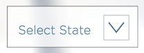
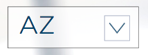
Although you’ll need to design a dropdown indicator, the list itself can be built entirely in code, which makes it easier to edit the list of options down the track.
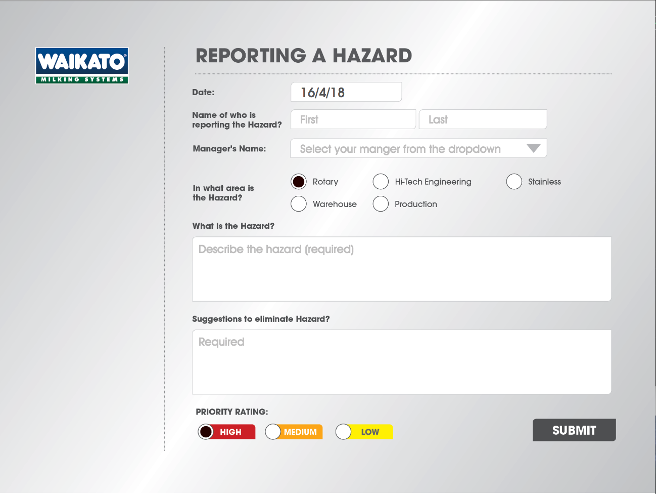
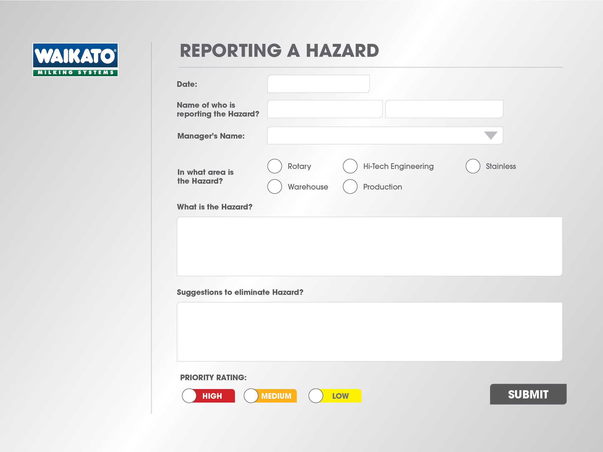
So dropdown lists are a good example of a form component that typically shouldn’t be built into that one flattened PNG. The only other components are field placeholders, any dynamic text (for example, a changing date or time indicator) and the check symbols and dots that go inside checkboxes and radio buttons. For this reason, it’s a good idea to supply your coder with a reference image of how the form should look with all placeholders intact, and checkboxes or radio buttons ticked or selected.
Reference image:
Supplied PNG:
If you’re getting really tricky and making a calculator with some sliders in it, you’ll need to export the drag handle of the slider - the bit that moves - as a separate .png with a transparent background.


You can still specify fonts that the coder should use in any dropdown lists, dynamically generated text, and in the field placeholders - which are also dynamically generated in code - you’ll just have to make sure you provide the coder with the appropriate font files.
The main thing to keep in mind when designing forms for Showcase is clarity. So as long is the user knows which fields to fill, in which order, which fields are required and where the buttons are (i.e. they can tell a field apart from a button) then you’re on the right track. Keep it clear for the person who will be coding as well - so if you end up with multiple screens, make sure the background images you provide to them are clearly named, for example screen-1.png, screen-2.png.
With all this in mind, you should be well prepared to start designing up some beautiful forms! If you want some further guidance on any part of this process, or you want to show off what you’ve built (we’d love to see!), drop us a line at helpdesk@showcaseworkshop.com.