You might have seen how we recently released the incredible hotspot multi-select and some other handy tweaks to the Showcase web platform...well now there are even more exciting developments to get jazzed about!
In our latest release, we've introduced a function for resizing a presentation; more colors for your presentation labels; a useful new analytics screen and some very cool "navigational" hotspots. Let's dive into it!
Resize a presentation
If you've ever started building a presentation in a widescreen, 16:9 ratio, then thought — dang, hang on, all our staff are on iPads! I need this to be a different size! Egads! — this feature's for you.
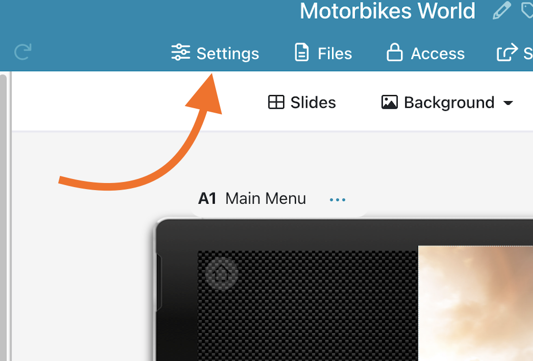
You can now resize or re-orient a presentation from the "Settings" option in the editor.
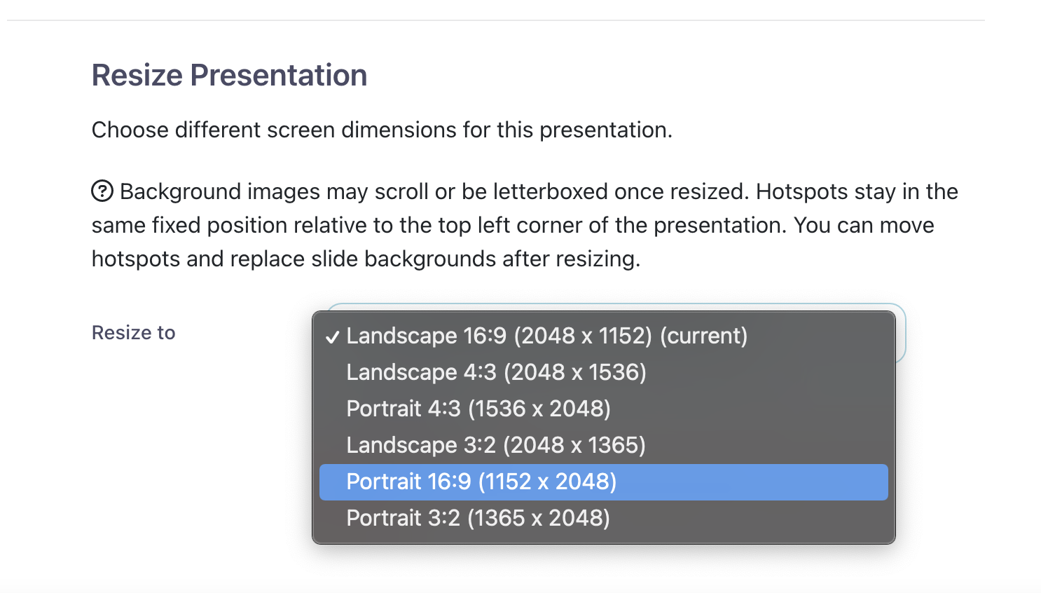
Down the bottom of this dialog is the option to "Resize" and select a different ratio and/or orientation for the presentation. In this example, I'm turning the whole thing from Landscape to Portrait:
Once I've selected a new size, I can click the "Resize" button and it'll work some Showcase magic, showing a progress checklist as it goes:
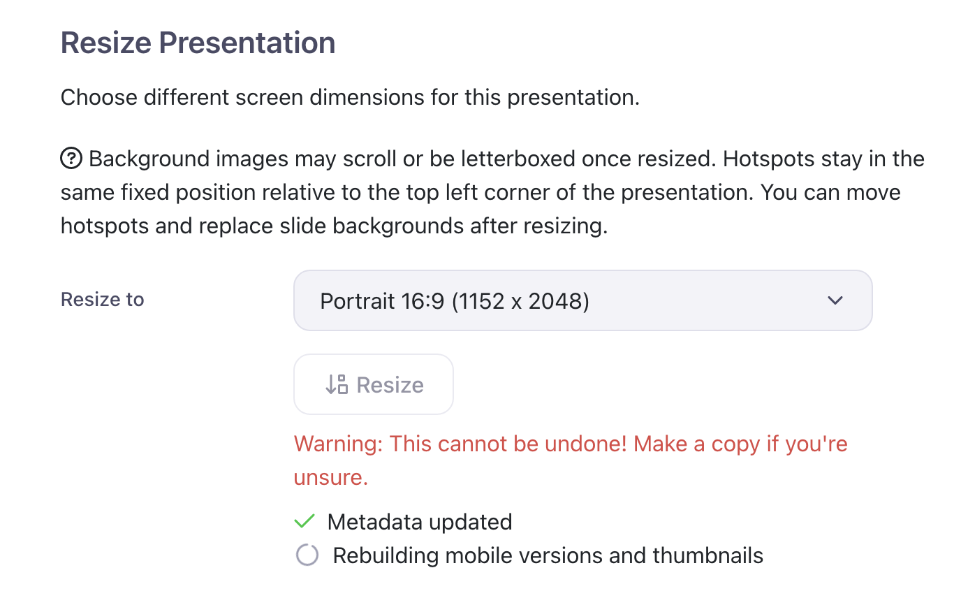
As the text suggests, this can effect how your images and hotspots turn out; you may end up with content off the canvas.
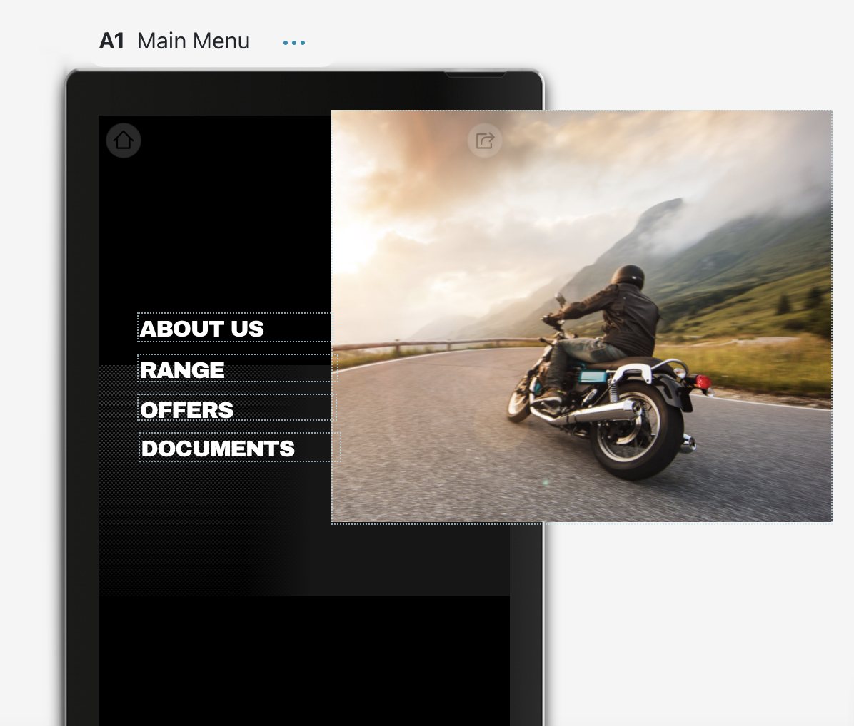
But from here, you can move and re-orient hotspots as usual, and replace your background images if required. It's certainly much quicker than rebuilding the whole thing from scratch! Hooray!
More colors for presentation labels
If you don't know what the heck labels even are, they're these colored boxes you see at the top of the "Home" or "Present" screen. They also show up on the apps, if you or an Admin for your workshop has set them up.

Labels are useful for filtering the list of presentations, so if I click "Russian", I'll only see presentations that have that label applied.
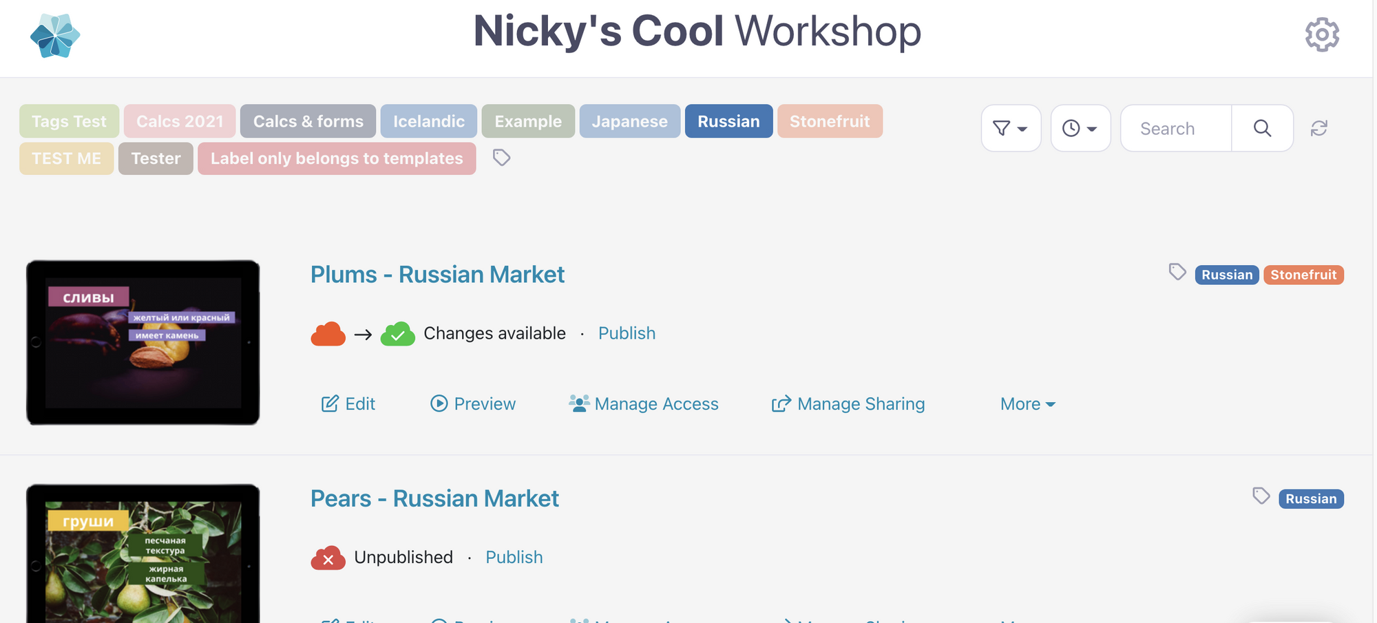
We used to have a set 10 colors only for labels. Well, no longer. You can now make labels across the spectrum! Click the label icon next to a presentation name to get started.

Next, you want a "New label"; the button at the bottom of the dialog.
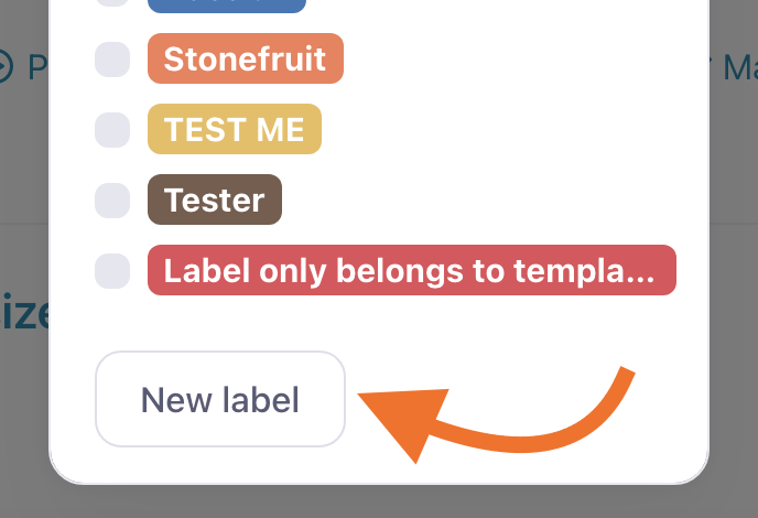
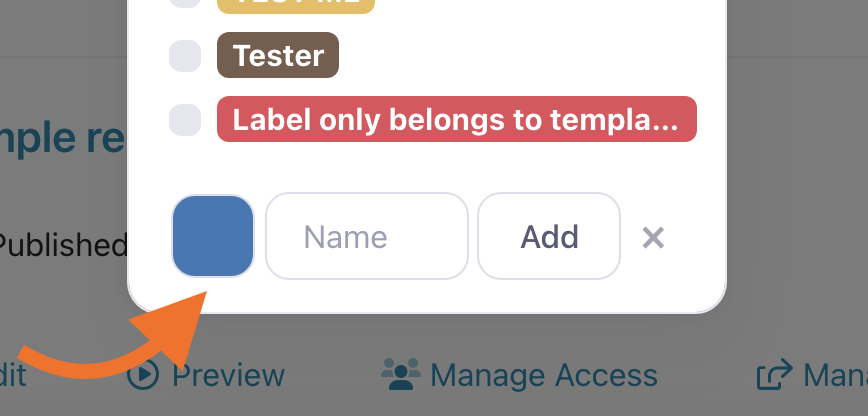
Click the coloured box to trigger the new advanced color picker:
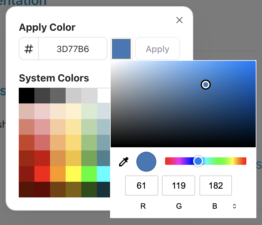
From here, you can choose from the gamut of "System Colors" or click on the selected color square next to the hex value and use the picker there to get the exact right shade.
Nifty!!
New Analytics Screen: Slide Report
This one is for the data nerds. You might know that we already provide a report for the specific performance of a file within any given presentation — breaking down how many of the total file views came from each of the top users.
You can get to this by selecting a presentation from the main analytics screen, then selecting one of the top files. The resulting screen looks a bit like this:
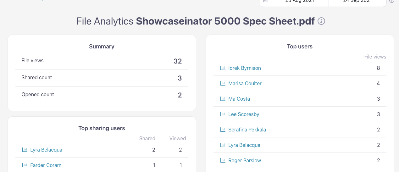
Well, now we do the same thing for slides. Except with slides, we count the total number of favorites and tags, rather than slide sharing.
You can get to this new "Slide report" the same way, by selecting a presentation from the main analytics screen first, then clicking on the name of the slide you want more data for.
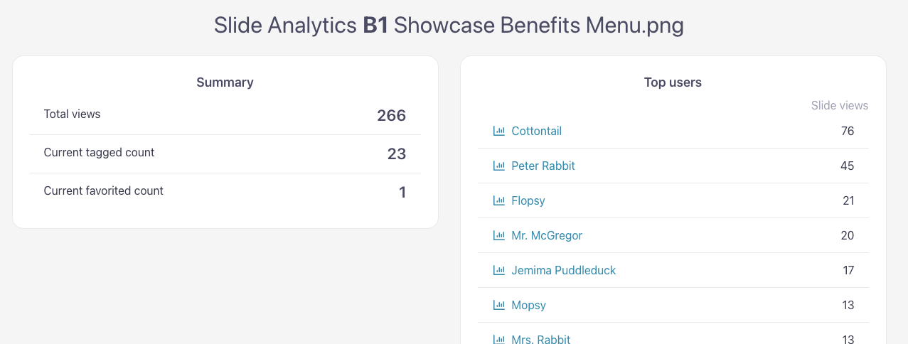
This is a great way to determine if your highly viewed slides are popular with the whole team, or just a handful of power users.
Special Navigational Hotspots
Speaking of power users; this one's for you. You can now create hotspots that functionally perform the same action as core Showcase navigation buttons.
By core navigation buttons, I mean the bits that usually appear around the edges of the presentation, like "Back", "Share", "Next" and "Previous" (those last two only appear if you're in a slideshow).
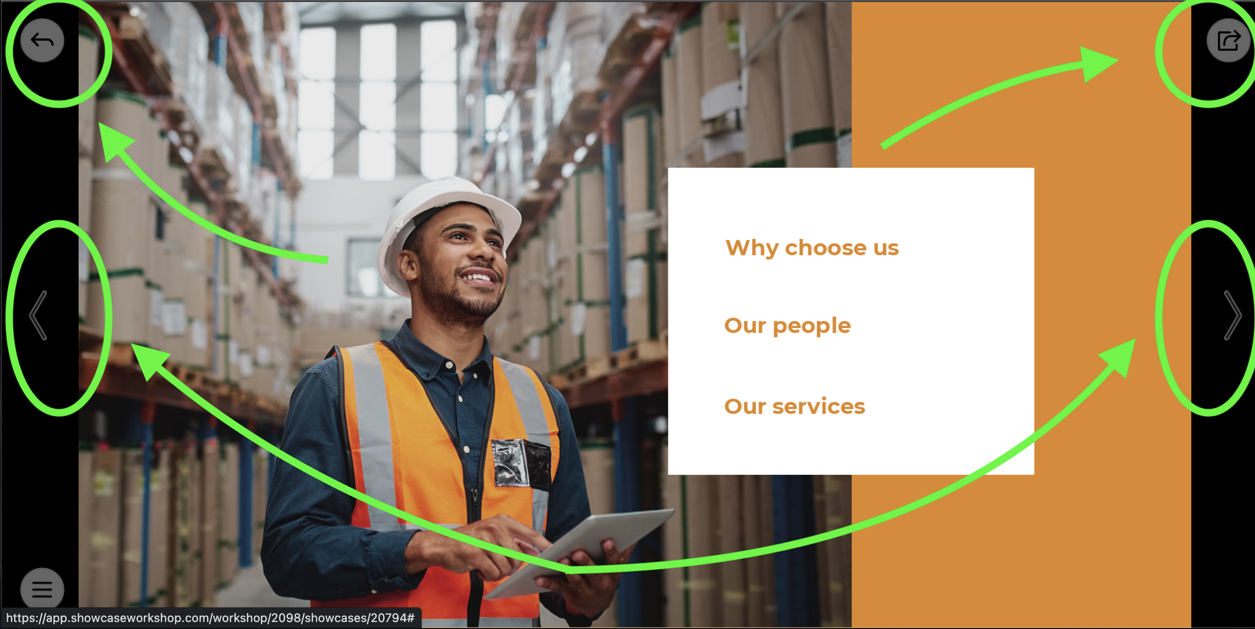
If you want to make your own 'buttons', in addition to the default Showcase ones, you now have the power to do that.
Here's how: you'd create a hotspot like any other, but the content type has to be a 'URL'.
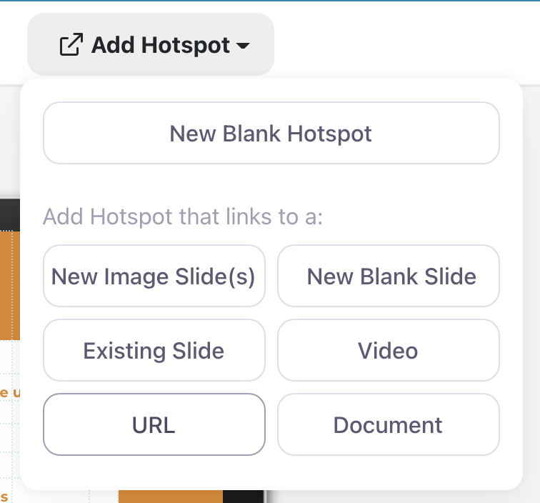
Then, the text you enter in the URL box is going to depend on the action you want that hotspot to perform. Here's the list of possible actions:
showcaseworkshop://home
showcaseworkshop://back
showcaseworkshop://share
showcaseworkshop://next
showcaseworkshop://prev
showcaseworkshop://backtostart
So if I wanted to make a 'button' that would take the user back to the last slide they were on, I'd enter showcaseworkshop://back in that URL box.
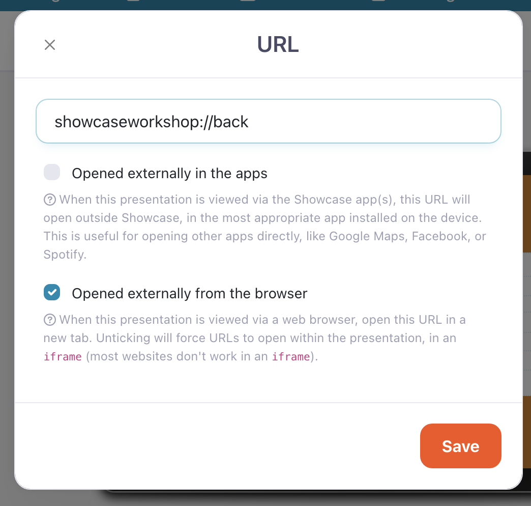
Now when the user hits this hotspot, they'll be taken "back", just as if they had tapped the default back button top left.
These types of hotspots can be copied and pasted, just like any other hotspot. So if you've created it once, you can copy and paste it onto multiple other slides.
This is going to be very useful when:
- you have a large user base who aren't tech-savvy, and training them on Showcase navigation basics is impractical
- you're sharing a presentation with someone who hasn't seen Showcase in action before
- you want to put a link to the very first slide on multiple nested slides within your presentation (use the 'showcaseworkshop://backtostart' option and copy-paste it!)
One last change: no more "default hotspot settings"
We had an option under "Branding Settings" to change the colour and text of your default hotspot — that is, the style that a hotspot has when it's first created in a brand new presentation. However, this was never much used and for a while now, any new hotspot's style mimics the style of the last created hotspot, making this setting effectively redundant. So it's gone! And the "Email Settings" are easier to find as a result. Score!
We hope you enjoy working with these new features as much as we enjoyed making them. Onward!
Photo by Tiachen Aier on Unsplash