When winter's only just 'over', but you're still grinding through the day-to-day, low-key fretting about the state of the world at large, it's nice to know that some things are getting better.
Specifically, the Showcase Workshop web platform and the features within for Admins & Editors.
I know it might seem like we've been improving Showcase a lot, recently; but as the corporate 80s motivational poster says, "Strive for Perfection... Settle for Excellence".
We're still not the "perfect" platform, given we can't materialise chocolate to fly out your computer screen, but we're still striving and we like to think these latest features are pretty excellent.
Here's a rundown.
1. No more mystery folders.
Here's what the folder structure in the file library used to look like:
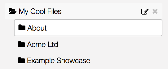
Fine, right? Fine. But not great. Because as it turns out...
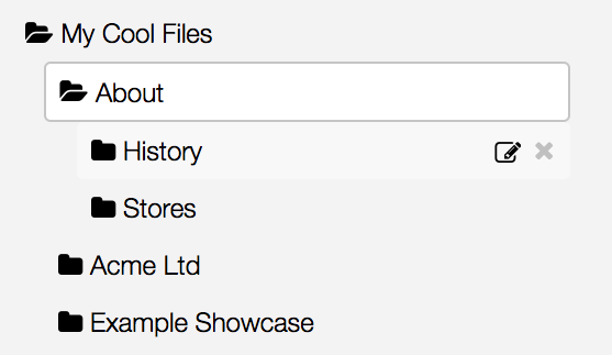
What the heck?! There was another folder in there the whole time! And I had no idea.
Our first tweak fixes this. Behold.
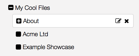
Aw yeah buddy. I now know without even clicking, that "About" has some subfolders.
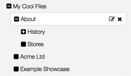
Genius.
2. More than one way to skin a cat upload a file
Here's that standard ol' file uploader we know and love:
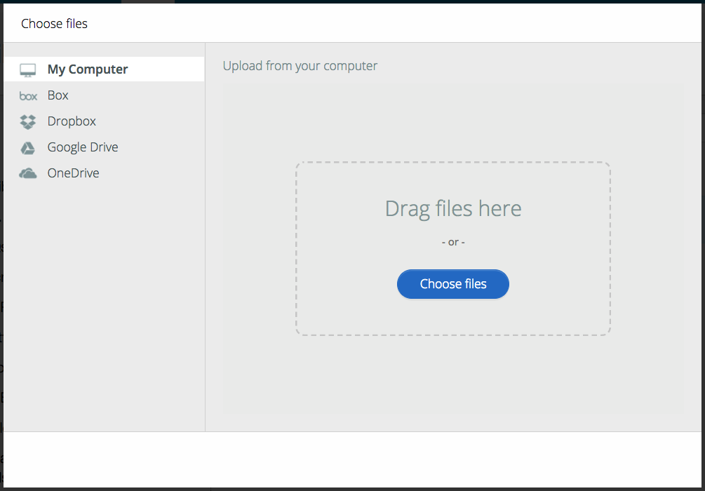
Nothing wrong with it, strictly speaking. But we found that very very few people were using the cloud services listed at the side; 99% of folks were going straight for a direct-from-computer upload. Not only this, but we found that a corporate firewall could sometimes prevent the filepicker from working. Yikes.
So we've removed the middle-man. Or at least, shuffled him off to the side a bit.
Your main upload button still looks just the same, and now there's a little cloud symbol beside it:

So now when you click the main upload button, instead of prompting the filepicker, it will straight-up open a Windows Explorer or Finder window for you to choose files from. That saves you a whole click.
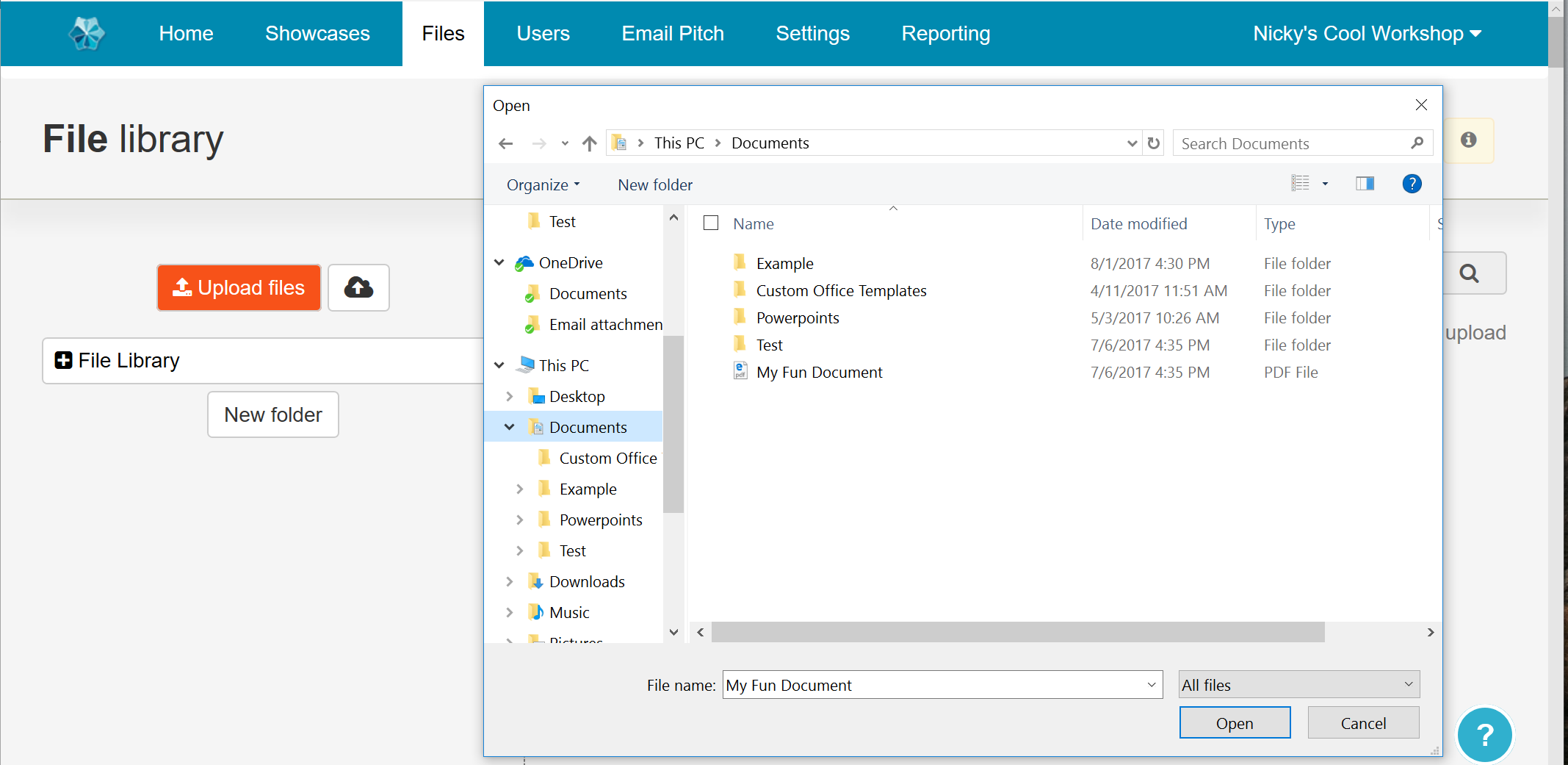
Then, if you're one of the few who do use the cloud services in the filepicker above, you can still click the little cloud button to get there; it hasn't gone away.
If you're one of those people who keeps all their files on the desktop and you're in a mad rush, or you think clicking on buttons is so last season, there is also now the option to "drag and drop" files directly into the main file library area.
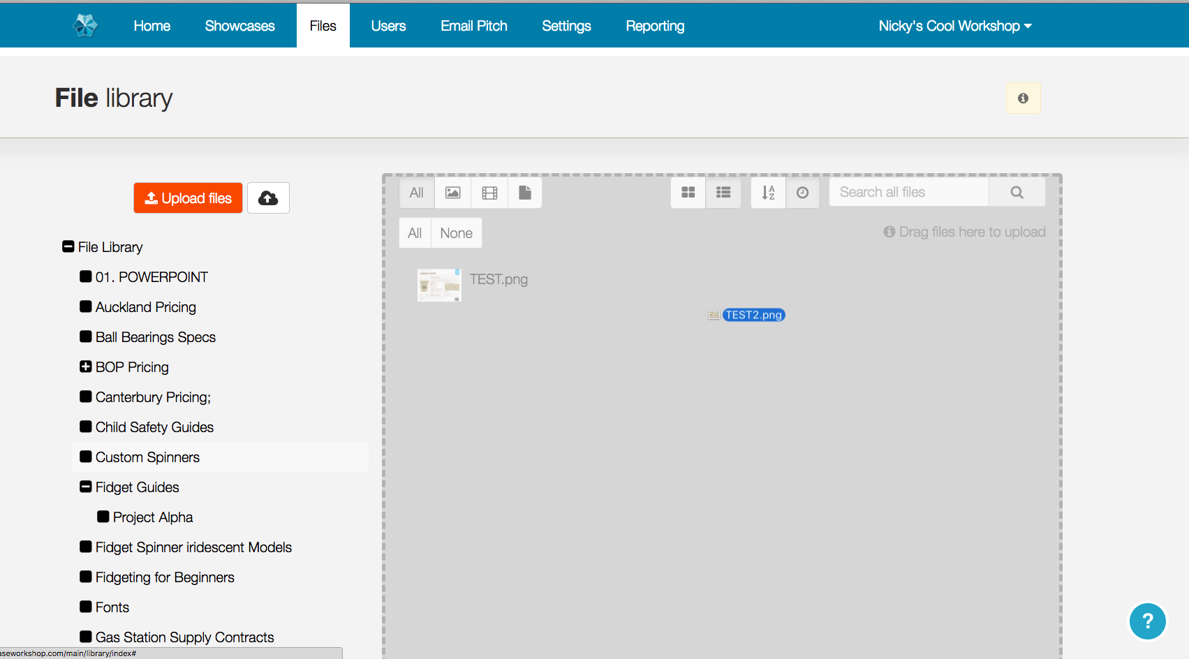
Efficient and enjoyable. You can drag in multiple files here as well. You will be a file uploading MACHINE.
3. List it.
Does this look familiar?
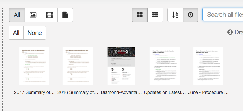
That's a lot of ellipses. Summary of what? Latest what?? I just want to see all my file names, dangit!
We hear ya. Now, to the left of the 'A-Z' & 'Clock' buttons along the top there (which as you hopefully know, order files alphabetically or by date uploaded respectively), you will find two icons with some rectangles.
When the 4 squares / window pane is active, you'll get the grid of thumbnails that you're used to. However, if you click the other button instead...
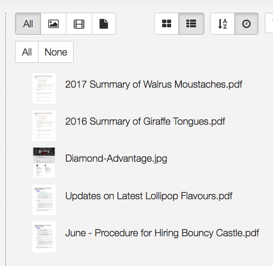
Huzzah! We get a full list of file names! Much better for scanning at a glance. If you're more of a visual person, the grid option remains and you can switch back to it at any time.
4. HTML in email footers
This is a real "extra for experts" like on the maths homework I used to get in primary school.
You may know that you, as in Admins, can customise the appearance of the sharing emails that get sent out by the Showcase platform. This is under Settings > Emails.
The standard things you can change are the header image that appears at the top of the email, and the footer message in plain text (in case you need a legal disclaimer or a standard "Please consider the environment before printing" message to be included).
Until today, this footer message could only be plain text. But now we have given you the power of HTML in your email footers. The text box will detect automatically if you've written some HTML, and will adjust accordingly.
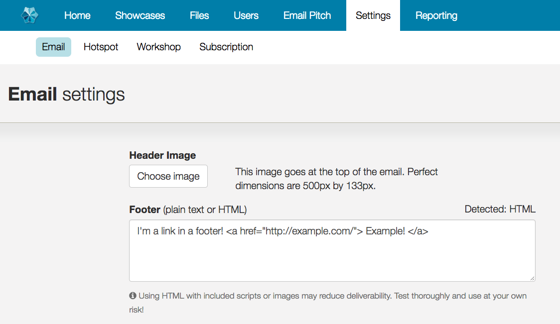
As the warning message suggests, you have to be careful about going too mad with scripts or images in here. But at the least, this gives you the power to include a link to sign up to your mailing system, or a link to your website for more information - things like that.
The preview will also update to show the results of your HTML code:
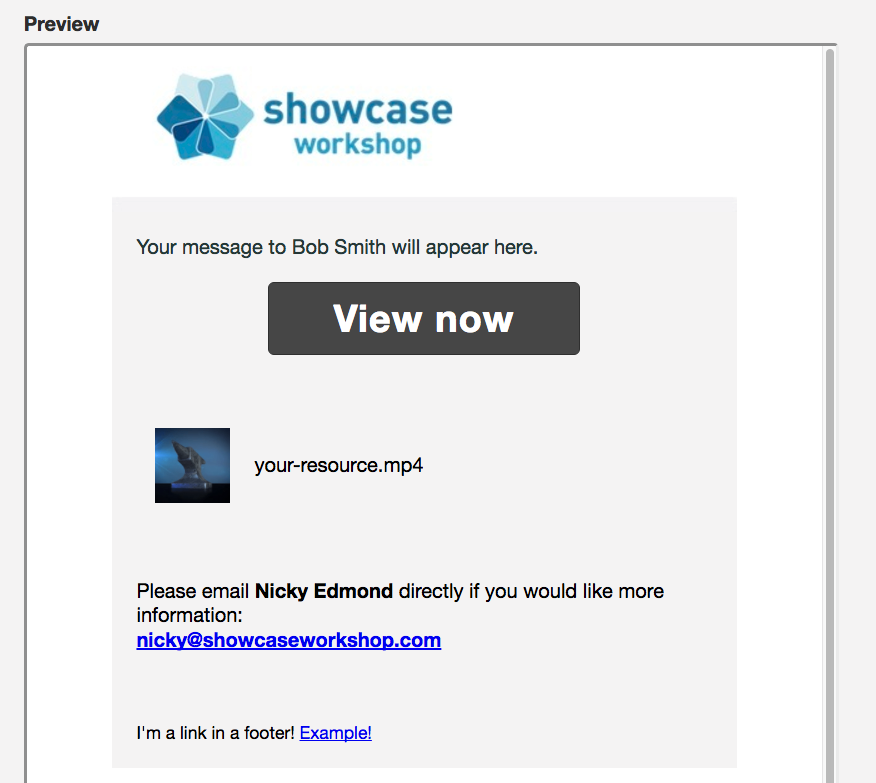
Again, as the warning message suggests, it is strongly recommended that if you do use HTML that you do some testing before blasting out crazy code to all your prospects.
If you don't use HTML and have no idea what we're talking about - don't worry about it. Plain text footers will continue to work just fine as normal.
5. Put a label on it.
Labels are here! We've given you the ability to apply "Labels" to your showcases.
This is a sorting & navigational function, for those that have multiple showcases and need some way to filter through and see subsets of those showcases all in one go.
If you're one of those companies that has stuck to one single showcase, you probably have no reason to use these. But if you have a bunch of different showcases for different purposes, and have trouble keeping track, this feature's for you!
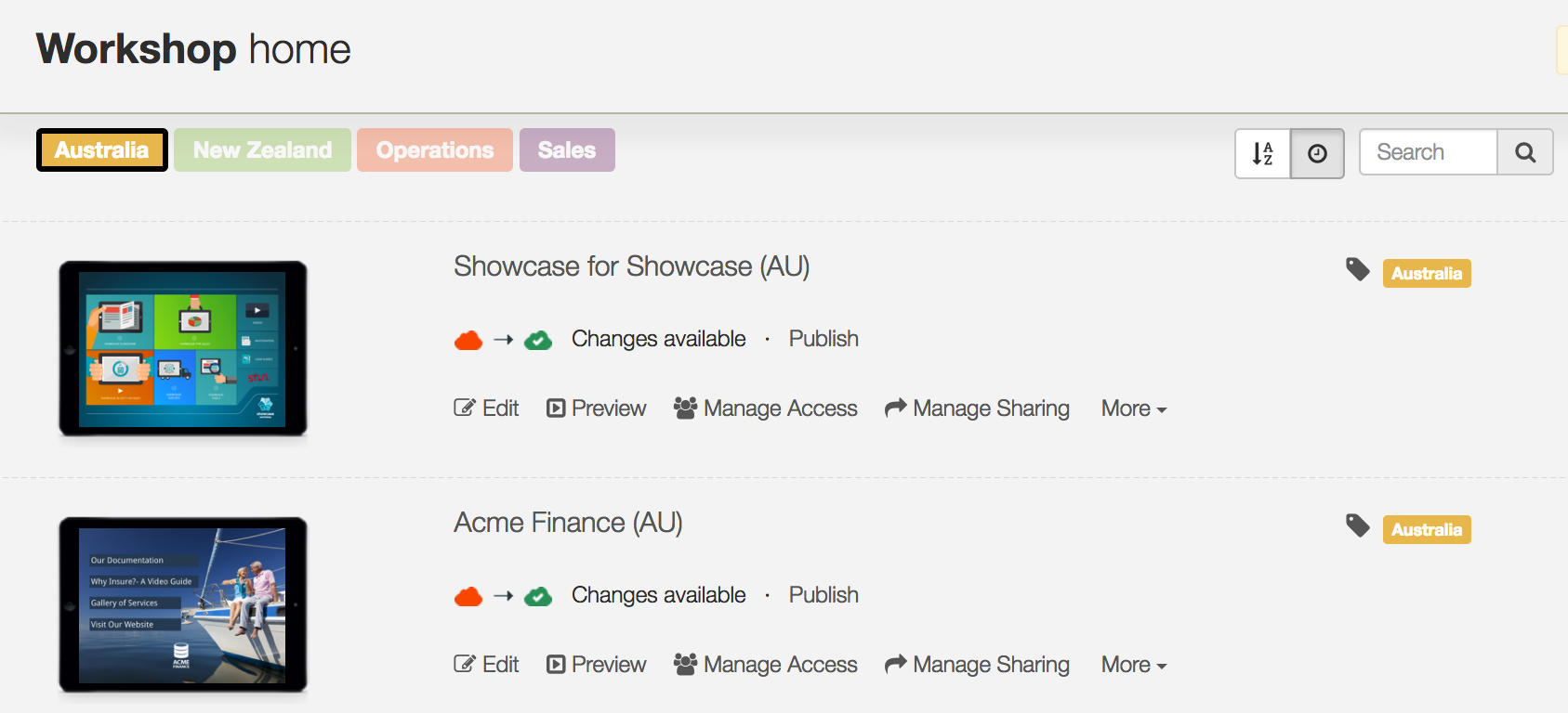
Firstly, if there are labels in place for any showcases, you will see them all along the top of the workshop home screen.
Labels for a specific showcase are indicated on the right hand side, next to the "label" icon.
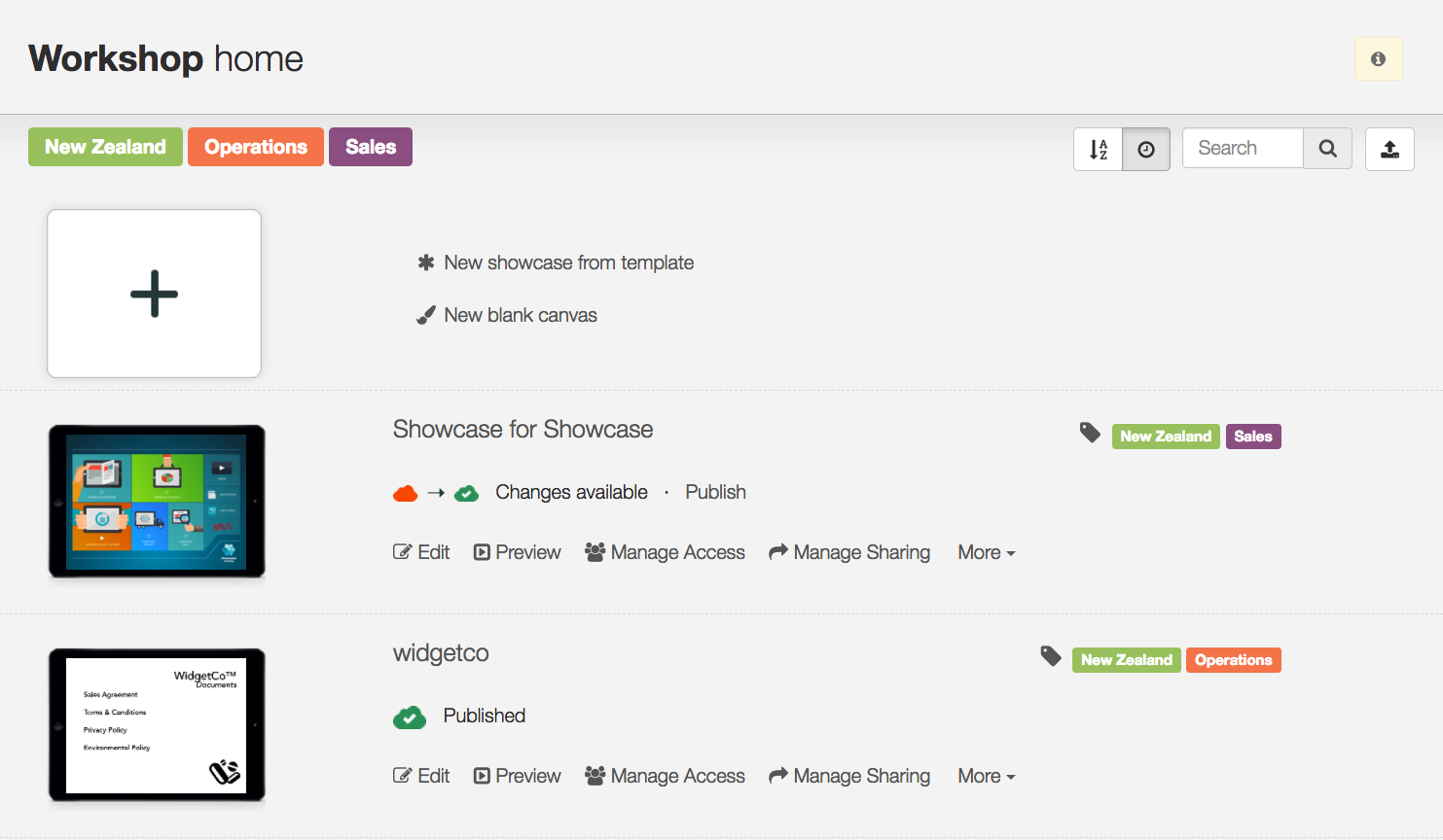
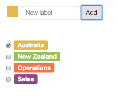
This label icon will appear even when there aren't any labels added; by clicking the icon, you are able to add & assign new labels. Once you have added a new label to one showcase, it will show up as an option in the list for future use on other showcases.
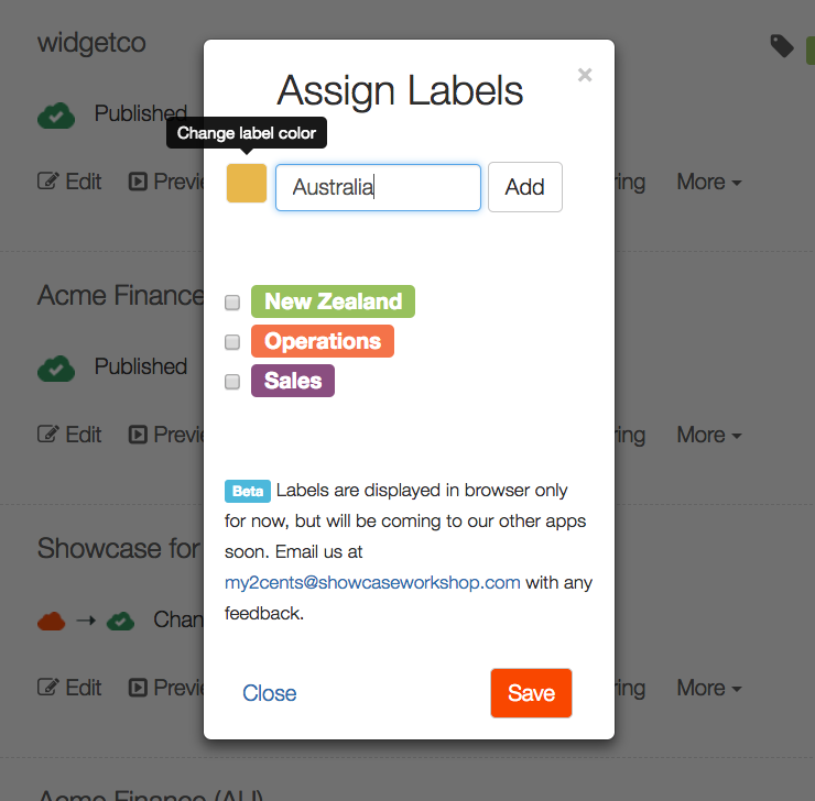
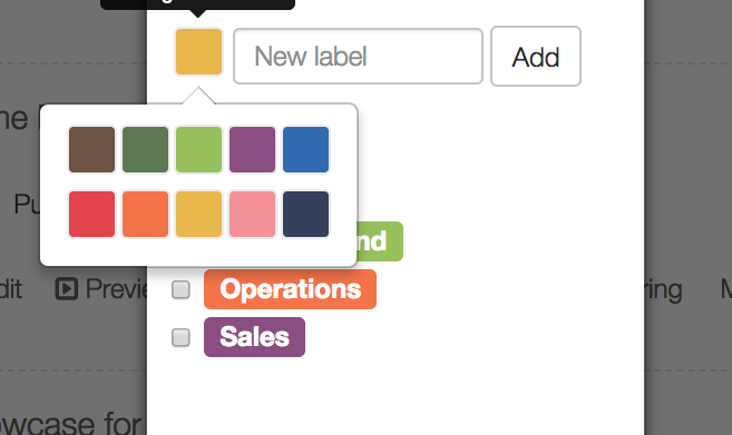
There are ten colours for labels so that you can differentiate or visually group them as required.
By clicking on one of the bigger labels along the top, you can filter the list of showcases to show only showcases with that label. Click another label to add that to the filter, or click the same label to deactivate that filter and go back to the full list of showcases. The label that is actively filtering will get a thick border and the others fade out a bit.
To remove a label from a showcase, you click the label icon again and "un-check" the box which indicates that label is assigned. If a label is removed from all showcases it disappears completely; to assign the same label in future you would re-create it and "add" it to a showcase once more.
The appearance and filtering of labels will be fairly similar in the apps, but Viewers won't have the ability to add or remove these labels.
Eventually, these labels will also be visible to Viewer users across all the apps as well, so Viewer users can also benefit from the categorisation.
That's it!
As always, we welcome feedback at my2cents@showcaseworkshop.com anytime.