Eagle-eyed users may have noticed that the Showcase Workshop template gallery has had a bit of a refresh recently. In fact, we've got 33 new templates all set up and ready for you to plug in your content. 33!

Of course, you can always create a presentation from scratch. This is an excellent option if you're bound by strict brand guidelines or have an in-house design team. To get a truly slick presentation, we recommend using a third-party tool like InDesign or Canva. With a blank template, you have complete freedom over the look and feel of the presentation.
But if you feel a creeping sense of dread when you look at that first blank slide, a template is a fantastic way to get set up quickly and easily.
Showcase Workshop templates are professionally designed by our friends at Stun, so you know they’re going to look good. Stun has designed slide backgrounds and set up a basic wireframe that you can adjust to your needs. Some of our new templates also include stock photos and hotspot designs for you to use. All you need to do is update the text and plug in your content.
Getting Started
To get started with your first template, open the web app and click ‘New presentation from template’.

This will open a gallery of template options. Scroll through the options and pick one you like! Although we’ve designed each template with specific industries in mind, you can still use ones outside your industry.
Like the look of one of the 'Tourism' templates but don't work in the tourism industry? Use it to sell your products instead! The world is your oyster. These templates are basically a jumping-off point. The goal is to make them yours.
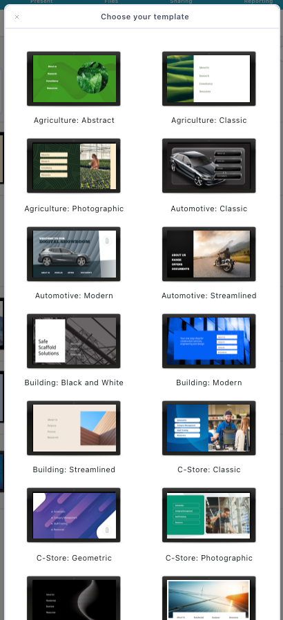
Your new presentation will appear at the bottom of your presentation list (it may take a few minutes to finish generating). The presentation will be called 'Untitled presentation' until you rename it. Click the name or 'Edit' to start customizing your template.
Adding or Removing Images
If you choose one of the templates with built-in images – like the one below – you can swap them out for your own branded imagery. You can see the image of this big red car is editable because it has a dotted line around it. This means it’s a hotspot (in this case, one that doesn’t link to anything).
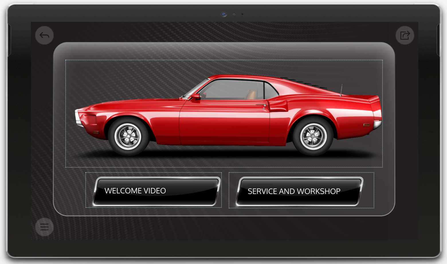
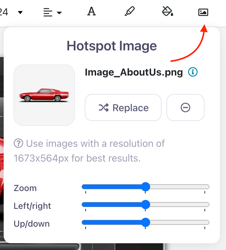
To replace this image, you would need to select it and click the ‘Hotspot Image’ icon in the toolbar above your presentation. Hit ‘Replace’ to upload your own product photo or branded image.
Sometimes, an image will be built into the slide background and you won’t be able to select it. In the example below, for example, you’ll notice that there’s no dotted line around the picture at the right.
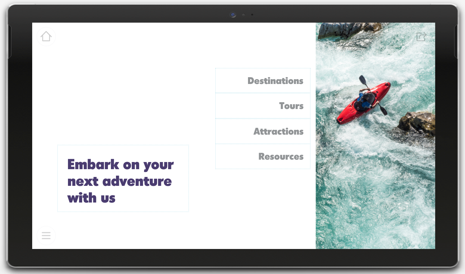
To change this picture, you would need to update the slide background. This is where having a designer comes in handy, because they can whip up an image that fits around your hotspots. If you don’t have access to a designer, you can always change the background color and add your own image as a separate hotspot. This way, you can edit it any time you want!
Hotspot Styles
A number of our new templates now include stylized hotspots that look like actual buttons. In the example below, you can see the text is sitting on top of funky green bars. These bars are image files that will automatically be saved to your File Library when you generate a new presentation from a template. You can add these files as images to any new hotspots you create. There will usually be a longer and a shorter option so you can choose a size that will fit your text and layout.
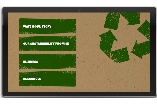
Adding images to your hotspots is a sure-fire way to make your presentation look more professional. They guide the presenter by making it obvious where they need to click. Perfect if you’re sharing your presentations with people outside your organization!
Resource Slides
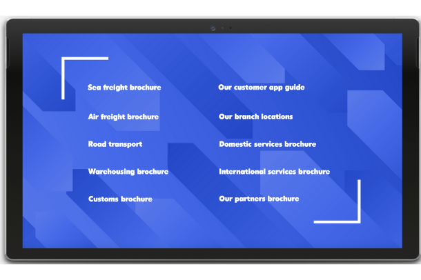
As well as a main menu and a few submenus, each template includes at least one slide with space for 8–10 hotspots. These slides are handy to have up your sleeve if you’ve got a lot of resources or miscellaneous documents that don’t necessarily fit under any of your main submenus. All you need to do is update the text and add your files to the relevant hotspot.
We don’t recommend adding more than 10 hotspots on a slide, as it can get cluttered fast. You want to give each one enough space so they’re easy to read and tap – especially if they’re plain text hotspots like the ones below!
Templates are the fast and simple way to get started with Showcase Workshop. We provide the wireframe and some simple design elements, and you decide how much you want to customize them.
We’d love to see how you use these new templates! If you have any questions or would like to be featured in an upcoming Design of the Month, email us at helpdesk@showcaseworkshop.com.
Header image by David Pisnoy on Unsplash