We previously told you about the changes to the overall layout in our new editor. Today, we're going to go a little more in-depth and look at how the primary controls have changed too. As with the layout changes, it's not a really drastic shift where literally everything is different, but more of an improved experience that will help you edit and build showcases more quickly and easily.
Let's crack on!
Primary Controls Change #1: Add hotspots quicker
In the 'old' editor, you had 3 steps to getting some content added to a slide. First, you'd click "New Hotspot".

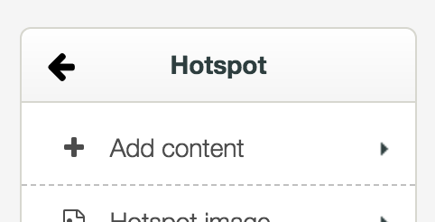
Then, once your hotspot had been created on the canvas, you'd click "Add content".
Finally, you'd pick the kind of content you wanted from the content list.
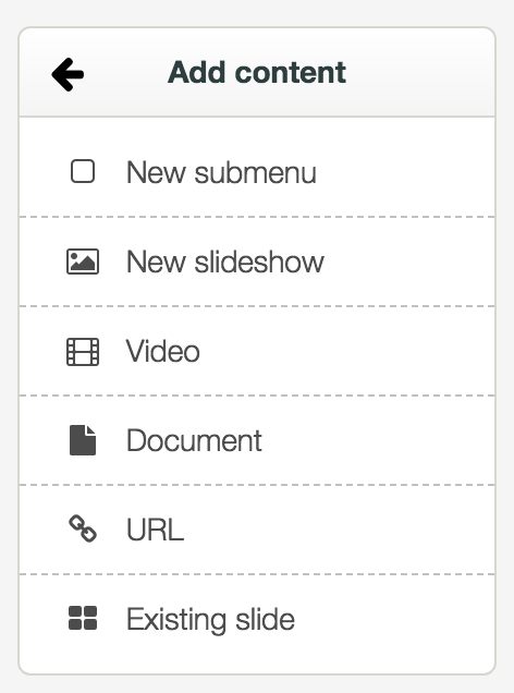
If you picked something that required choosing a file, like a document, the file library would pop open at that point so you could select the file.
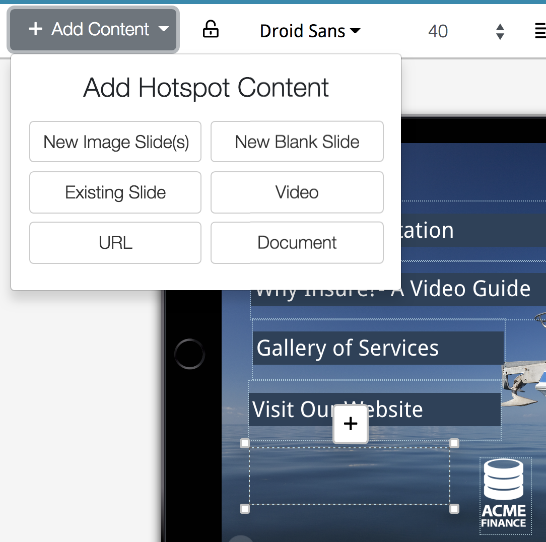
In the new editor, we are condensing this process from 3 clicks down to 2. So now, you can simply click on the "Add hotspot" option from the top bar, and your range of content options are already there - no need to do that extra "Add content" step!
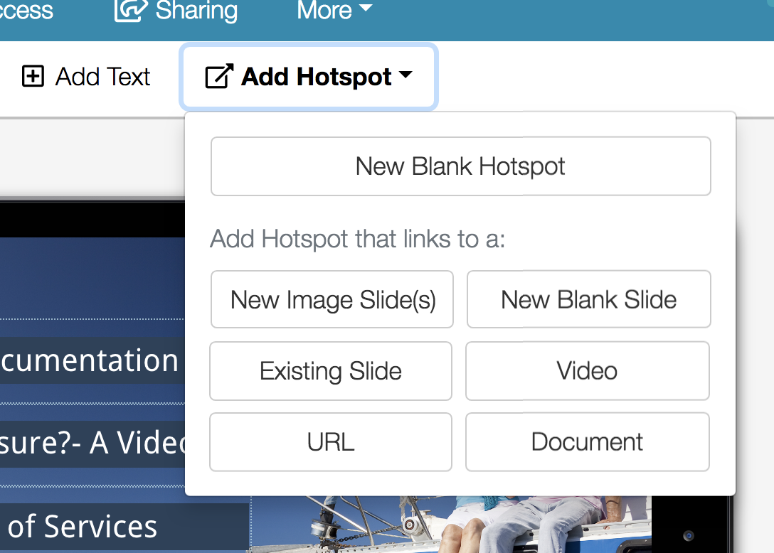
Just like before, clicking a specific file type will pop open the file library. That one click less is a small step, but hopefully will save some time over the course of building a showcase!
Of course, you can still create a blank hotspot if you need to, and add content to it at a later point; you don't have to choose a content type to add right away. If you do create a blank hotspot, it will have this little '+' button on top for choosing content later:
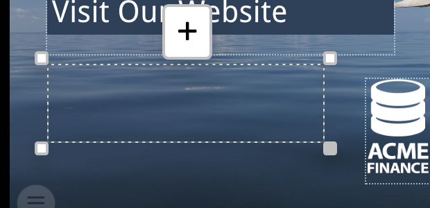
Clicking the plus gives you that same range of content options to add, just whenever you're ready:
Primary Controls Change #2: Add text
You may have noticed this "new" option in some of the screenshots. But to be honest, it's not really new, just a different way to quickly create hotspots of a certain type. When you click "Add text", a new hotspot with no content and some pre-selected text will appear:
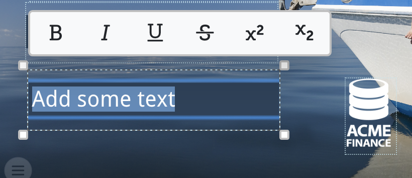
You can then start typing immediately to put some new text onto your slide.
Usually, for the majority of showcase designs, text within hotspots isn't really used. You get far more control over the appearance of text using a design program like Adobe InDesign, and exporting slide designs as fully flattened PNGs, text and all. That's why most hotspots are transparent and have no visual attributes by default.
So if this is the case, why would you want this "Add text" option? Well, if you have a very simple design that you wish to change often, you might go for text-based hotspots rather than having to open up Adobe InDesign every time you want to make a change.
Or, if you're building out a 'wireframe' showcase, trying to figure out which content should go on which slides, using text-based hotspots can be a very useful way to add placeholders for the real content you intend to add later. You can continue to use this placeholder method even when the majority of your showcase has been built already - if you're waiting on the officially designed slide image and/or don't have the hotspot file yet, but want to indicate that that is where the content will go in future.
Primary Controls Change #3: Control sharing when you add a file
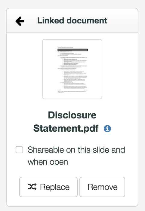
This is something else that's only mildly different from the 'old' editor, but we're hoping again that it'll be useful. Previously when you added a specific file - say a document - you had the option to make it "Shareable on this slide":
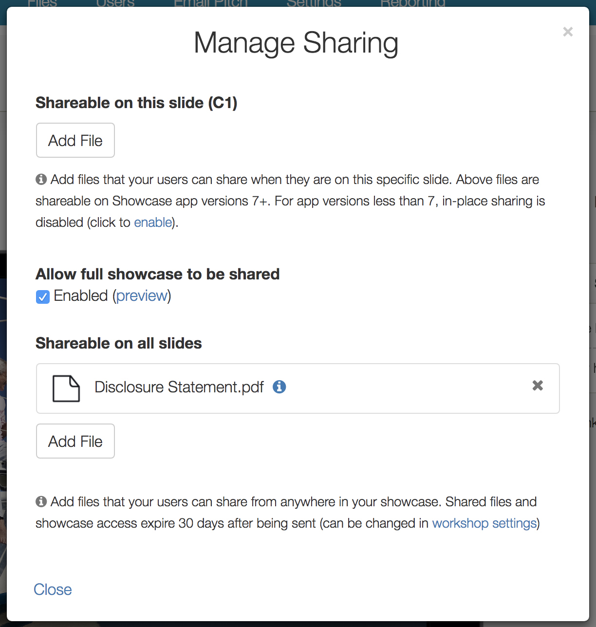
But, if you wanted the file you had added to be shareable everywhere in the showcase, you would have to open the "Manage Sharing" dialog separately:
Now, in the new editor, when you add a file to a hotspot you have the option to control "Sharing for this file" from a handy button:
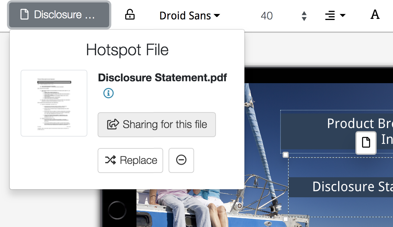
Clicking this button brings up the Manage Sharing dialog with an extra feature of two checkboxes on the top. This way, you can make a file shareable from a single slide, and/or the whole showcase, all while seeing the context of the other sharing settings you have enabled.
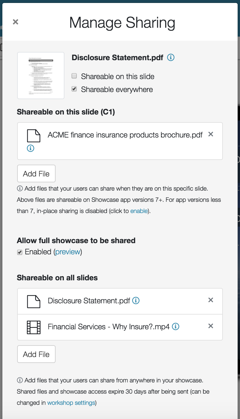
Checking the boxes will instantly add that file to the appropriate list. This makes it a lot easier to keep your sharing files consistent and up-to-date. You can still access the "Manage Sharing" panel without having selected a specific file, second from the right along the top blue bar.
And that's it for part 2! If you missed the first post about layout changes, it's here - or if all this reading is proving a little tiresome you can also check out our 10-minute overview video, which goes over all the same changes just in less depth.
If you have any feedback, fire it through to helpdesk@showcaseworkshop.com & stay tuned for our next installment - the major new features!
Read the other posts in this New Editor series!
https://blog.showcaseworkshop.com/our-lovely-new-editor-part-1-layout-changes/
https://blog.showcaseworkshop.com/our-shiny-new-editor-part-3-major-new-features/
https://blog.showcaseworkshop.com/our-friendly-new-editor-part-4-minor-new-features/