'Sup, and welcome to the first post in a series of 4 about our cool new editor. We already gave you a quick video overview of all the changes, but if you're more an "in-depth screencaps and text" kinda person, that's what this post is for! Let's get started!
Layout Change 1: Controls that used to be in the right-hand panel are now along the top.
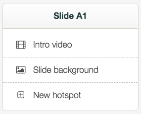
Previously you had a panel to the right of the device you were editing, and it looked like this on slide A1:
Now, those same controls can be found along the top of the whole editor:
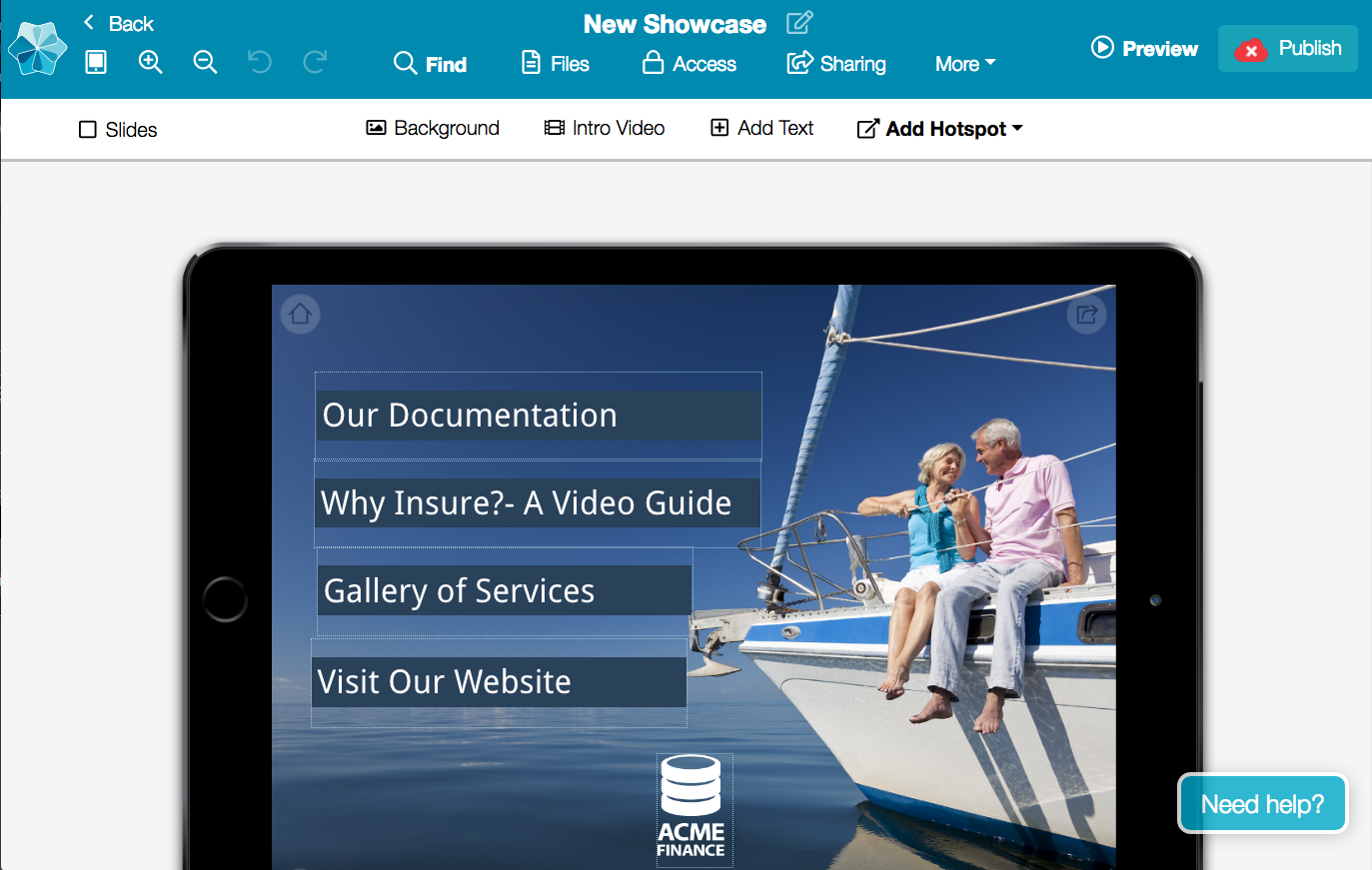
Oh yes. Here's a close-up:

That's for the same context, where you are on slide A1.
But, as you may recall, when you selected a hotspot in the 'old' editor, the right-hand panel would change to show you the hotspot-specific controls:
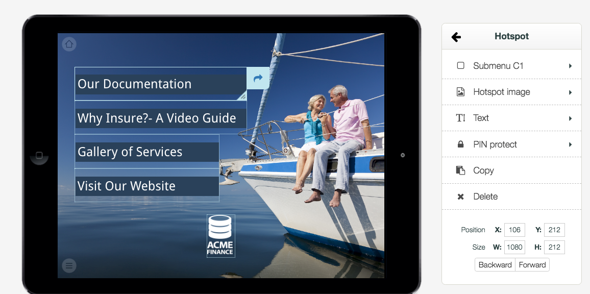
That contextual behaviour hasn't changed, so now with the controls along the top, when you select a hotspot, those controls will change:
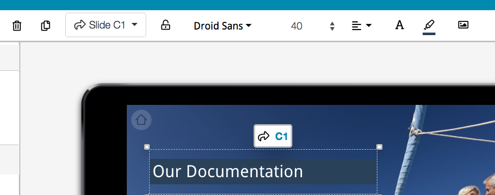
Lovely. The controls are a little re-arranged - delete is now first, for example - but the exact same tools are still there. In fact, if you use hotspot text at all, the controls that were previously a click away are now more instantly accessible. If you need a refresher, here's how they used to look:
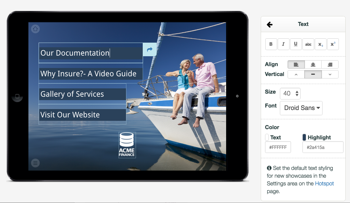
So now we have font and size first, then the align controls in their own little dropdown, then the colours. Here's that extra align dropdown, and the colour picker for your reference:
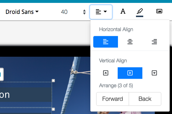
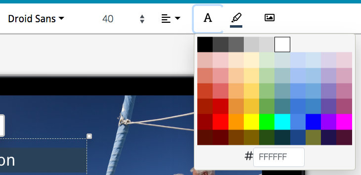
Swish! You can see that both of these look a little cleaner and nicer than they used to.
You may be one of those folks that uses "hotspot images" in your showcase(s) - if that's the case, those controls are up the top now too, with a little more fine-tuning for the position of the image within the hotspot.

Layout Change 2: New "Slides Panel" at left.
This new panel hangs out at the left of your editing area. It's open by default, but you can close it with the 'x' icon. It allows you to see all slides in your showcase at once - so if you want to navigate to a certain slide to edit it, but can't recall exactly how you get there, just scroll to that slide and click on it to start editing it.
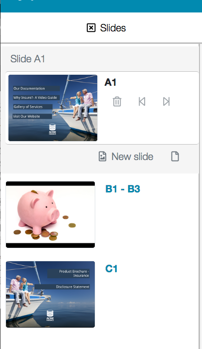
When you have multiple image slides in sequence to form a slideshow, these are collapsed by default (like in the above example with the 'B' range of slides), but will pop open as soon as you navigate to any slide in the sequence:
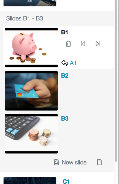
When you do have a slideshow open in this slides panel, you can delete, add, and rearrange the slides within, like you used to do in this area in the old editor:

The 'rearrange' control used to be a drag and drop, which you could only see when your mouse was hovering over a slide thumbnail. Now, we have the more obvious 'move this slide' arrows, which are next to the delete button. Aside from this slight difference, the same slideshow controls you're used to - delete, add slides, etc - are unchanged and all still available on the new slides panel.
Layout Change 3: Files Library independently accessible as a window
Previously, if you wanted to manage your files, you had to go to our whole separate page for that purpose:
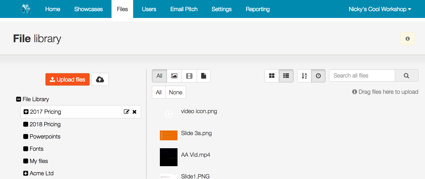
This page is still very much accessible from the Home tab, or any other tab of the showcase website.
However, while editing showcases in the new editor, you can now pop a floating window version of this file library without leaving the editor and abandoning your edit session. You don't have to be adding a document or replacing a file at the time either.
You can pop the files window by clicking the "Files" option second left along the top blue bar:

Once you do, it looks like this:
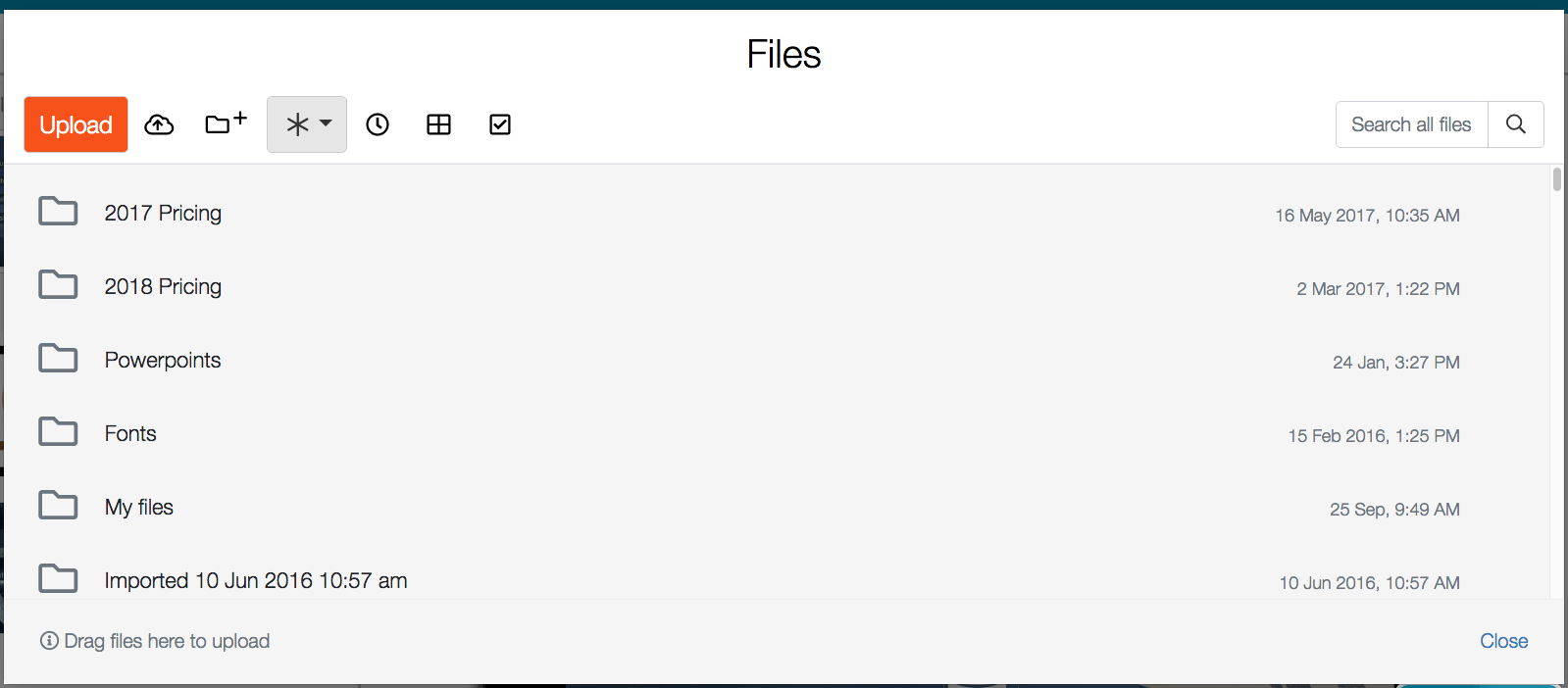
You'll notice that in addition to being a floating window rather than a whole separate page, the icons & general appearance have also been updated to a fresher look. It now looks a little more like your standard Windows Explorer or Mac Finder, with the folders being "inline" and searchable like the rest of the files. You now don't have to scroll past the list of folders to create a new folder (the control is now at the top) and you can still 'filter by filetype', 'sort by date added/alphabetically', 'arrange files in a grid or list view', and 'select all files in a folder', just like you can in the 'standard' file library.
That's it for the layout changes - fun stuff! Stay tuned for post no. 2, about changes to the primary controls. And remember, any feedback whatsoever, you can feel free to send through to helpdesk@showcaseworkshop.com.
Read the other posts in this New Editor series!
https://blog.showcaseworkshop.com/our-juicy-new-editor-part-2-changes-to-the-primary-controls/
https://blog.showcaseworkshop.com/our-shiny-new-editor-part-3-major-new-features/
https://blog.showcaseworkshop.com/our-friendly-new-editor-part-4-minor-new-features/