You know how it is, darling. Sometimes one just needs a little...lift. A bit of botox here, a tiny tuck there...A resurfacing, if you will.
The main "guts" of Showcase - the editor - has already had its reinvention. Now it's time for the rest of the web platform to shine.
We'll be launching a refreshed version of the web interface on Monday 19th November.
Unlike the editor, we unfortunately can't do a soft Beta release, where you had the choice as to whether to use it for a few days. The changes are too wide-ranging to split. So once it's live, it's live! A brand new face out there in the world.
The Showcase nerds have been busily working on rewriting every screen of our web platform at https://app.showcaseworkshop.com. At a high level, this has two major consequences:
- Performance is better. Yes, every App Store update ever lists those generic "performance improvements", but these are for real. We're talking much much quicker, overall, for a start. It should also be more stable.
These improvements may not be that noticeable in your day-to-day use of Showcase, but they'll be saving you time and stress in the long run.
Not only that, but the way we've rewritten the screens makes it quicker and easier to add cool new features in future. - It looks different. Appearance can be very subjective, but we think it looks cleaner and nicer overall. A lot of the icons used about the place have become bigger and crisper; links are more obvious and clickable; pages in general have a more centred layout, in order to suit a wider range of screen sizes.
Fundamentally, as with the editor, we've done our utmost to not remove functionality anywhere. Although it'll look different, you can still do all the things you're used to doing on Showcase. We're not taking anything away from you. In fact, in a few places, we've added tools that should help you. Before we get on to that though, here's what you've been waiting for...a sneak peek of Showcase's updated face!
Before:
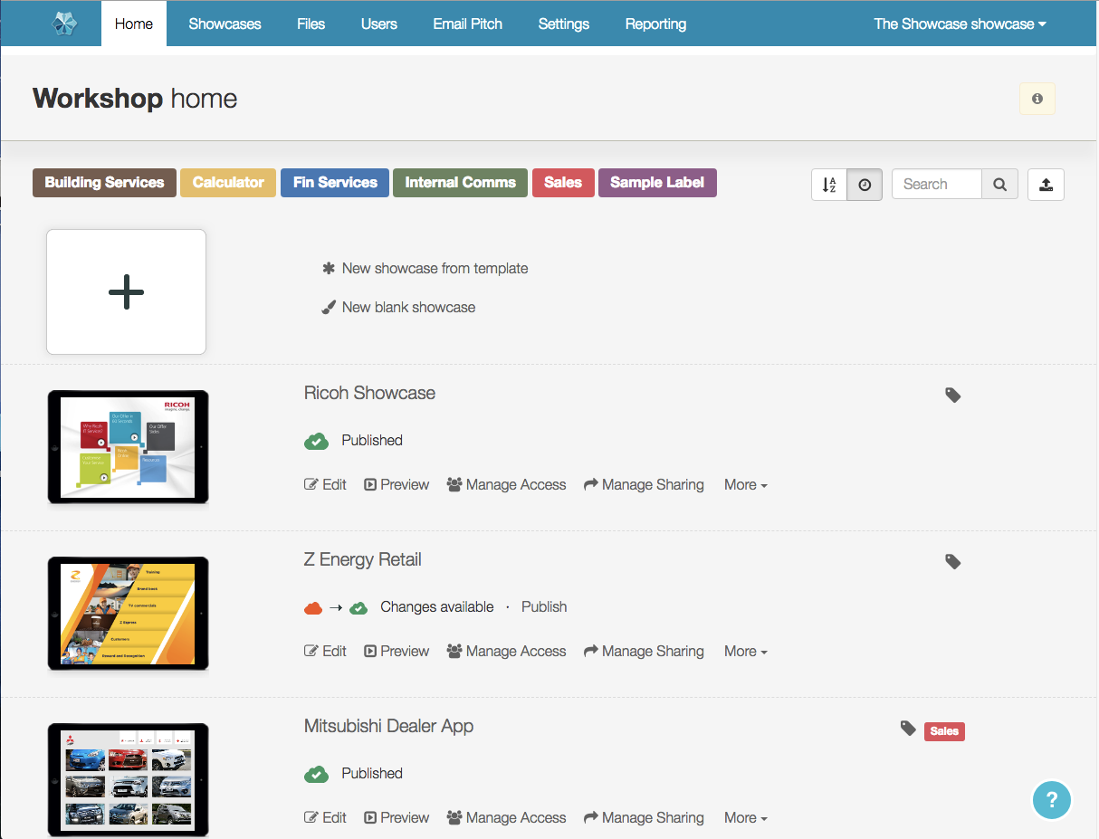
And....after!:
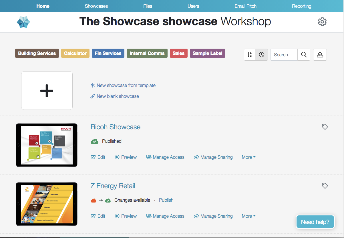
✨ Beautiful ✨. Let's look at another tab!
Before...:
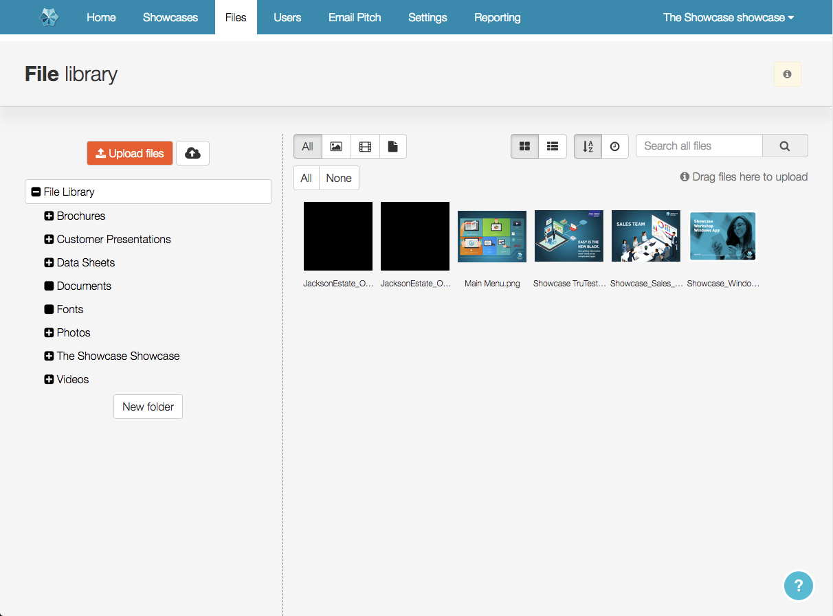
And...after!:
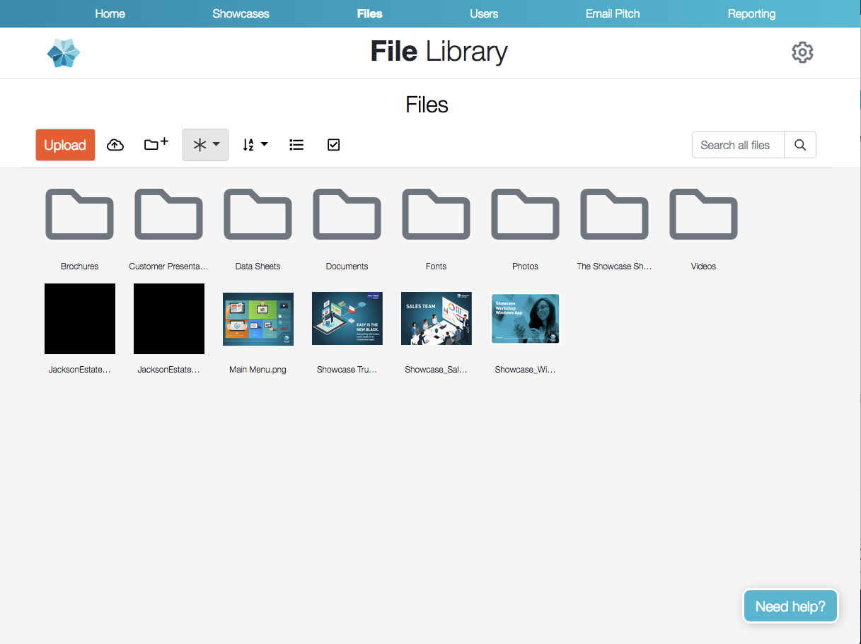
If you've been using our new editor, this should look at least slightly familiar.
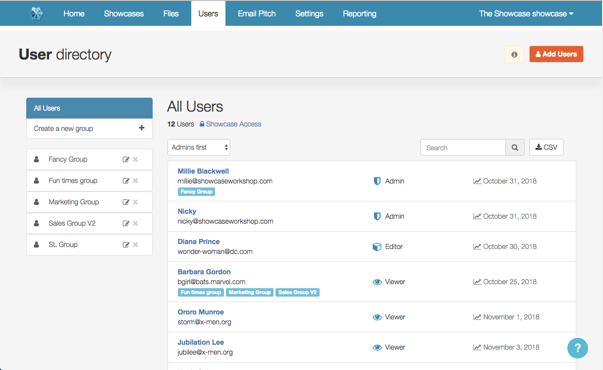
Here's one for the Admins in the room - the Users tab.
Before...:
And...after!:
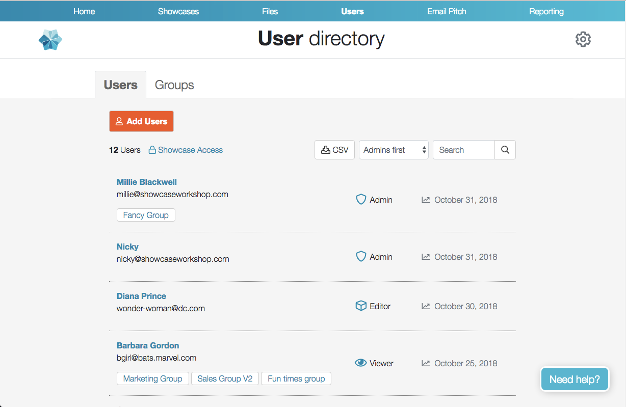
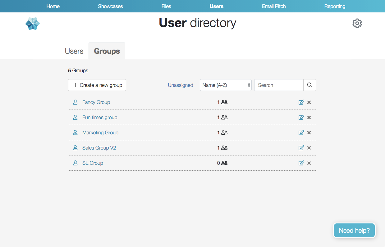
This is where one of the functional improvements comes in - Groups get their own tab. This means you can search for groups! You also get an at-a-glance tally of number of users in each group. And, very usefully, you can look at all the users who are "Unassigned" and don't have a group.
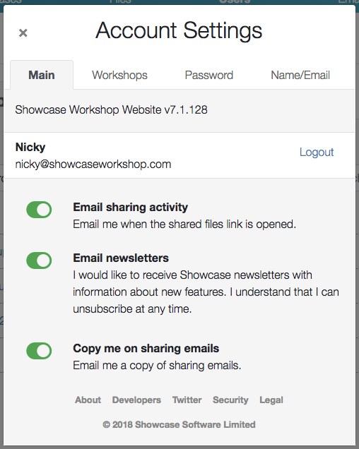
Something you may have noticed from these screens is that the "Settings" tab, and the Workshop title, have moved from the top bar. They are both now covered under the Settings cog top right. That settings cog looks a lot like our app interface cog, for a bit more synchronicity. When you click on it, you can see your own main personal settings, and your workshop settings, all in one place.
That's it for the major differences. All the other screens also look slightly different, in that same "centred & cleaner" vein. And, we have a few more minor feature additions which will be detailed in other blog post to come.
Remember, launch date for this new web interface is Monday 19th November. Despite the facelift, we're still going to be the Showcase you know and love. If it freaks you out, please do send complaints, laments, feedback and/or constructive criticism to helpdesk@showcaseworkshop.com. We'll be here to hear ya.