So we told you about how we're getting a facelift (just in time for the Kiwi summer) and mentioned some minor new functionalities are in the mix too. These aren't fully fledged features, just little additions that will hopefully make things a bit easier and more useful. Small, nice extras like the Torch app on your phone, the extra guac in your black bean burrito, or the slug of Baileys in your Saturday morning coffee.
Here's the rundown - remember these will all be available from Monday 19th November.
1: Up arrow key goes 'back' when viewing a showcase.
This applies to both Preview and the web view for a showcase, which you access from the 'Showcases' tab. As well as clicking the back arrow icon (top left of the screen) to go 'back' a slide, you can now hit the up arrow on your keyboard.
2: New default size options.
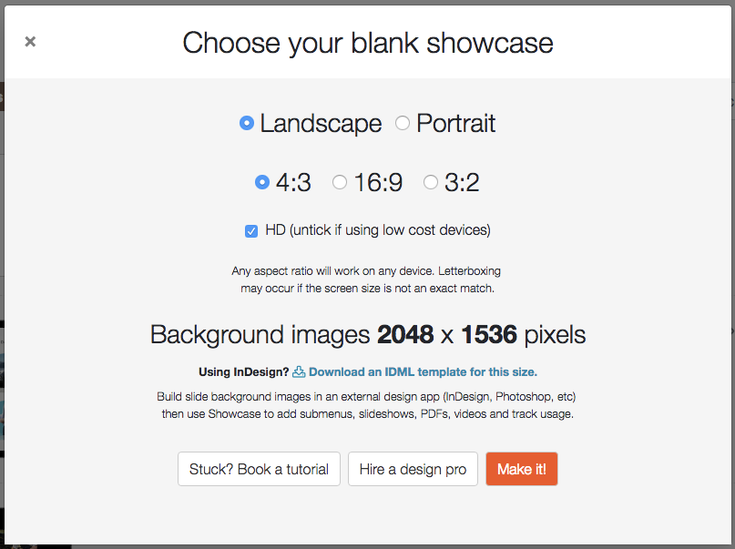
You can now make a blank showcase in landscape or portrait for any ratio - and you can choose whether it's high-definition or not. That's a total of 12 different sizes to choose from! If you know all your users will be on phones, or basic tablet models, you can choose that lower-resolution option for smaller file sizes overall.
3. New templates
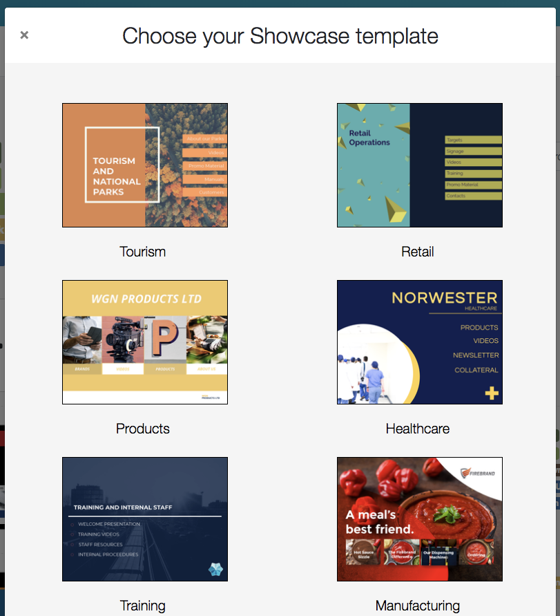
Woohoo! If you've been struggling to get up and running, or just need to wireframe out a basic structure quickly, these pretty new templates should definitely help. They are very editable, so you can mess with the slide background images, colours, and fonts to get a look that suits you.
4. Shareable files listed in Outline
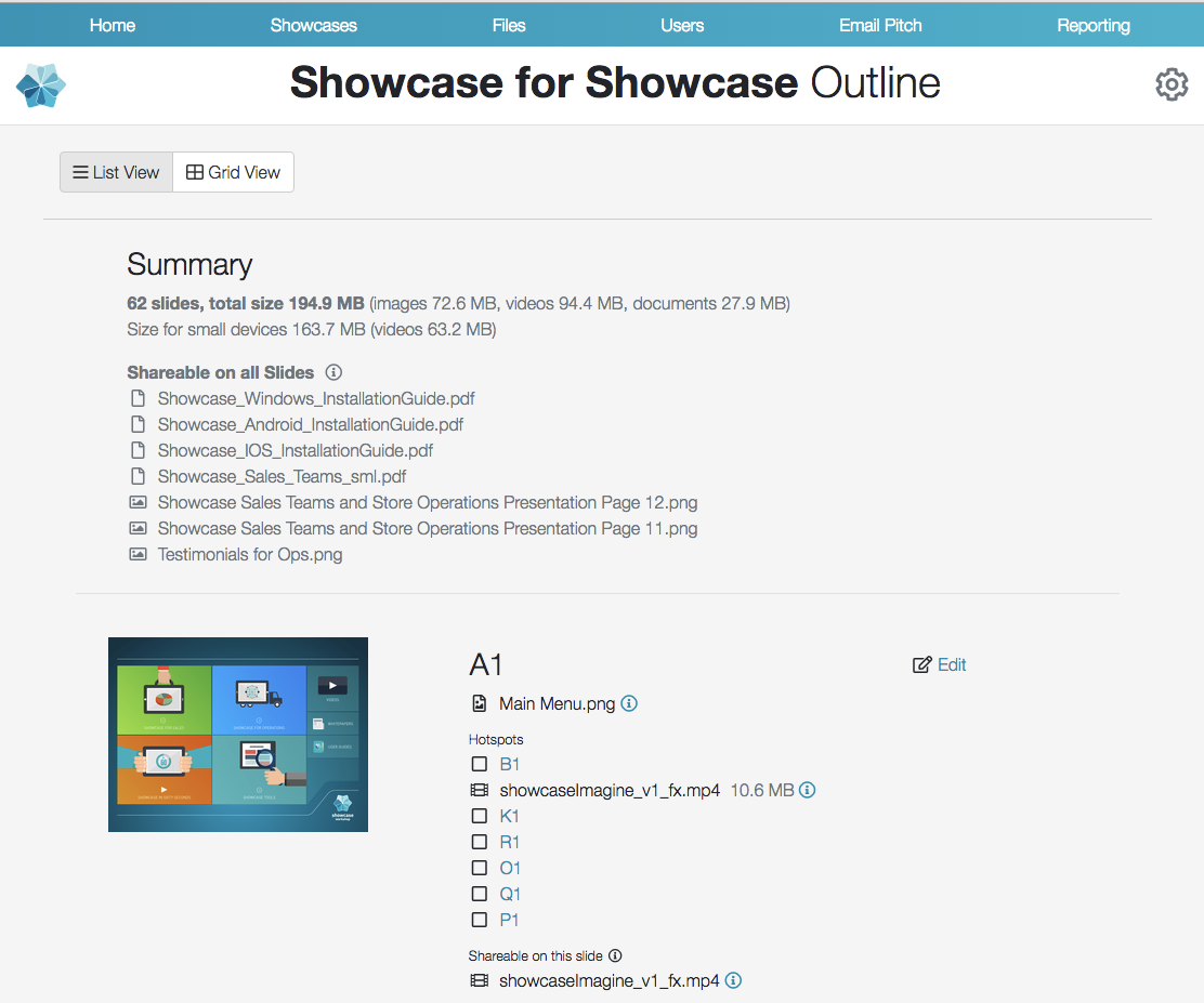
This is my personal favourite, and I've already found it incredibly useful. You may not have known that we have an "Outline" option, under the 'More' dropdown for any given showcase. Clicking on this gives you an overview of all the slides and files in the showcase and how they link together. This has been available for a while, but it's only in this latest release that we've added details of which files are shareable in the showcase, including any slide-specific sharing you've got set up.
What's cool about this is that we previously had no way to get an at-a-glance look at all slide-specific sharing files at once. The 'Manage Sharing' dialog only shows you the specific files for the slide you have currently active. So this update to Outline gives you a really good way to get a sense of slide-specific sharing files across the whole showcase.
5. Rename a showcase from the home tab
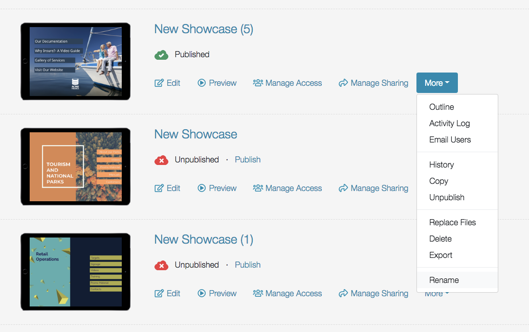
We've all done it - you carefully build out your showcase, get all your navigation just right, hit the publish button then realise: you forgot to name the darn thing! Now you can rename the whole showcase without having to click 'Edit' and load up the editor to do it. In the new web platform, the option to 'Rename' will be added to the More dropdown. Clicking this will allow you to rename the showcase. Like any change, it needs to be published in order for your Viewer uses to see it on their apps.
6. Edit subject in 'Email Users'.
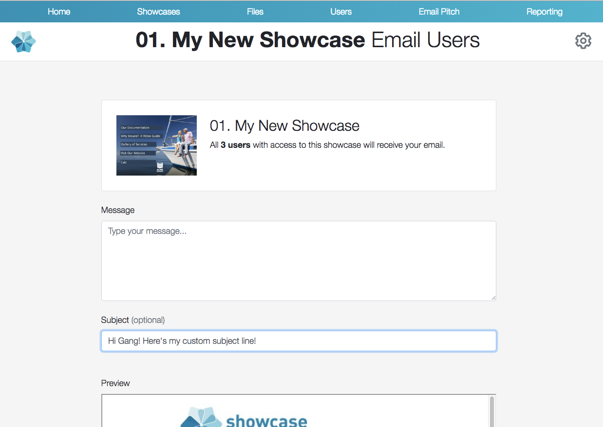
Like the improvement to Outline, this is an improvement to a feature you might not even know about. From the More dropdown for any given showcase, you can choose to 'Email Users' and send a message to all users who have access to that showcase. It used to be that this message would have a default, unchangeable subject line - but now you can edit this. Winner!
That's it for the minor little additions and improvements - stuff we hope will improve your days in small ways.
Remember we summarised the bigger-picture stuff in the original post, so check that out for some more screencaps and teasers if you haven't already.
And, we're always listening for feedback or questions, at helpdesk@showcaseworkshop.com.