It's a stressful time in the world, kids; there's no denying it. We've gotta keep trying hard, being kind, and taking small moments of soothing calmness where we can get it. In that vein, we're pleased to unveil a brand new look for the Showcase Workshop web platform.
It's smooth, it's shapely, and it's distinctly more 'friendly' to look at. A rounded little drop of zen in the chaotic hard-edged torrent of 2020.
It's also (we hope) easier to use. Bigger buttons are easier to click on, and the styles of buttons, text, and tips throughout the platform have been made more consistent.
Let's take a look, shall we?
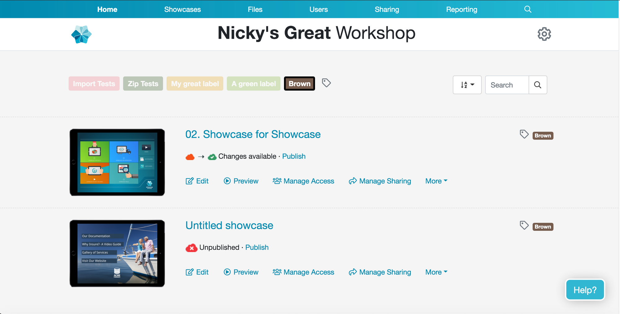
Home screen
Here's what you currently see when you open the Showcase web platform:
And here's the revamped version:
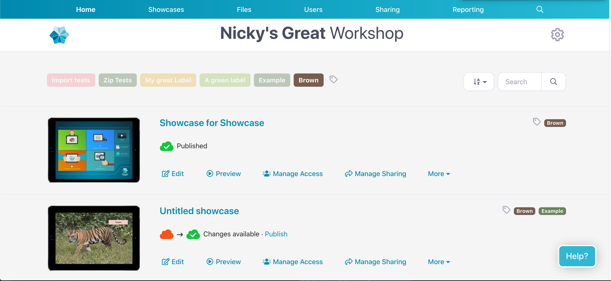
Check out those rounded corners and crisp font. Swissssh!
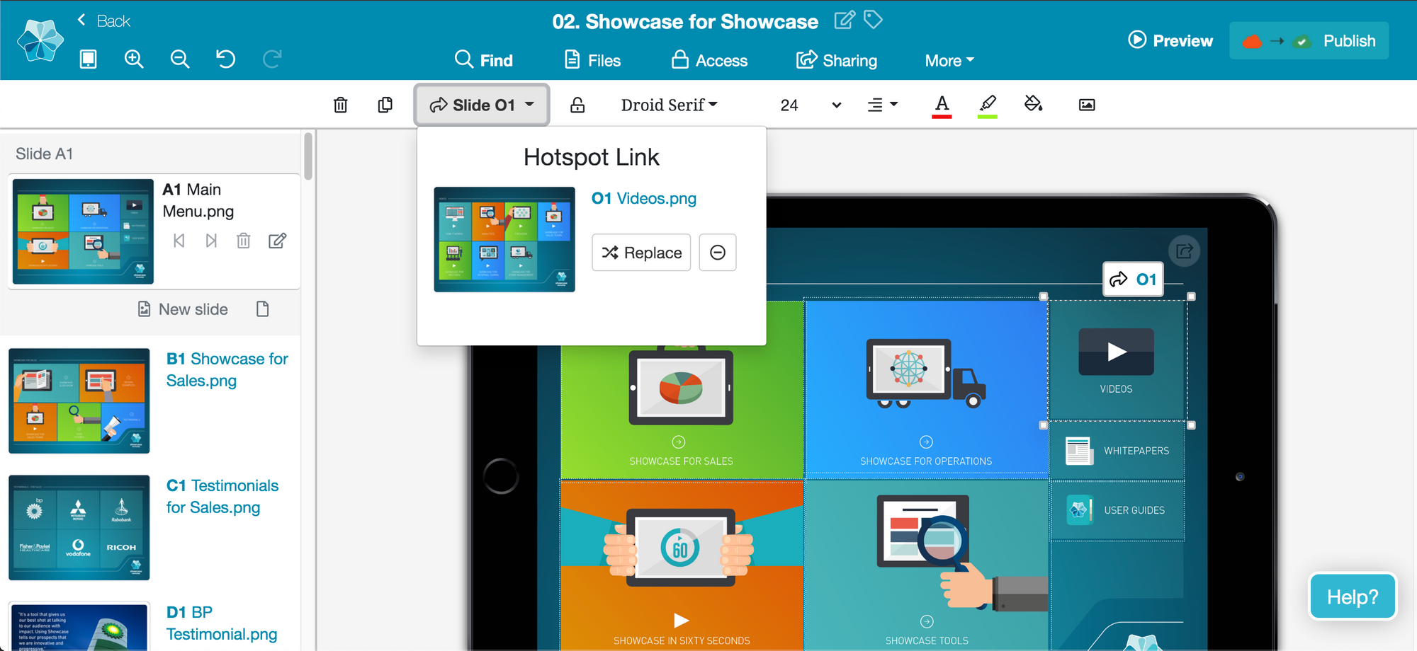
The Editor
If you're editing a presentation, you'll currently be met with this style:
And here's what we've done with it:
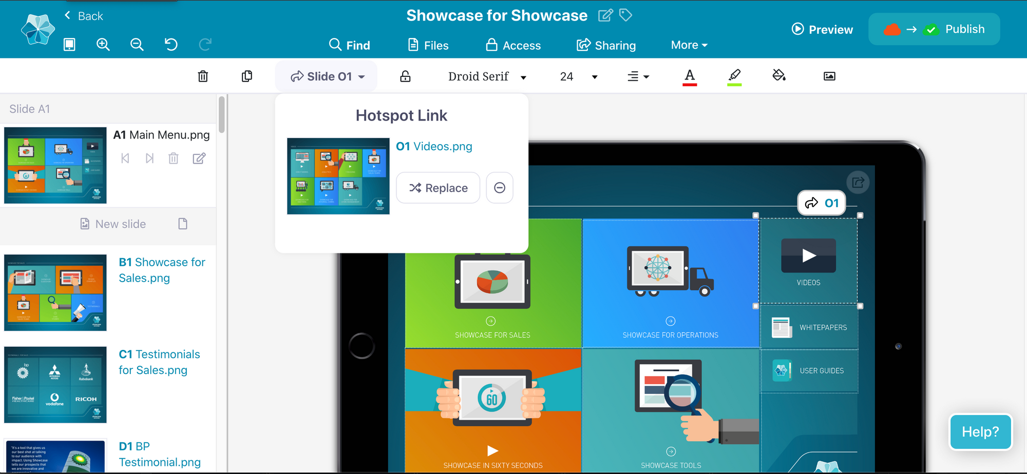
Shazam!
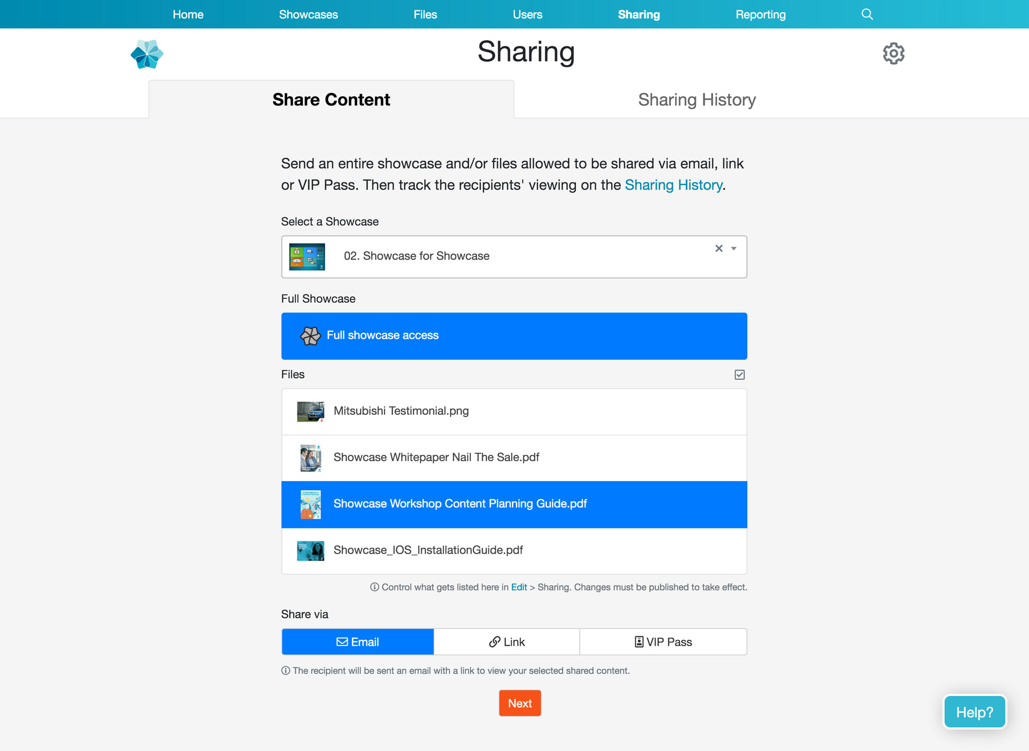
Sharing screen
How about the Sharing page? It currently looks like this:
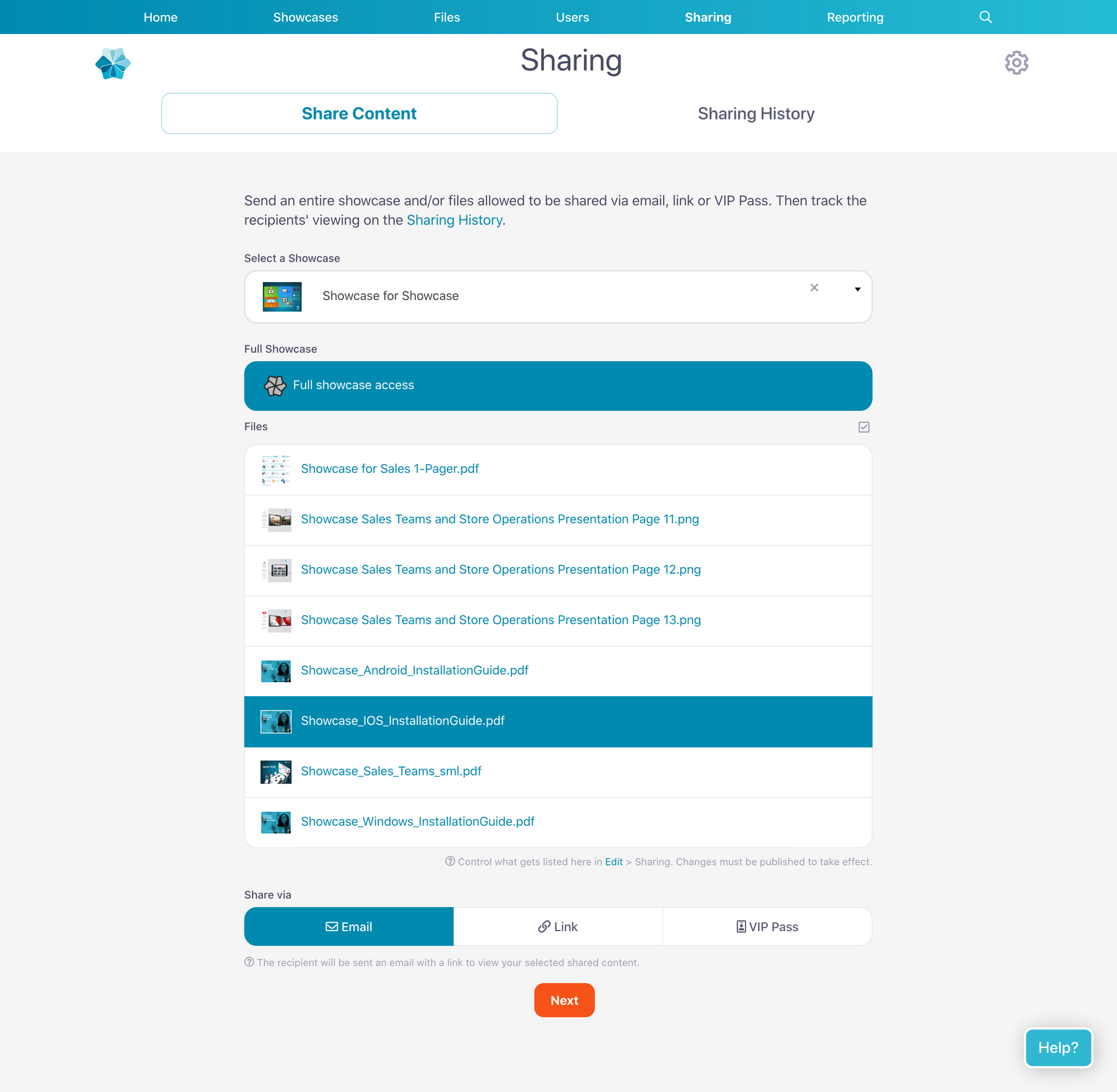
In the new look, it becomes a lot cleaner and smoother with rounded buttons and extra spacing:
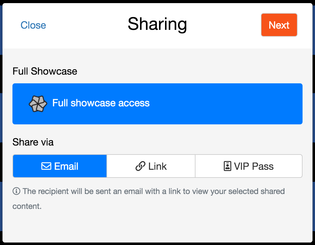
In terms of translating this look to the Sharing dialog, this is what that pop-up box currently looks like:
And the new look is like this:
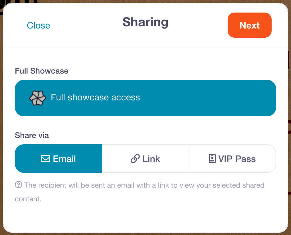
Dang. Very nice. It's much more on-brand with the Showcase Workshop colours. It's just so... satisfying.
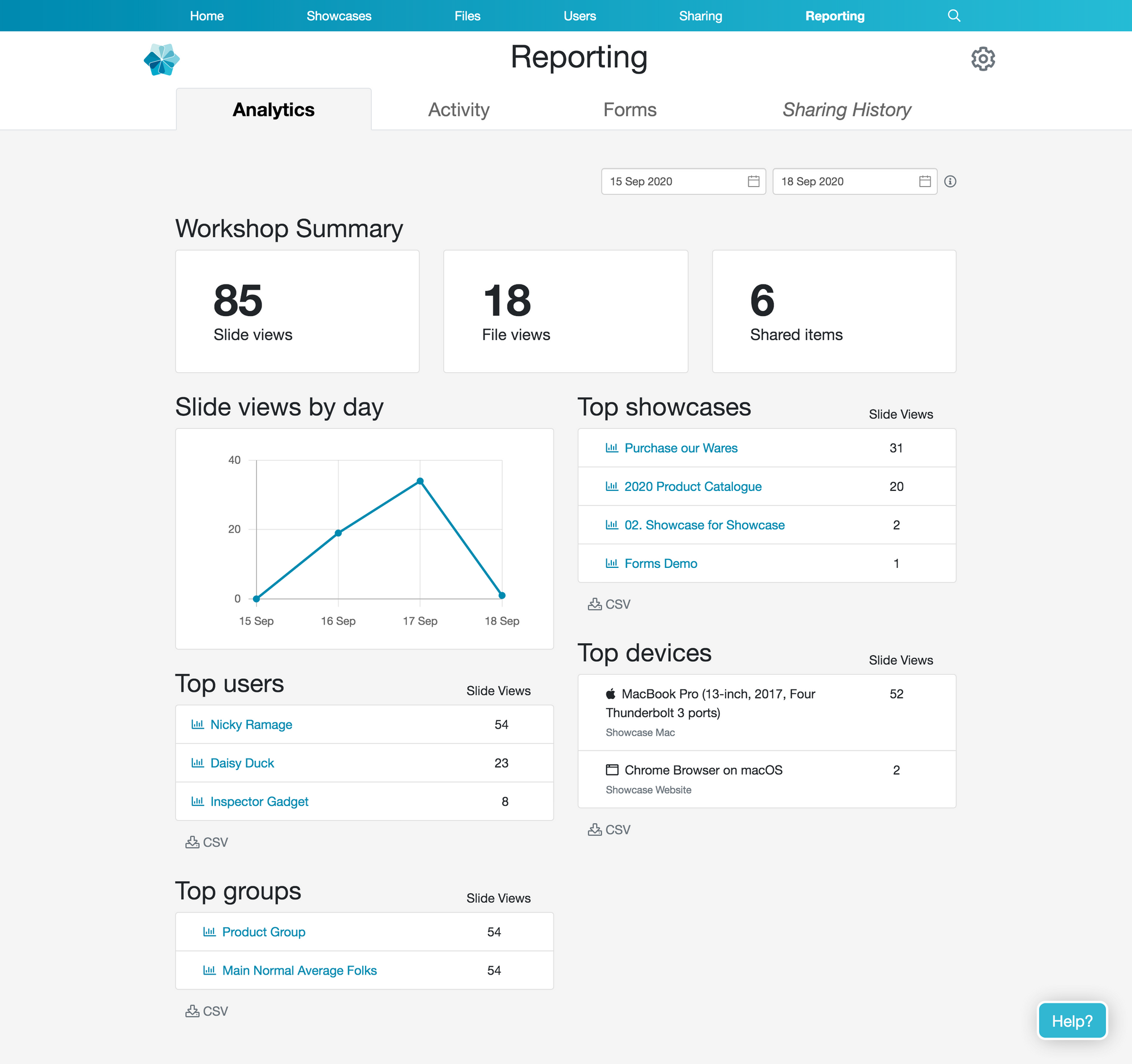
Analytics screen
Ok, one more preview for the road. Here's what the Analytics page looks like at the moment:
And the new style has us looking like this:
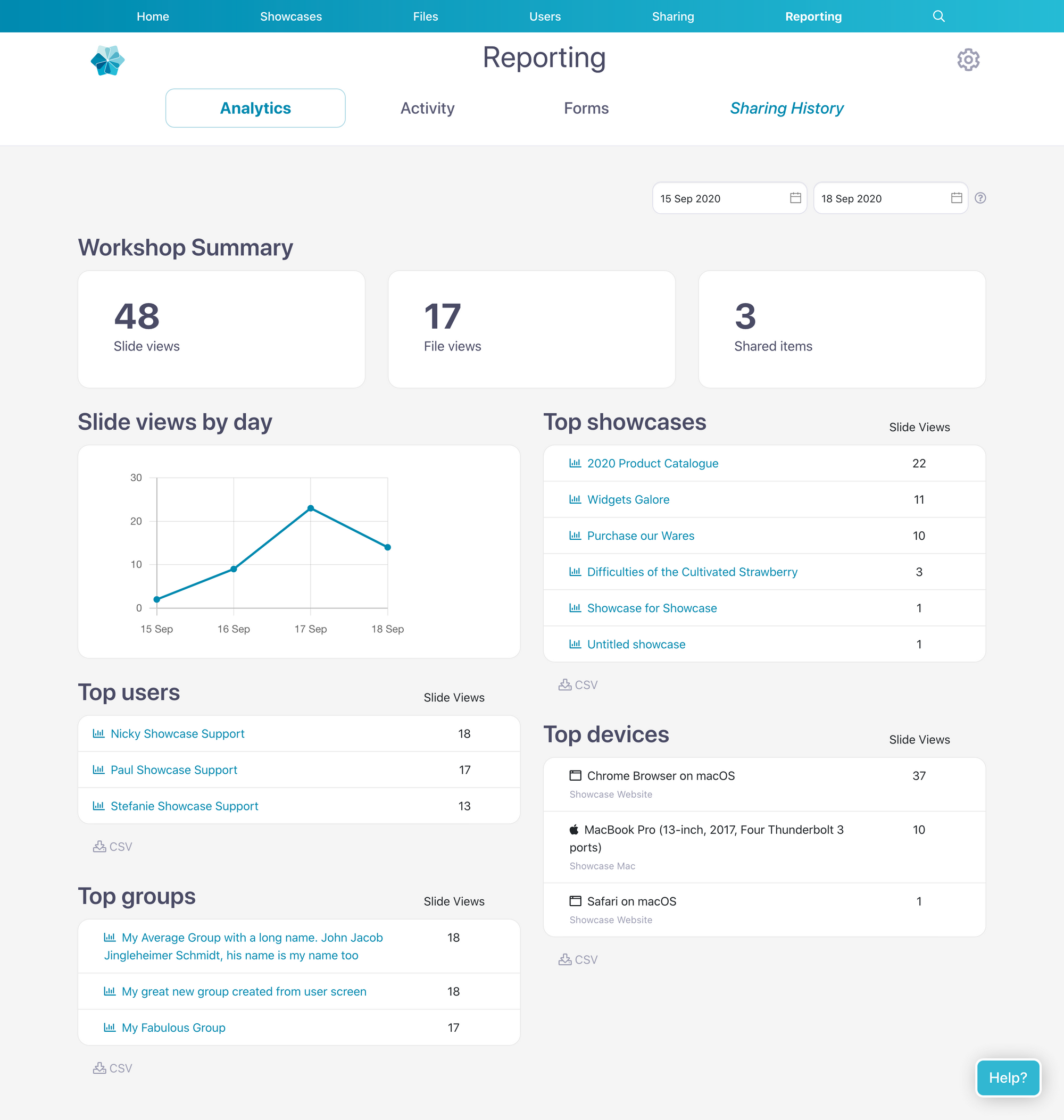
Real fresh. Real modern.
This cute new aesthetic is coming to your screens within the next week or so — keep your eyes peeled! A similar style will roll out to the apps not long after.
Love it? Hate it? Conflicted? Let us know by emailing us at my2cents@showcaseworkshop.com!