Buckle your seatbelts, because we’ve got two exciting design updates that we think you’re going to love! Go forth and update your Showcase apps so you can make full use of them today.
1. Solid Colors
We’ll start with a small but fun feature.
Our previously transparent hotspots have had a bit of a revamp and now you can add solid colors to them!
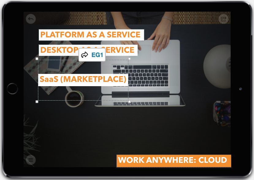
Previously, you could highlight text inside a hotspot but not the whole box. So, if you wanted your hotspot to be bigger than your text, you were left with something like this:

See the dotted square around "SaaS (Marketplace)"? That's your hotspot. And it's not playing ball.
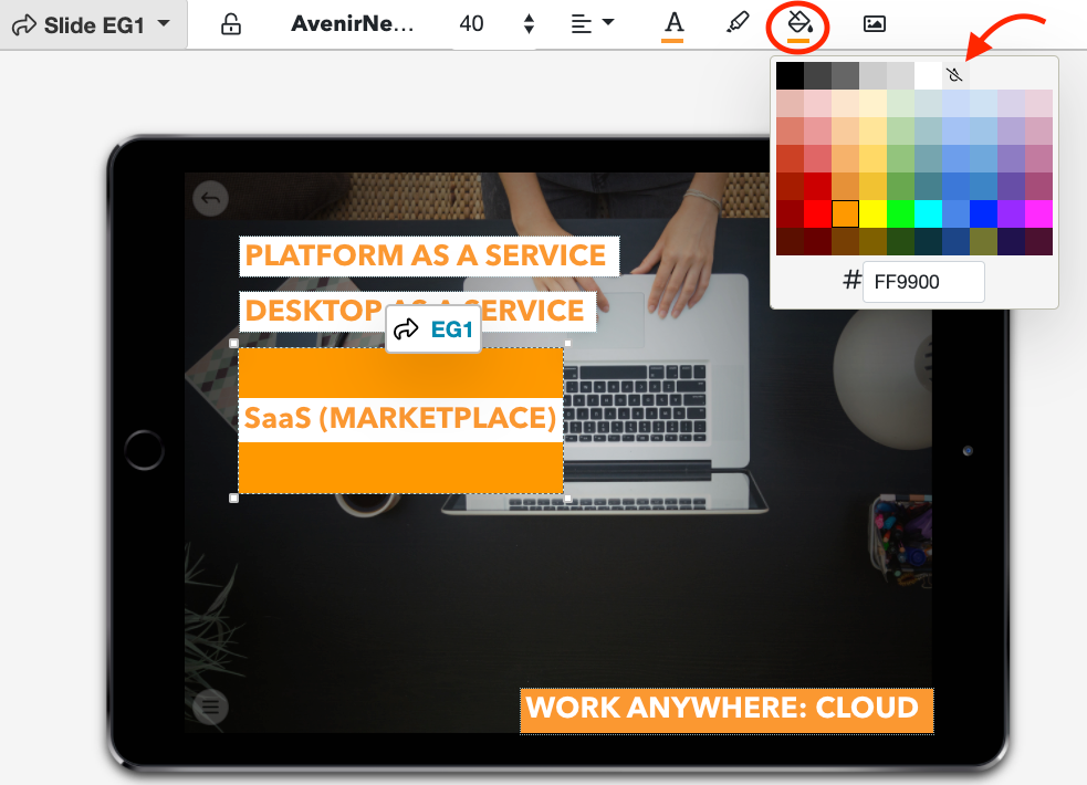
Now, you can fill your whole hotspot with a solid color no matter the size or shape.
To do this, select your hotspot and click the 'Fill Color' icon (the one that looks like a paint pot) in the toolbar. This will open a color picker — the same kind you use for highlighting.
You can choose a single color, or different ones for the hotspot and highlighting. Or, you can pick no color by clicking the 'Transparent' icon in both color pickers.

If you’re happy with the way your transparent hotspots work, great! Keep using them that way! But if you want hotspots that are a little more customizable, this feature is for you.
You can also add a color to your background by clicking the 'Background' button (logical — just the way I like it). This is great for smaller images that don’t quite fit your showcase dimensions, plus it works with transparent PNG images so you can use it with transparent logos!
Don't forget: You can add images and text to any hotspot, as well as align your text to get it just right (or left).
2. Cinemagraph
You might need to take a seat for this one because it’s a biggie.
Are you ready? Our latest update lets you add videos or animated images to your slide backgrounds, meaning your background can now move!
Don’t run screaming around the neighborhood just yet, because we’ve got some important information to share with you first.
- Any video file you use as a background will be muted. If you have a video with important audio, upload it as a regular video instead. This feature is all about adding variety and making your showcase look like a million bucks.
- The system will stretch your file to fit the screen. We recommend previewing it on various devices before publishing to make sure it looks good everywhere.
- The video or animation will play on a loop, so we recommend choosing something that flows nicely.
What is a cinemagraph?
Although we'll be referring to video files throughout this article, cinemagraphs are actually slightly different to regular videos. Essentially, cinemagraphs are still photos that have one or two aspects moving ever so subtly.
Not sure what I mean? Check out the one below:

Cinemagraphs are perfect for slide backgrounds because they're not flashy or distracting. If you're looking for inspiration, Kevin Burg and Jamie Beck have created some incredible cinemagraphs. Have a chat to your designers about what would work for your business!
This feature is a fantastic way to engage your visual customers. Here are two ways you could incorporate cinemagraphs into your showcase:
- Add an animated logo in the corner of your slide — this is great because it's visually interesting without being distracting.
- Use a subtle cinemagraph for your entire the background — awesome for slides that don't have much written content like landing pages.
How do I add one to my showcase?
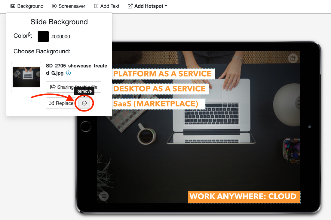
First things first: You need to remove any existing background image before you can do anything. In the Editor, select 'Background' and click the 'minus' button in the bottom right corner.

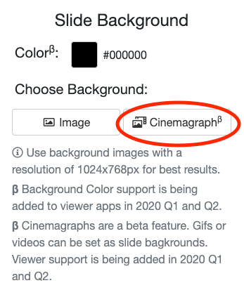
Once you've removed the background image, the dropdown menu should look like this:

Clicking the 'Cinemagraph' button will open your file library — automatically filtered so only video or GIF files appear. You can choose a video from your library or upload a brand new file.
Top Tips and Sage Advice
We recommend using video files rather than GIFs where possible. Although the system can handle either, videos tend to be better at telling stories through moving information. They're usually better quality too!
Also, try not to overload your showcase with videos. Contrary to popular belief, you can have too much of a good thing and showcases can quickly become overwhelming if there's a video background on every slide. Always keep your audience in mind when creating new content!
As always, we're available on helpdesk@showcaseworkshop.com if you have any questions about these updates.
We're super excited to see how you use these new features! We'd love to see your creations, so please send us an email or reach out on social media if you'd like to share them.