Hotspots - they're the most important part of any showcase. We wouldn't get anywhere without them (literally)! Depending on your needs and design aspirations, playing around with how you create your hotspots can change how your entire showcase is presented, but most importantly - how it's perceived.
Back to Hotspot Basics
The way you choose your hotspot design will likely be decided from a number of different variables.
- If you already have an established design (say, on your website branding) that you'd like to carry over into Showcase.
- The intended target audience for your showcases (internal staff, external sales presentations, direct customers).
- How often your hotspots and/or design will need to be updated on an ongoing basis.
- The amount of text or imagery needed for each hotspot.
The most common design of a hotspot is a basic rectangular 'tab' style.
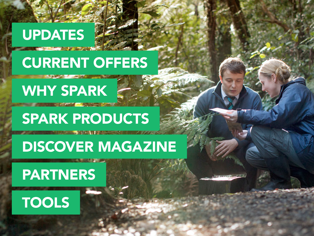
This type of design is popular because:
- It's the clearest layout design for slides that need a number of hotspot options displayed
- It keeps things organised and tidy on the slide itself, and
- It's the simplest to implement and design on your own in external tools such as Canva, PowerPoint, and InDesign.
Keep this tab design style in mind: if creating showcases that have many layers of submenus - the structured alignment will help your users navigate your presentation with ease.
What it's not ideal for: hotspots/tabs that have a lot of text. Long sentences or sentences with line breaks can clutter a rectangular hotspot easily, so keep in mind you're not 'overfilling' your text area.
Get Out Of The Box
The beauty of hotspots is that you can layer them over anything - even if it doesn't look like a hotspot and even if it's not a square or rectangle!
Getting out of the box with your slide design can not only make you look slightly fancier than most, but it can create a more interactive and exciting presentation, especially when presenting externally or sharing with prospects.
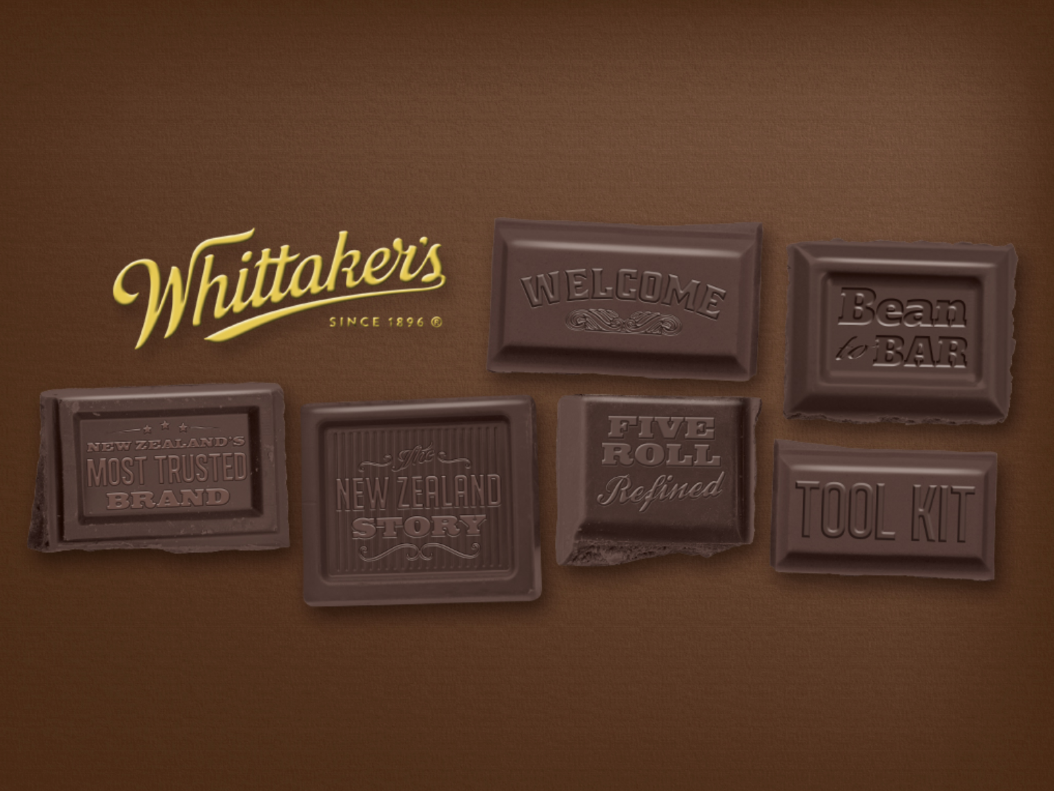
Each square of chocolate on this slide from Whittakers is a hotspot linking to another area, and the 'chocolate as buttons' design runs throughout the whole presentation. This is an amazing example of using existing branding to keep consistency throughout the showcase. It does make me hungry though...
Here's another example from Asteron Life who have strayed away from the standard style of text box and have implemented circles as hotspots in their showcase. It's a simple deviation from the standard tabs, but simple changes can make a big difference in the overall feel and usability of a showcase.

Keep this style in mind: when you want to have a little fun with your design! Or if you have a recognisable brand identity that should flow throughout your showcase.
Flat Backgrounds vs Hotspot Text
The majority of Showcase users create slides that are flat images with all imagery and text included - this means that hotspots are layered over preexisting text and images, and nothing on the slide background itself can be changed through Showcase.
However, if you know that you'll likely need to update your text or imagery on a regular basis - it may make more sense for you to utilise our hotspot Text feature! By creating a hotspot and then using the text feature to write inside the hotspot, you're able to make changes whenever you like - without having to tinker with the original design.
You're able to upload your own custom font into Showcase, and set back ground colours, font size, and alignment.

Here's a great example of on of our templates where the entire image bar the yellow background, is made using hotspot features like the text feature and hotspot images. This template is entirely customisable within Showcase!
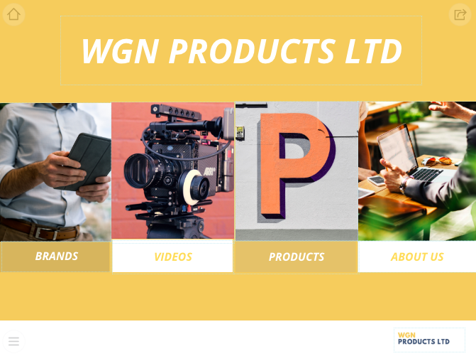
Keep this style in mind: if you want complete control of your customisation, or your text or images change on a frequent basis. Do it your way!
What it's not ideal for: if your design has a large amount of text on one slide in very close proximity, it may be a challenge to have every single hotspot editable. In order to reduce opportunities for mistakes or cluttered slides, ensure that each hotspot has enough free space around it before editing. Hotspots that are too close to each other get difficult to differentiate between on devices with smaller screens!
The Options Are Endless. And Stylish!
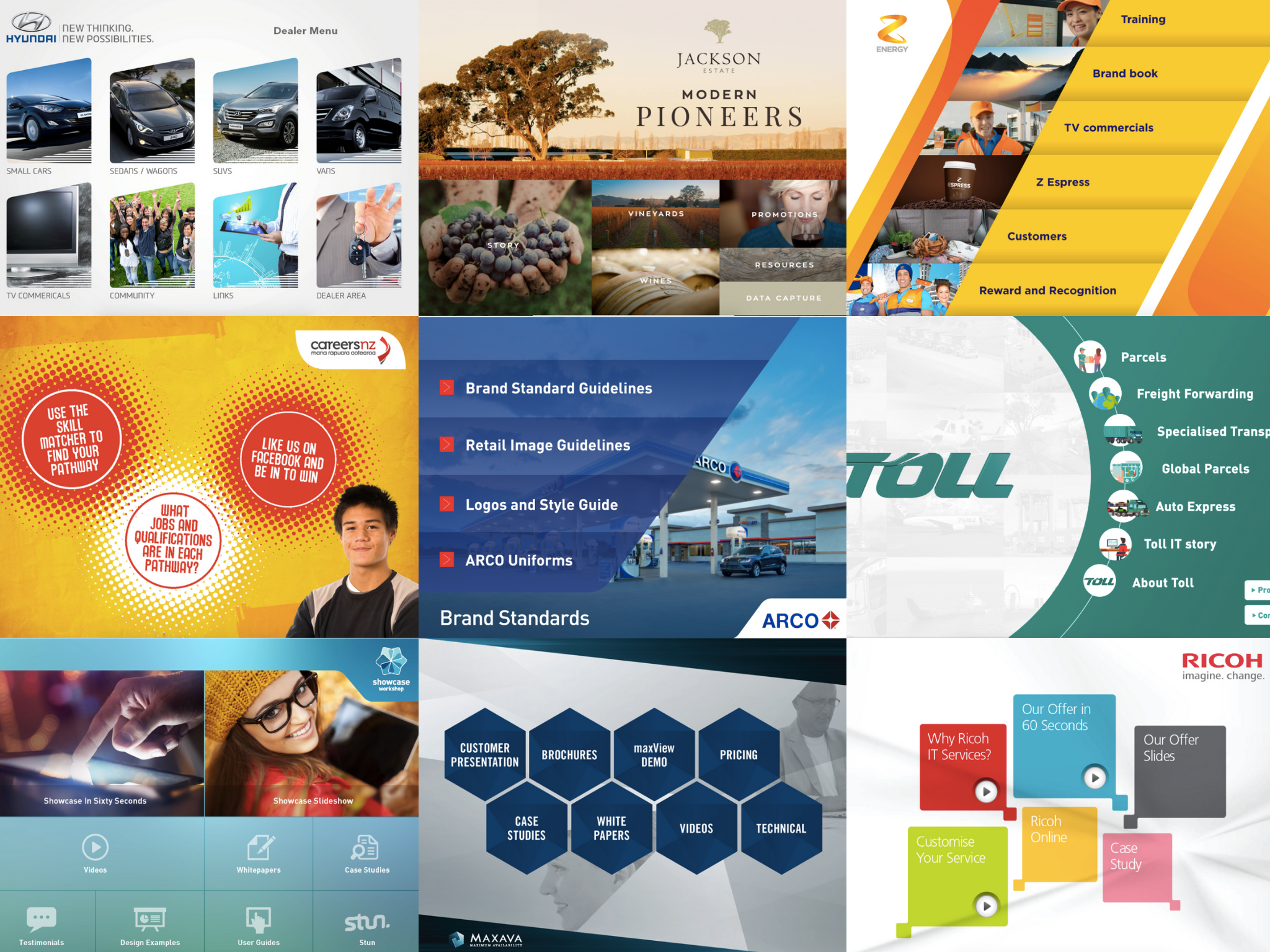
Looking for some more inspiration? Take a gander over some of our favourite unique examples of hotspot styling and you'll see the opportunities of what you can create are truly endless.
If you're interested in refreshing your showcase design, get in touch with us and we can spend some time with you discussing your needs and goals, then we'll link you up to our partner design agency. #makeover
Start the new year off on a very stylish foot.