Here at Showcase, we are continually impressed with the variation and innovation of what our custies do with our platform.
We have such a wide range of customers that we want to take the time to display some notable mentions that you may or may not have heard of, or some design styles that may interest you for future rebrands or rebuilds!
This months Customer spotlight is: Seed Force!
Who are Seed Force?
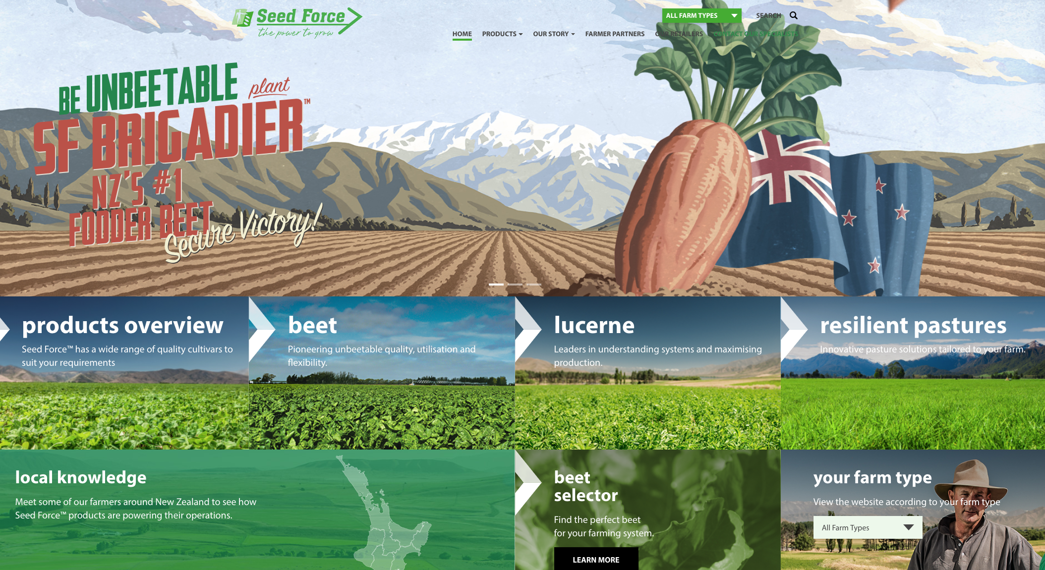
Seed Force is a New Zealand seed breeding company supplying premium cultivars across Australasia. Their business is all about helping grow farmers’ productivity and profitability – choosing the right seed is just the beginning!
From humble beginnings to offering premium cultivars across a wide range of species, Seed Force are constantly growing, testing, fine-tuning and expanding their range.

Seed Force have been with Showcase for over 4 years - we're officially in long term relationship territory here!
Why we love their showcases
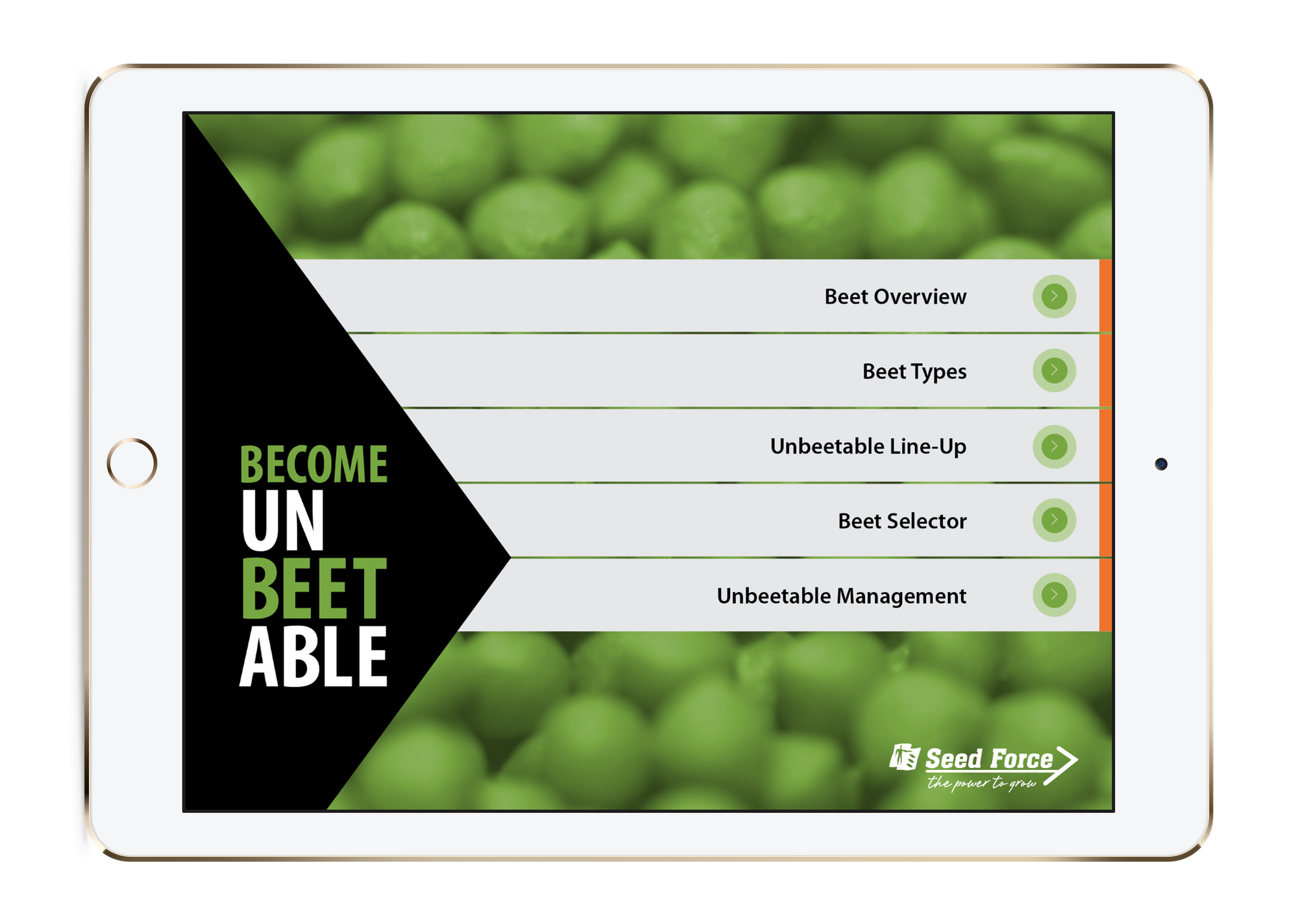
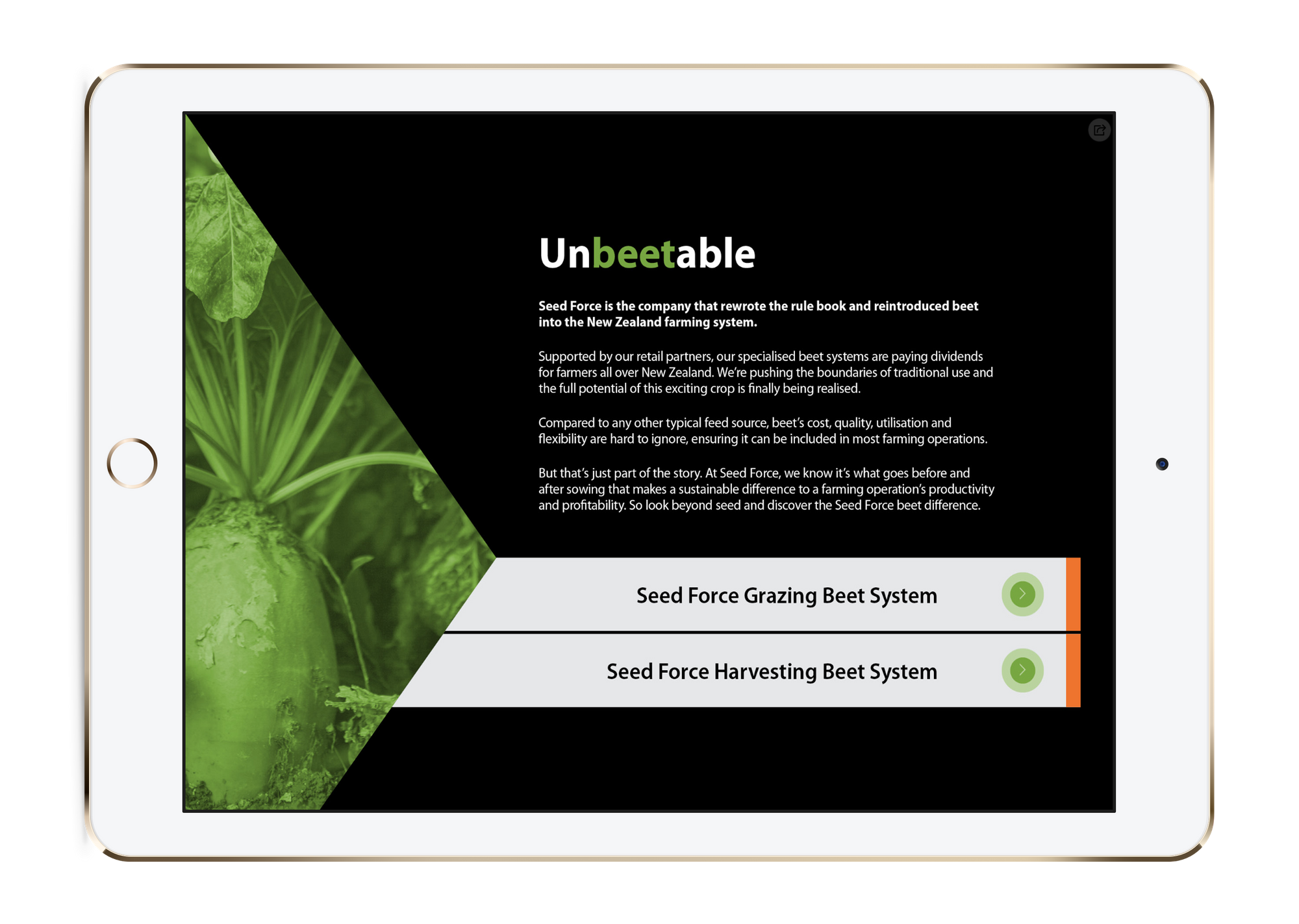
Seed Force has created a very consistent and stylish series of showcases, that carry their branding throughout which is immediately recognisable to their customers.
Continuity in branding is super important and is one of the basics of good design. You want your showcases to look like they're coming from you!

Apart from the obviously amazing pun that carries throughout (unBEETable, anyone?!) the showcase design itself is simple and understated. The benefits of this style of design ensures their showcases are easy to navigate, customer friendly, and straight to the point.
Simple background boxes or tabs keep text to a minimum, and also set out the main menu clearly. The branding and colour palette are also continued through the showcase menus with clever soft focus photography as backgrounds - a great way to amp up a background, as opposed to colour blocked colours.

Design and Showcase tips to take away from Seed Force
- Keep things consistent! Carry your brand throughout your whole showcase.
- Minimalism packs a punch. Less is more if you want a real focus on your content and ease of use.
- Puns are always appropriate.
- Think about how you're laying out your showcase. Think about how many tabs are on each slide - can they be split into submenus? Are all tabs on that slide necessary? Packing too many hotspots and tabs onto one slide can look messy and be confusing for the user. A great way to get around this is to sufficiently wireframe out your slides before you build a showcase!

Check out all things Seed Force at https://www.seedforce.co.nz/ and get caught up in some UnBEETable products and knowledge.
Start a free 14 Day Showcase trial of your own, or if you want a helping hand or just a sounding board about your own showcase design - get in touch with us any time at helpdesk@showcaseworkshop.com