When you've been using Showcase for a long time, you naturally think of upgrades and improvements to your original ideas and designs.
Professional preferences and daily needs change, much like they do in every day life - a lot like changing your hair cut or switching up your regular coffee order.
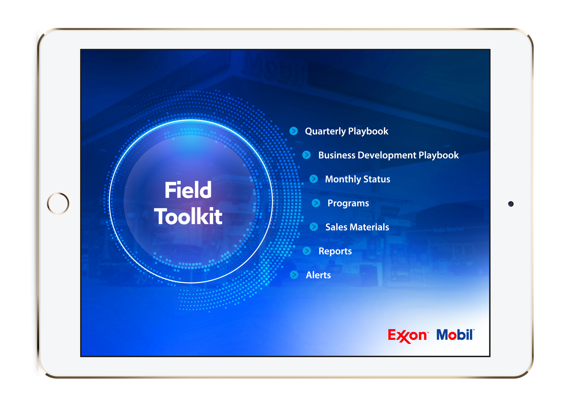
In 2017, we helped Andeavor's ExxonMobil brand team with a set of beautiful showcase designs complete with a stylish intro video that played every time a user opened a showcase.

As time has moved on and Showcase usage has continued to grow, the team felt they needed to switch it up a bit and give users something fresh to engage with.
The team had also identified some opportunities to streamline and improve the process for their editors and end users.
Here's another quick peek at one of their original designs.

The ExxonMobil brand team realised over time that they needed the best of both worlds: showcases that were both easily editable by their administrators, and easy to use for their franchisees and store managers. Content changes frequently - much of it on a monthly or quarterly basis - and when you have content like that there are a lot of regular design requests and text changes so their administrators needed to be able to act fast.
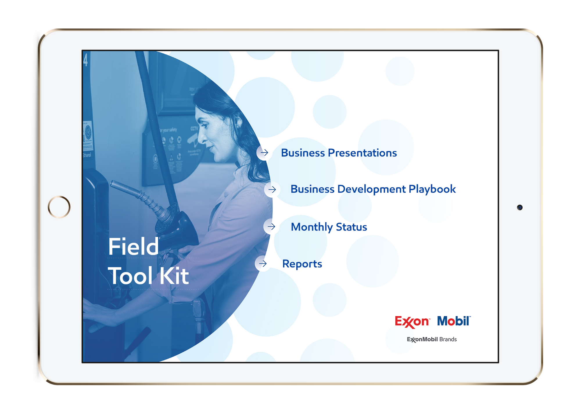
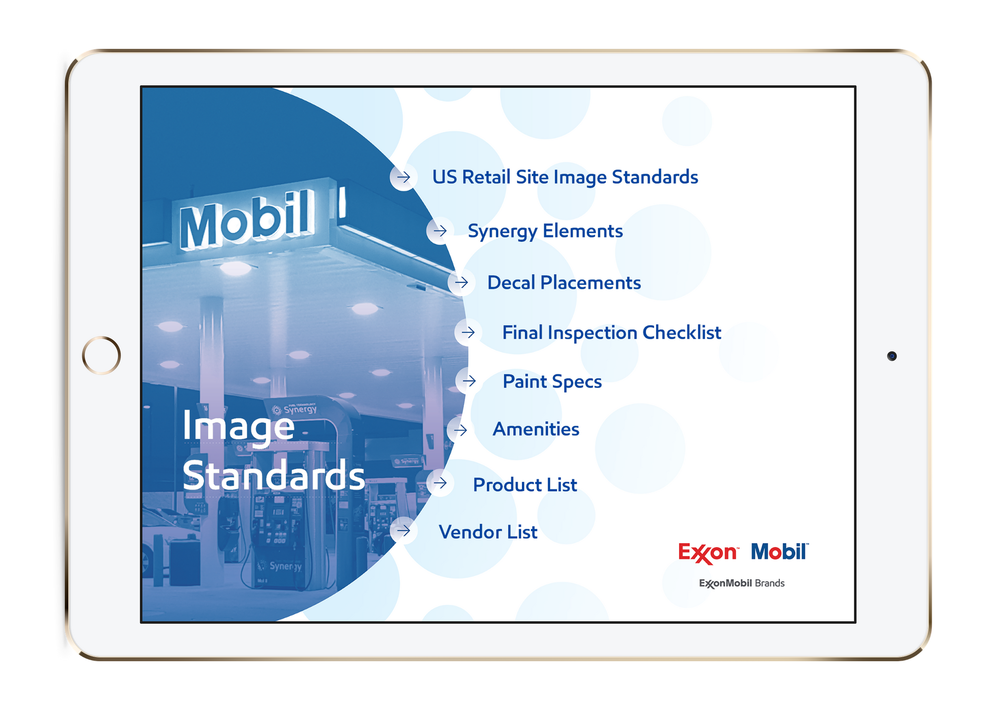
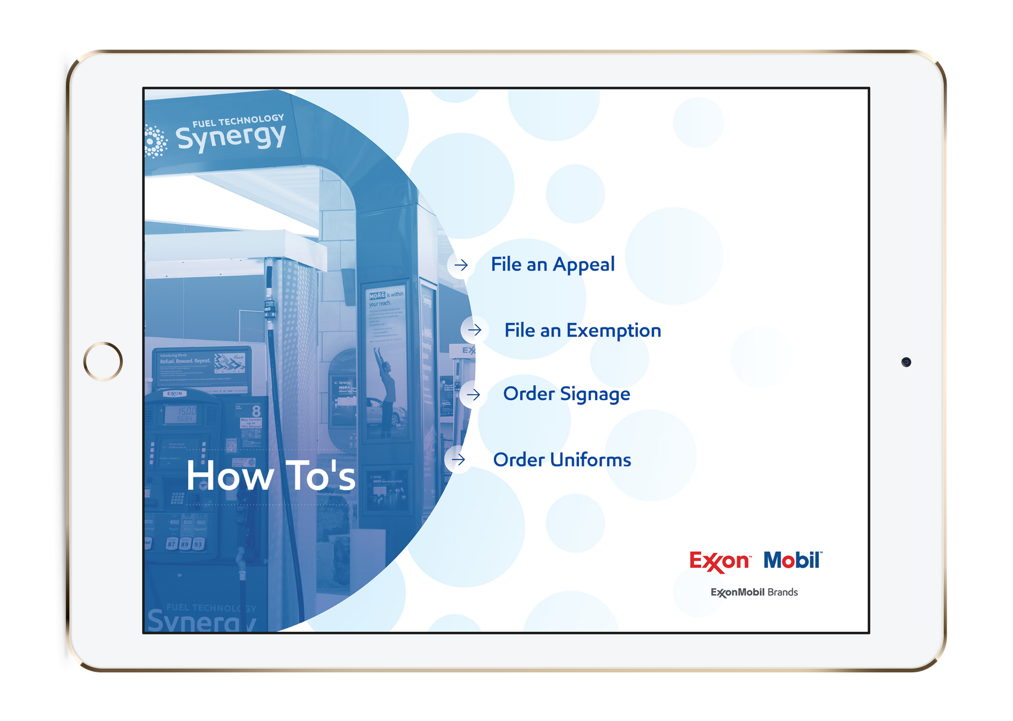
Working with our design team, they settled on a simple yet stylish template that would allow them to work on any part of the showcases on their own, rather than requesting the help of a designer each time.
We were able to upload their proprietary font (you can too) directly into their workshop and preset that font as the default so the team is always on brand without even having to think about it. Each time the ExxonMobil administrators replace text or create new hotspots - the correct font, size, and brand colour is already there, leaving no room for mismatched text or colours.

For ExxonMobil franchisees and business development managers, no matter where they are in the country, they are able to access exactly the right information and content whenever they need it and with the convenience of using any device they have.
Separating large content buckets such as their Field ToolKit and Speedpass+ information into individual showcases, allows users to find what they need in a flash and eliminates extra tapping and swiping through pages and pages of documents.
A consistent template throughout all of the showcases allows users to become accustomed to the structure and how things are laid out.

It was really important for ExxonMobil to have their established brand continue throughout their showcases in a number of ways. If you're a regular at one of their stores, you'll know the familiar blue /white / red colour scheme so it's only logical that their showcases reflect the same.

If you're keen on joining ExxonMobil in the future and leaving intranets and Powerpoint in the dust, book a free demo with us and let's start the beginning of a wonderful friendship!