Vodafone is arguably one of the most recognisable brands on the planet. So to refresh their logo, tagline and brand positioning across all their collateral is no small feat.
Luckily Vodafone NZ have been enthusiastic Showcase users since way back. So when the time came to update their sales tools in the New Zealand market, Showcase helped make that brand refresh process a whole lot smoother right off the bat. That’s for two main reasons:
-
New collateral - sales brochures, offer documents, explanatory videos and links – can completely replace old within minutes. Salespeople don’t have to try figure out the difference, as it’s already there waiting for them in the Showcase apps.
-
Showcase’s sister design agency, STUN, is well versed in creating designs optimised for the Showcase format – while still following specific brand guidelines.
Let’s take a look at some menu designs:

This is the main menu of Vodafone’s showcase – a nice bold design, with hotspots of generous heights to tap on, and a manageable number to choose from too. The in-store guide is highlighted as a kind of “quick link” for users.
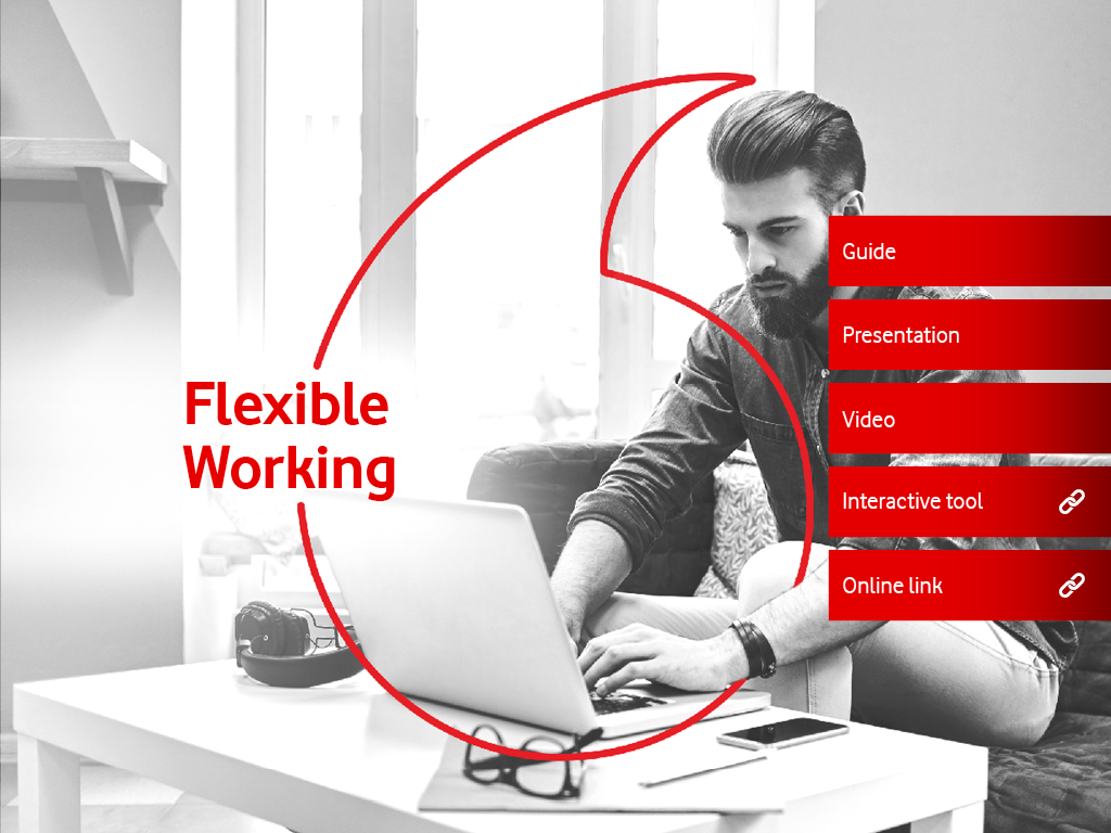
Hotspots that go to a website are indicated by a link symbol within the hotspot; the slide titles and background imagery keep the user anchored as to what they’re talking about.

The same design language has been employed in a special, vertical showcase that Vodafone will be using for Kiosks at Enterprise Events:

This is a great example of clean visual design – focusing on a limited colour palette and quality stock photography to make an impact. Great job, Vodafone!
If you’re feeling inspired and would like to see what Showcase and Stun can do for presenting your own sales collateral, get in touch with us!