When you spend a good chunk of your day talking about an intangible cloud-service like we do, it's really helpful to have examples that bring the details to life.
When those examples are also real customers - and those customers are well known brands - it adds a layer of cream-on-top reassurance for most viewers.
Among the examples that our lovely customers have given us permission to share in demonstrations, we have a handful of customer designs that are so good, even in markets where the brand is not known, their designs consistently make viewers sit up and take notice.
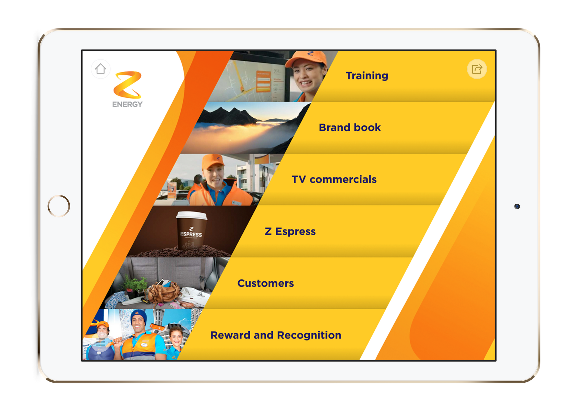
Among that group is this design from Z Energy* - New Zealand's most trusted fuel brand, but a mostly unknown name out of home.
*Pronounced "Zed Energy" by the locals.

This template was originally designed for a Z Dealer Roadshow all the way back in 2014 and given to Z's Dealers on a fully provisioned iPad they could keep. Nice!
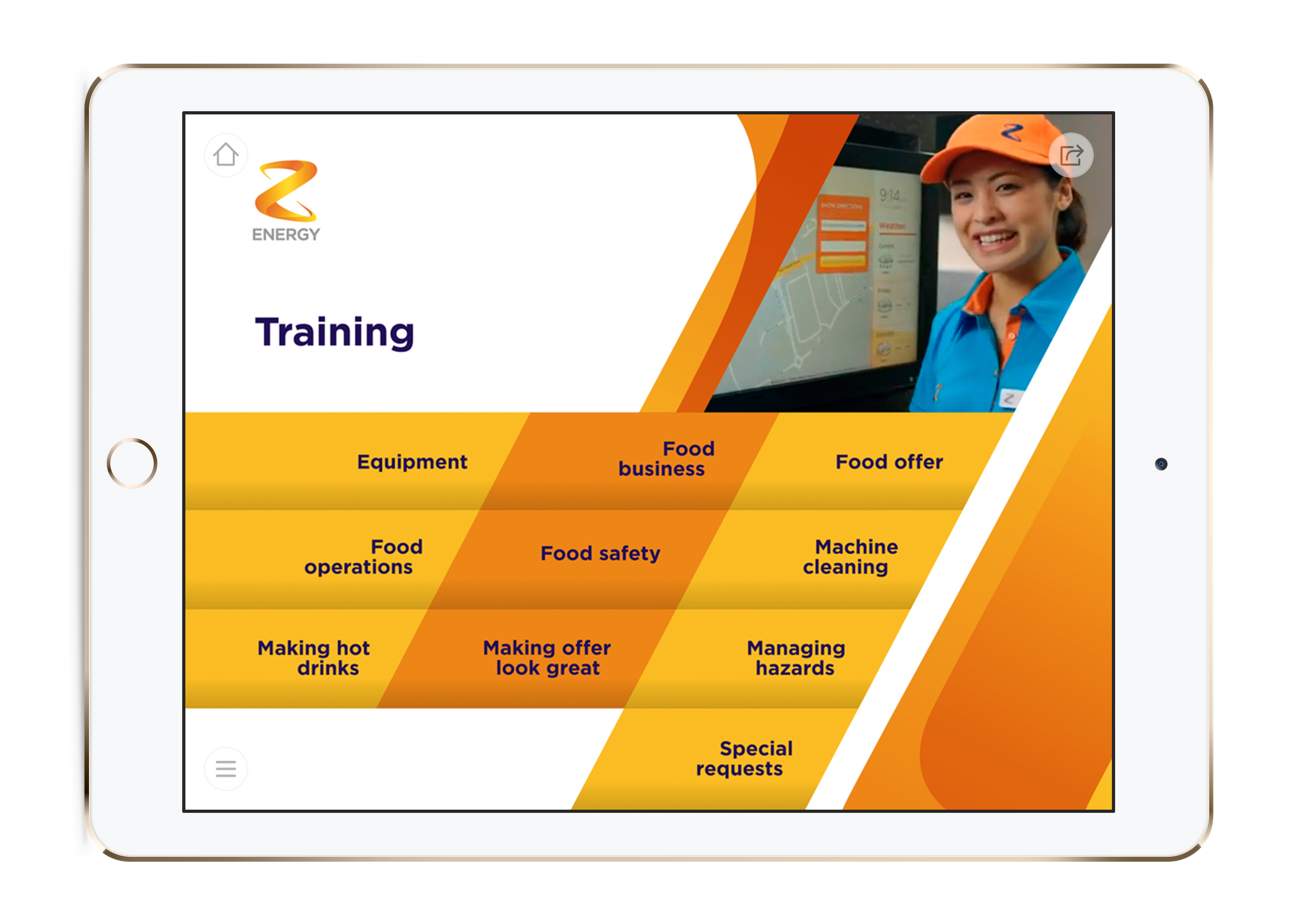
The fetching orange design has really stood the test of time and routinely perks viewer interest for its bold lines and bursts of colour.

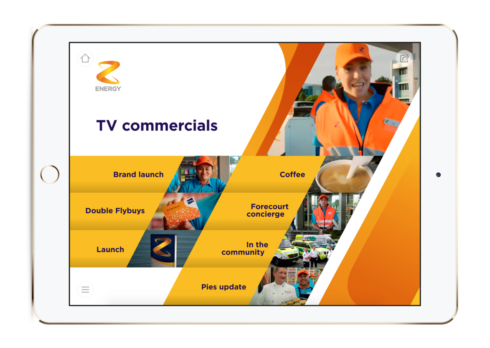
Content-wise, this showcase brought together site training materials, brand and style guidelines, and access to information about latest promotions - all good stuff for sites to have quick access to.
What I really liked about this design was the inclusion of the company's TV commercials. It gave site staff a way to keep up with exactly what customers see during the ad breaks in The Dog Show or the 6pm News.
