My awesome husband and I have worked together in business for 15 years, and lived together for almost 10. We’re familiar with how the other person interacts with human beings - clients, suppliers, baristas, home handymen… people we see regularly.
There aren’t many surprises; we're quite similar in the way we interact with people. That is, until we go vehicle shopping. We’ve recently been looking at SUVs, or maybe even a pick-up truck. (Yes, a ute, but when in Rome...)
Adam prefers a salesperson who sells the vision: Adam and I driving around in style, hitting National Parks in the comfort of our new truck.
Me, I want to be sold to by a details nerd. Tell me everything about the digital dashboard's specific features, the fuel economy and the specs of the spare tire!
So we need to be sold to by the Swiss Army Knife of personalities - equal parts charisma and detail. Some salespeople can balance these; we’ve met the “details guy” who brings the vision to life on the test drive, and the “vision guy” who solidifies the dream by pointing out facts and figures on their mobile device.
This got me thinking about a case study we wrote about Mitsubishi Motors in 2016. When I opened it up, the first three sentences stood out to me, sounding just as true as they were three years ago:
"Let’s face it. For certain industries, face-to-face interaction is crucial for the business and for the customer.
The auto industry is one of them.
No matter how much information a customer has when they walk into a car dealership, the interaction with the sales rep will make or break the deal."
If the salesperson answers our questions quickly and confidently, it reassures us that we’re in good hands.
If the salesperson struggles or worse, appears to bluff, it makes us uneasy.
Mitsubishi Motors’ showcase design has come a long way since they first launched in 2015 and along with this rather long-winded story about my marriage and car shopping, I wanted to share some highlights from their current design.
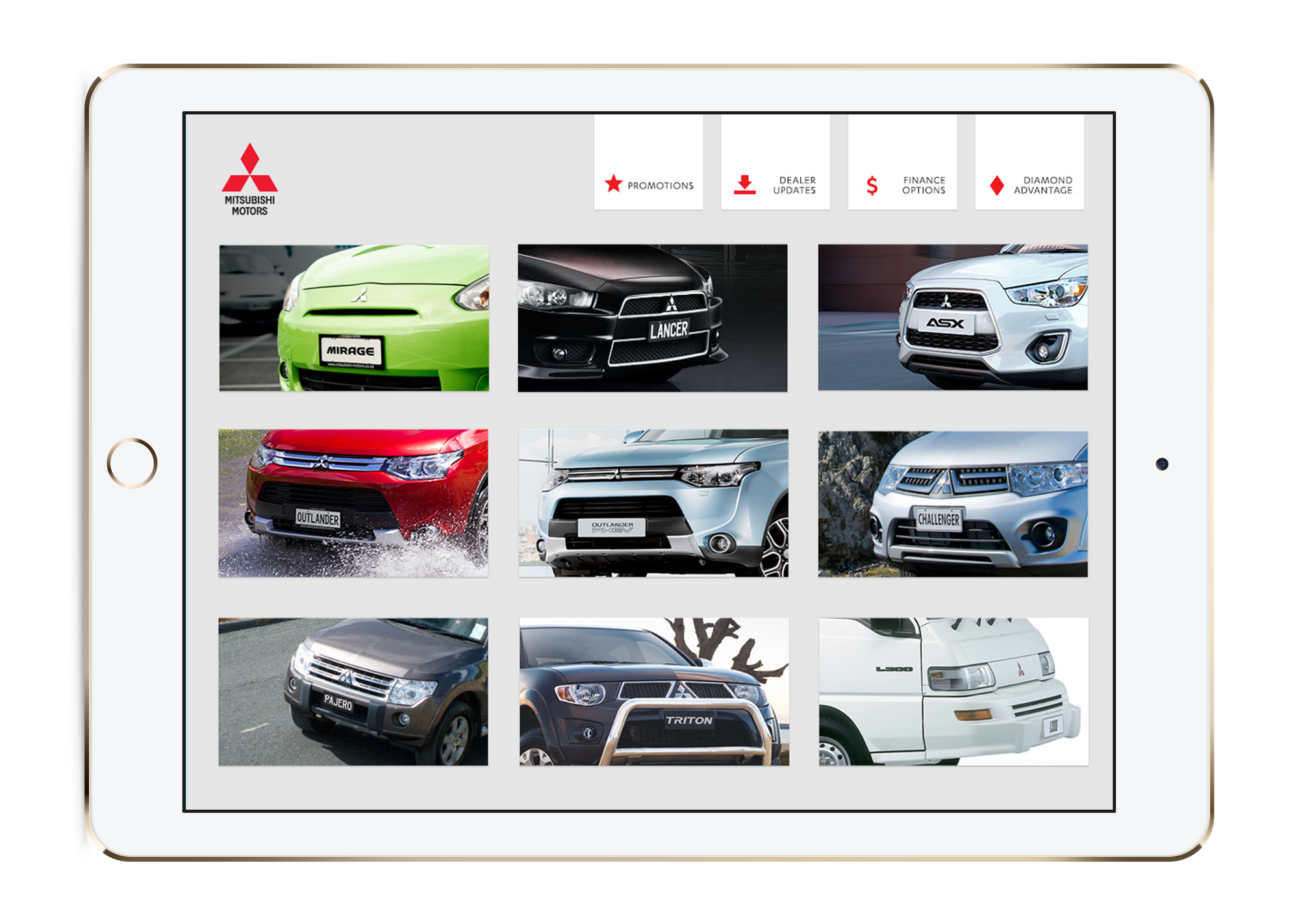
In 2015 they launched like this:

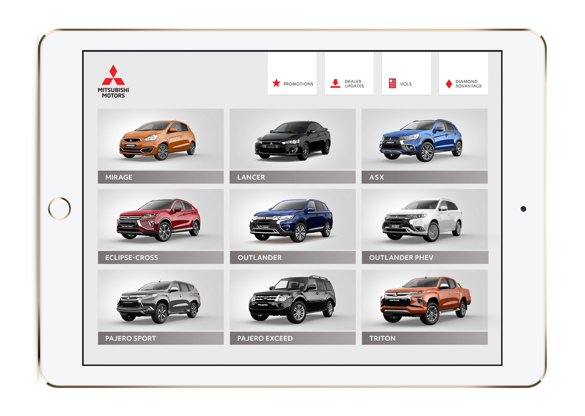
Not shabby at all, but 2019’s design is definitely looking more elegant:

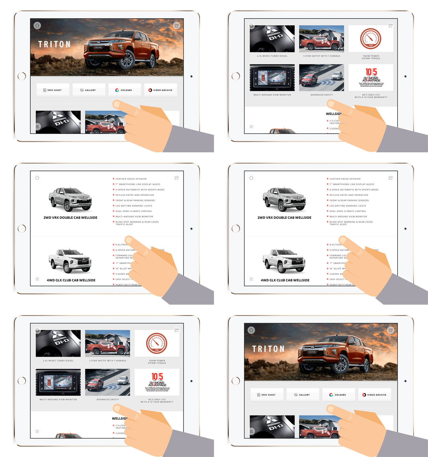
To avoid extra clicks, Mitsubishi Motors designed the sub pages - one for each of their models - to be scrolling, but kept the critical facts and shareable files positioned above the fold.
Spec sheets, galleries and videos are just one click away, and it's just two more clicks to share those with the customer sitting in the showroom or returned from a test drive. Perfect for buyers like me, who want those details to review for themselves.

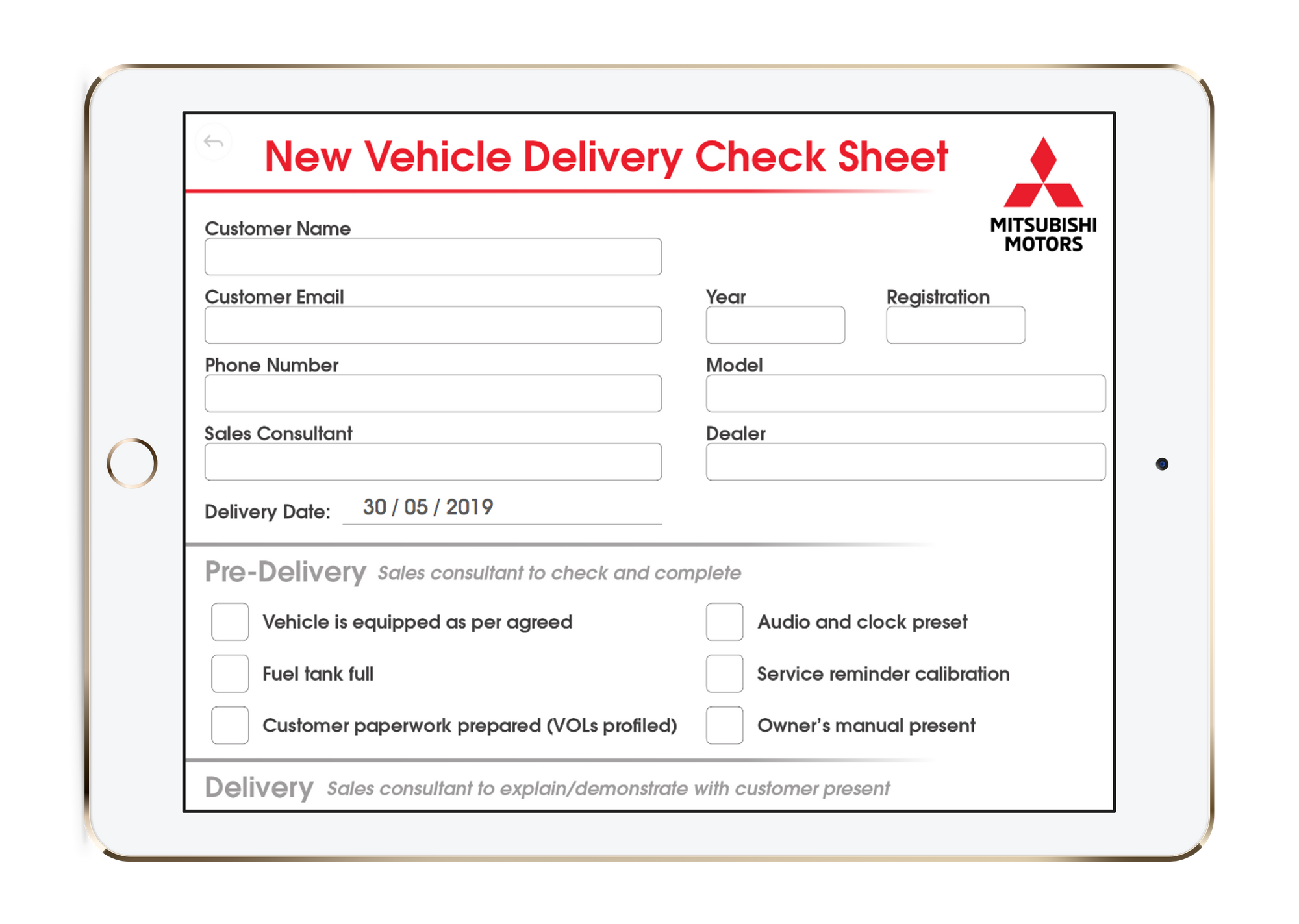
Mitsubishi Motors also added some rather wonderful innovation in 2018. A New Vehicle Delivery Check Sheet that can be both completed and signed on the tablet.

This really streamlines the immediate after-sales process. In fact, it means that Showcase helps Mitsubishi take buyers from the initial conversation, through to a detailed shortlist and followup, through to the vehicle delivery process, all on the same app. Smoother than a hybrid on the highway.
Regardless of whether Mitsubishi's salespeople are big-picture dream sellers, all about the numbers, or somewhere in between; they still have a beautiful and practical tool for selling new sets of wheels with ease.
Adam and I haven’t settled on a new vehicle yet, but if our own car-buying experience is as simple as Mitsubishi makes it, I'll be happy.